MAAP, Off The Front, Issue 2
Published September 29, 2023
By FontsInUse
Contributed by Tristan Ceddia
Source: www.instagram.com License: All Rights Reserved.


Source: www.instagram.com License: All Rights Reserved.

Source: www.instagram.com License: All Rights Reserved.
Source: www.instagram.com License: All Rights Reserved.
Source: www.instagram.com License: All Rights Reserved.
Source: www.instagram.com License: All Rights Reserved.
This post was originally published at Fonts In Use
Source: www.instagram.com License: All Rights Reserved.
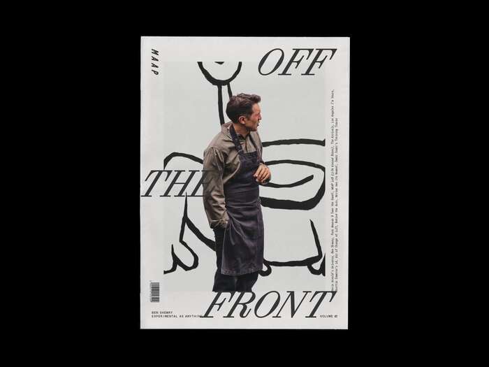
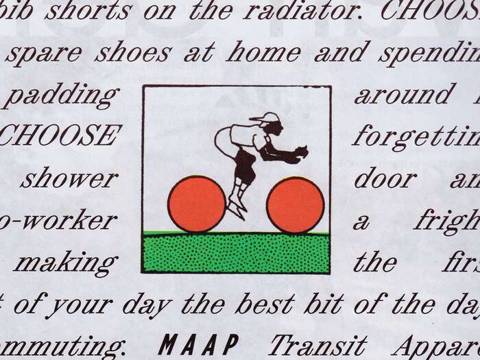
Coinciding with the launch of their experiential MAAP LaB store, TRiC was invited to art direct and design the second issue of the MAAP publication Off The Front.
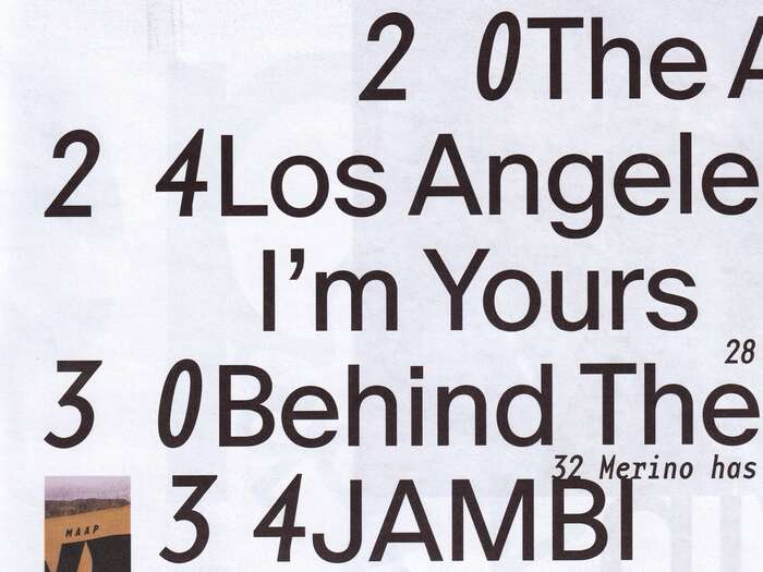
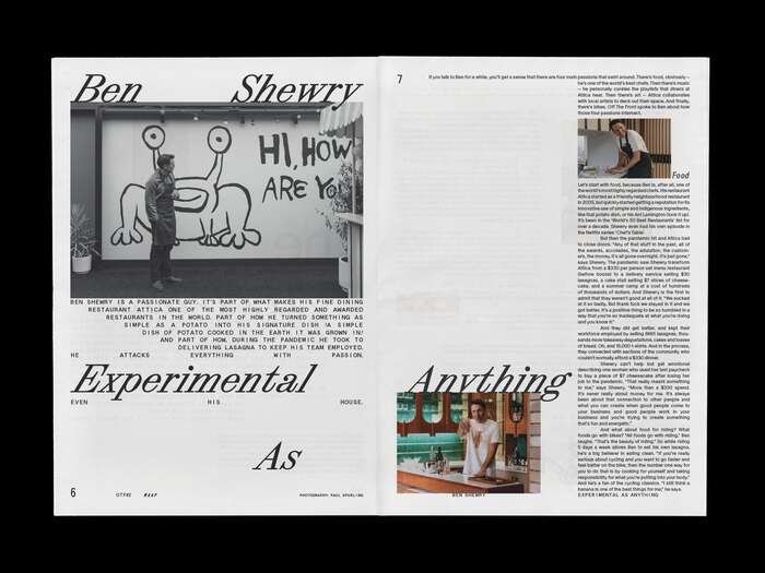
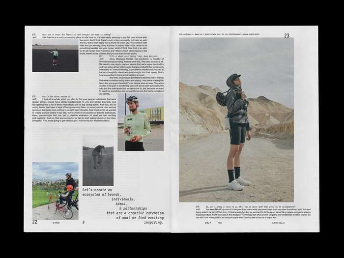
As an extension of the LaB brand, TRiC incorporated the typefaces ABC Synt and ABC Oracle by Dinamo and Base Monospace by Emigre to bring a new dimension to the publication. These typefaces were employed within a dynamic, flexible grid system, referencing concrete poetry and early desktop publishing layouts. The energy, movement and pace of the publication reinforce MAAP’s position as a leader in design and innovation within the global cycling industry.
Source: www.instagram.com License: All Rights Reserved.
Source: www.instagram.com License: All Rights Reserved.
Source: www.instagram.com License: All Rights Reserved.
Source: www.instagram.com License: All Rights Reserved.
Source: www.instagram.com License: All Rights Reserved.
ABC Synt’s Turbo style
This post was originally published at Fonts In Use
Read full story.
WRITTEN BY
FontsInUse
An independent archive of typography.