Ma’Erra Production
Source: www.maelletarnaud.com Maëlle Tarnaud. License: All Rights Reserved.


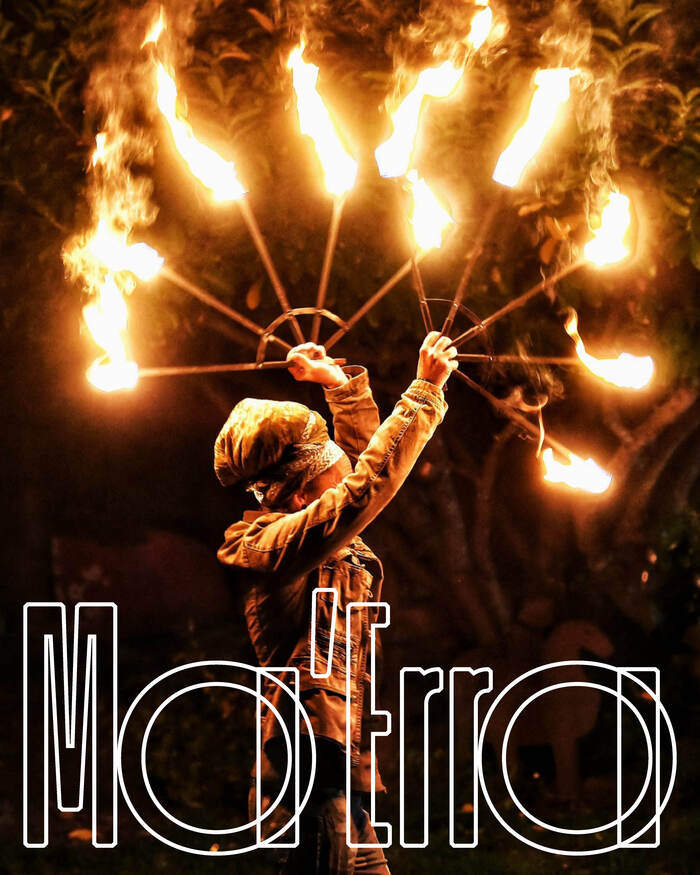
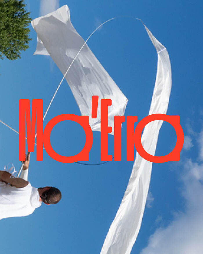
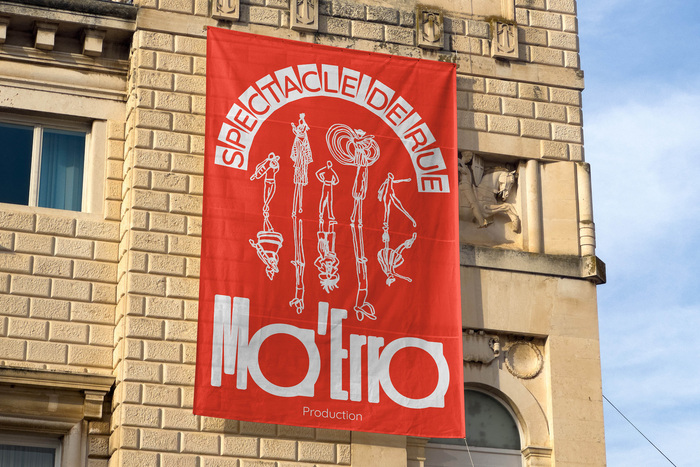
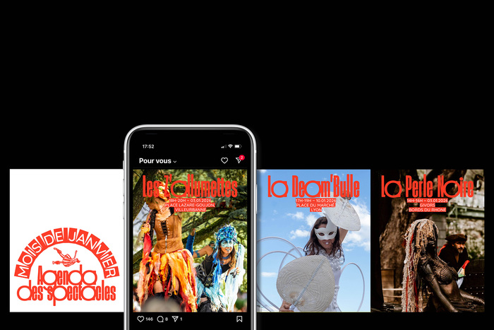
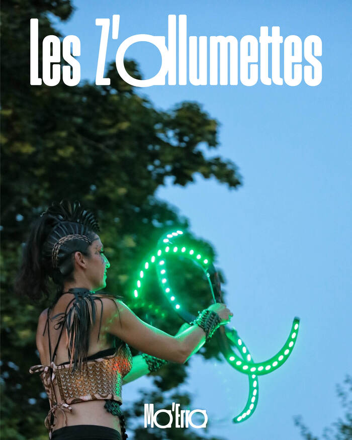
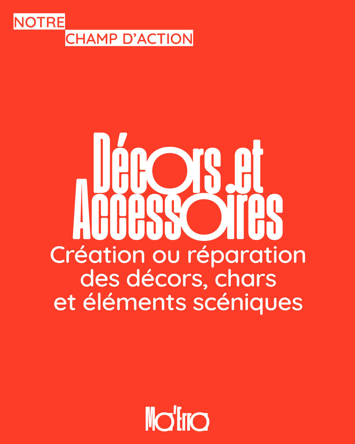
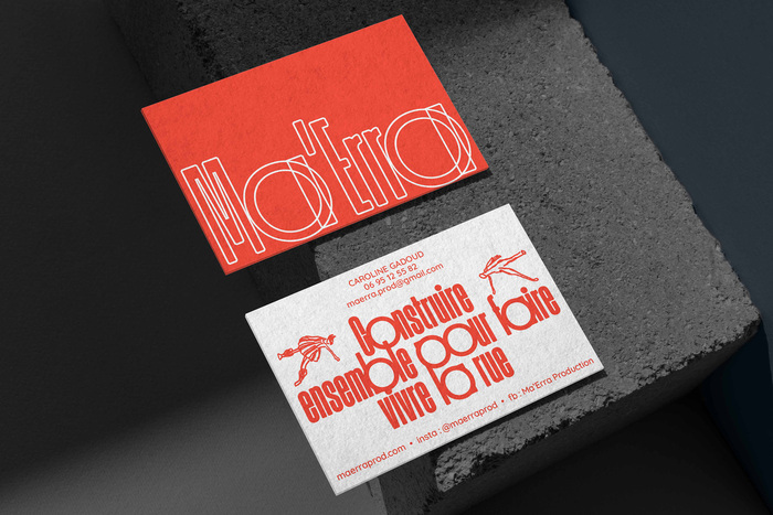
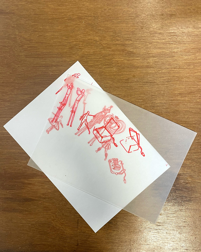
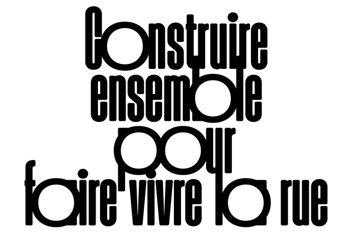
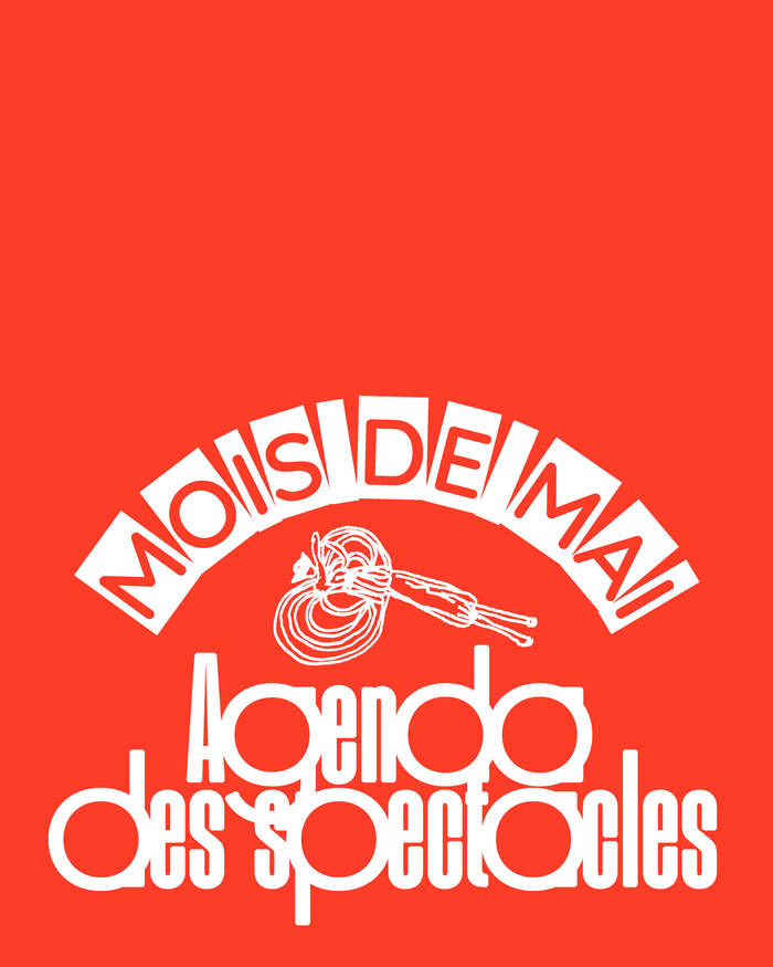
Ma’Erra Production supports performance companies and artists in the structuring and management of their projects. “Building together” is at the heart of their approach: street performance is a collective work, shaped both on stage and behind the scenes. The visual identity highlights this creative process by exploring the construction of forms and deconstructing the elements of the set; stilts, costume patterns, scaffolding or music box mechanisms to reveal what is being played in the background.
The typography featuring Round Ultra supports this intention: its rounded and structured shapes evoke a construction in balance between organic and technical. The a and the o, very circular, echo the rhythms of street art, its apparatus, its percussions and scenic elements; the condensed aspect, stretched vertically, reminiscent of stilts, thus creating a direct link between typographic forms and the elements of the show.
Source: www.maelletarnaud.com License: All Rights Reserved.
Source: www.maelletarnaud.com License: All Rights Reserved.
Source: www.maelletarnaud.com License: All Rights Reserved.
Source: www.maelletarnaud.com License: All Rights Reserved.
Source: www.maelletarnaud.com License: All Rights Reserved.
Source: www.maelletarnaud.com License: All Rights Reserved.
Source: www.maelletarnaud.com License: All Rights Reserved.
Source: www.maelletarnaud.com License: All Rights Reserved.
Source: www.maelletarnaud.com License: All Rights Reserved.
Source: www.maelletarnaud.com License: All Rights Reserved.
This post was originally published at Fonts In Use