Chasing Cambodia documentary
Tida Tep. License: All Rights Reserved.


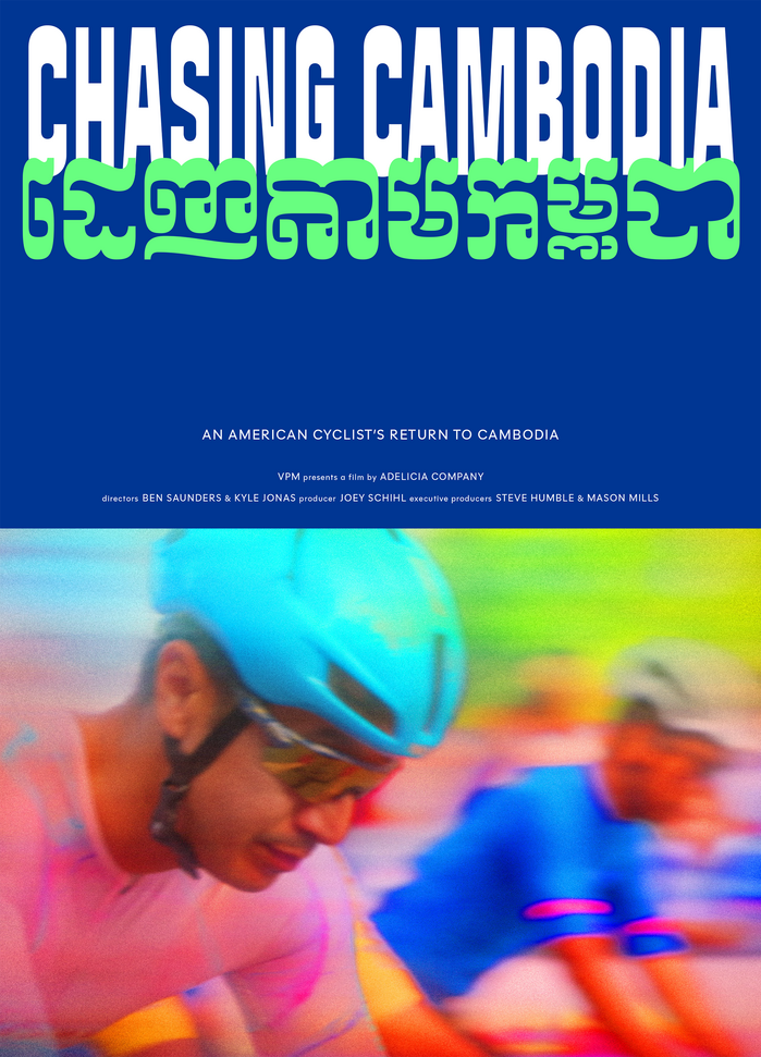
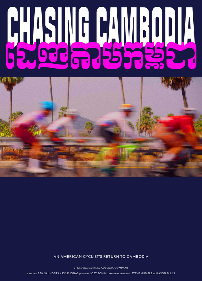
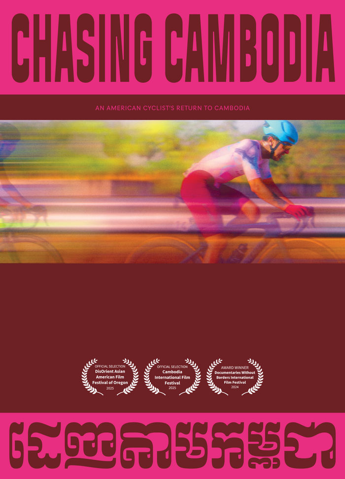
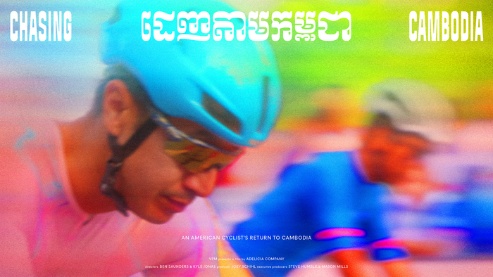
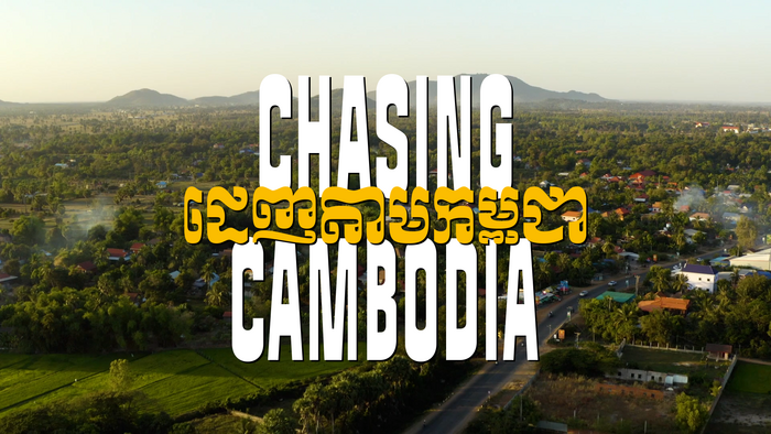
Title and poster design for Chasing Cambodia, a documentary following a Cambodian-American cyclist invited to race for Cambodia's national team.
The project began with translation, rendering the film’s title in Khmer in a way that would feel natural and nuanced to native speakers. From there, custom Khmer lettering was drawn by Fred Shallcrass, drawing from Moul script: a bold, rounded style ubiquitous across Cambodia. The letterforms carry cultural weight while holding their own visually against the Latin type.
We paired the Khmer lettering with Signal Compressed, a typeface rooted in French road signage and designed to remain legible at an angle or in motion. These qualities made it a fitting counterpart for a story about racing, and the compression amplifies a sense of speed and forward momentum. The small text is in Polymath.
The color palette and compositions take their cues from cycling kits and race jerseys, reinforcing the kinetic energy at the heart of the film.
Tida Tep. License: All Rights Reserved.
Tida Tep. License: All Rights Reserved.
Tida Tep. License: All Rights Reserved.
Tida Tep. License: All Rights Reserved.
Tida Tep. License: All Rights Reserved.

Tida Tep. License: All Rights Reserved.
Tida Tep. License: All Rights Reserved.
This post was originally published at Fonts In Use