Lotmore
Source: www.smalltownfolk.com Small Town Folk. License: All Rights Reserved.
Lotmore’s logo is custom. It draws inspiration from the transformable nature inherent in the products. The negative space in each letter mirrors the way the furniture folds, while the form has been meticulously optimized for clarity and impact, performing seamlessly across both large and small sizes.

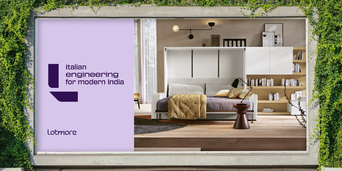
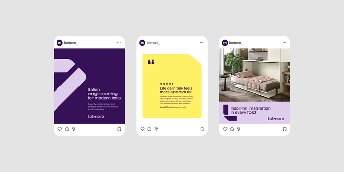
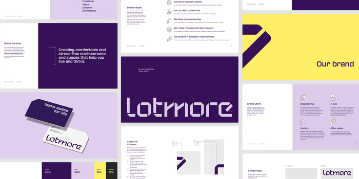
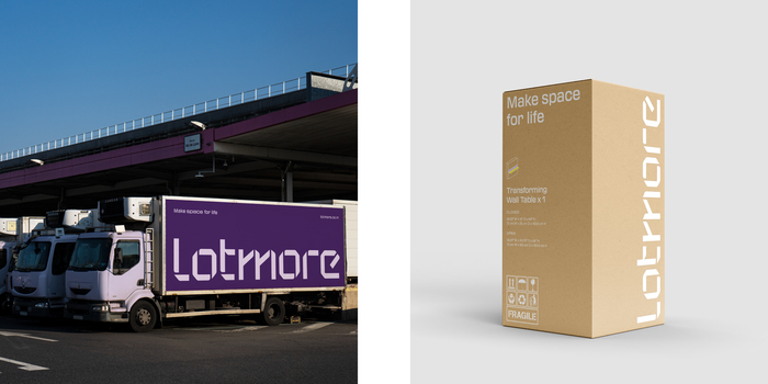
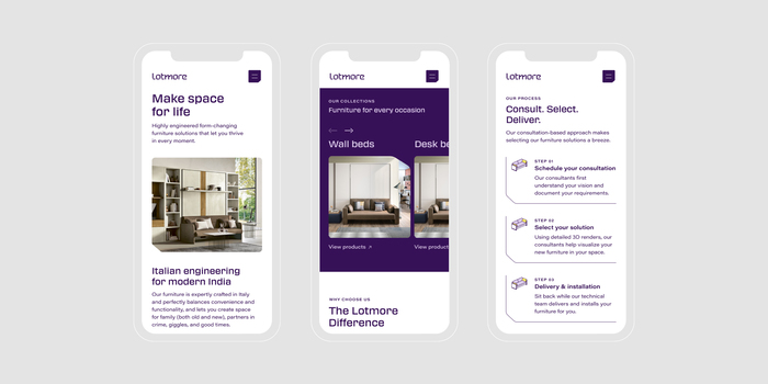
Lotmore is a furniture brand that aims to solve the problem of space utilization in small homes and apartments through highly engineered and functionally designed furniture solutions. Practical and form-changing, they are designed to solve real pain points, so that their customers can thrive in every moment and make space for life. We worked with them to coin the brand name, define a clear narrative that articulates its positioning, and create a distinctive identity and design system that truly embodies the idea of space-saving.
Typography is a foundational pillar in Lotmore’s visual language. Transducer was selected as the headline typeface for its mechanical construction and extended style, bringing dynamism to communication. To balance its boldness, we paired it with Acumin Wide, establishing a clear visual hierarchy and distinction.
Source: www.smalltownfolk.com Small Town Folk. License: All Rights Reserved.
Source: www.smalltownfolk.com Small Town Folk. License: All Rights Reserved.
Source: www.smalltownfolk.com Small Town Folk. License: All Rights Reserved.

Source: www.smalltownfolk.com Small Town Folk. License: All Rights Reserved.
Source: www.smalltownfolk.com Small Town Folk. License: All Rights Reserved.

Source: www.smalltownfolk.com Small Town Folk. License: All Rights Reserved.

Source: lotmore.co.in License: All Rights Reserved.
Website detail

Source: lotmore.co.in License: All Rights Reserved.
Website detail
Source: www.smalltownfolk.com Small Town Folk. License: All Rights Reserved.

Source: www.smalltownfolk.com Small Town Folk. License: All Rights Reserved.
This post was originally published at Fonts In Use