Loro restaurant website
Source: www.loroeats.com License: All Rights Reserved.


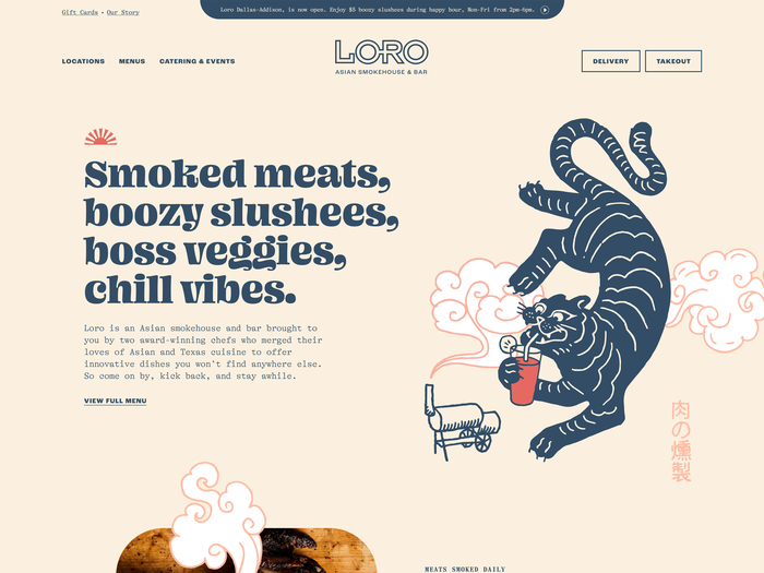
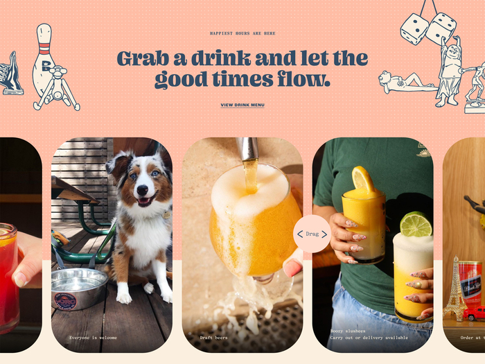
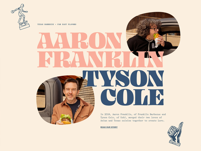
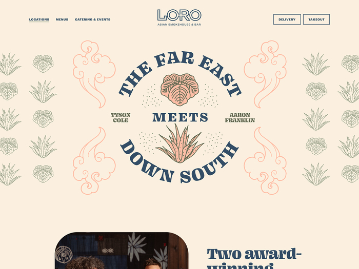
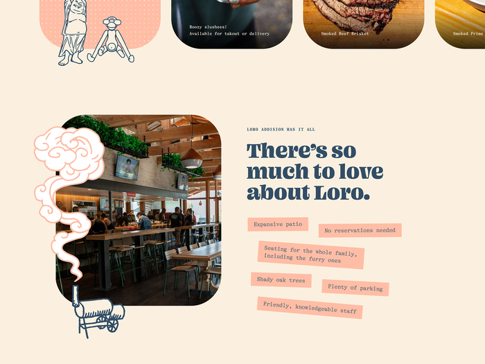
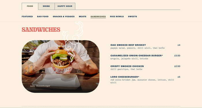
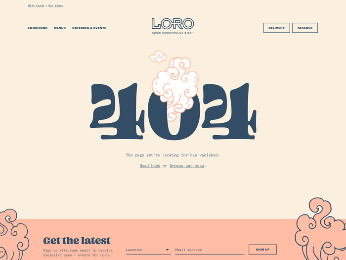
Loro is an Asian smokehouse concept by Hai Hospitality. They needed a brand facelift to better align with a newly minted brand positioning and personality. Our goal was to create a unique, quirky, and visually appetizing brand and website that would really stand on its own in the sea of Austin restaurant dining aesthetics.
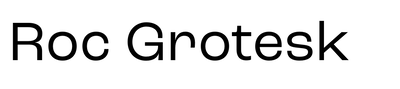
While exploring different brand expressions for a persona known as “The Effortless Entertainer”, we discovered the Ohno Blazeface and Ohno Fatface families from OH no Type Co. and immediately fell in love. Blazeface, in particular, is packed with charisma while feeling friendly and approachable. A perfect typographic representative for the voice of this witty and sometimes irrelevant brand. We paired the Ohno display and headline fonts with GT Alpina Typewriter for the body, an equally playful mono font that really completed the casual vibe we were going for. Roc Grotesk is used for UI elements.
Source: www.loroeats.com License: All Rights Reserved.
Source: www.loroeats.com License: All Rights Reserved.
Source: www.loroeats.com License: All Rights Reserved.
Source: www.loroeats.com License: All Rights Reserved.
Source: www.loroeats.com License: All Rights Reserved.
Source: www.loroeats.com License: All Rights Reserved.
This post was originally published at Fonts In Use