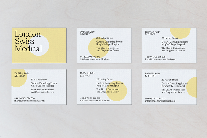
London Swiss Medical
Source: BOB Design London Swiss Medical. License: All Rights Reserved.

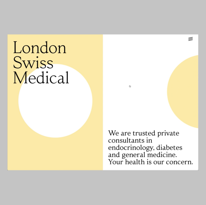
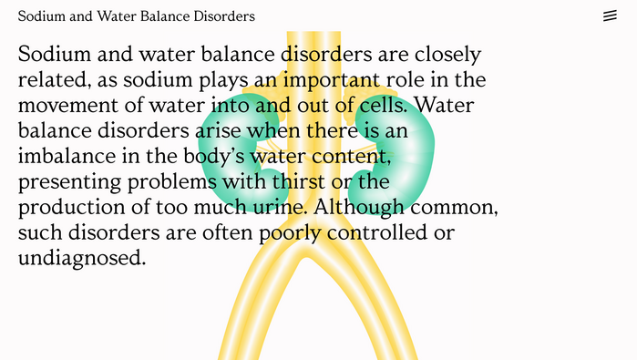
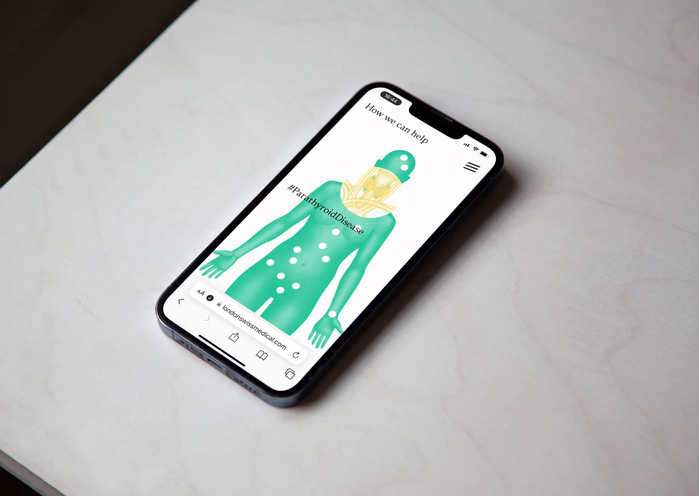
London Swiss Medical are private consultants in endocrinology, the branch of medicine that cares for hormone-related conditions.
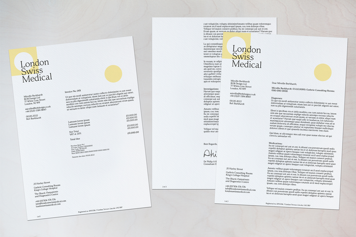
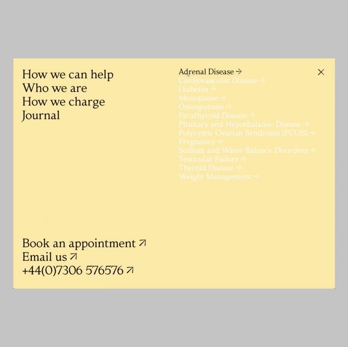
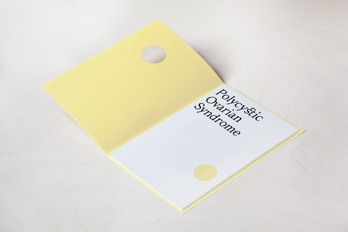
BOB created an identity and website with the concept of 'find, fit, flourish'. Hormones seek cells shaped to fit them, almost like pieces in a puzzle. They use shapes and counter shapes to illustrate this process which, in their bold, pared back geometry, also bring an echo of Swiss-ness.
The designers added a sense of London to this mix with Albis – a typeface inspired by William Morris’ Golden Type. The typeface is used across the entire identity, website and print. The llustrations from Matthew Lewis, Website built by Archive Studio, with copywriting by Emma Keyte. Printed matter was handled by Opal Print, using Modigliani Candido paper by Fenner Paper.

Source: BOB Design License: All Rights Reserved.
Source: BOB Design License: CC BY-NC-ND.
Source: BOB Design License: All Rights Reserved.
Source: BOB Design License: All Rights Reserved.
Source: BOB Design License: All Rights Reserved.
Source: www.londonswissmedical.com License: All Rights Reserved.
Source: www.instagram.com License: All Rights Reserved.
This post was originally published at Fonts In Use