London & North Eastern Railway – Tourist Travel Facilities booklet
Source: www.flickr.com Uploaded to Flickr by mikeyashworth and tagged with “ehmckemediäval”. License: All Rights Reserved.

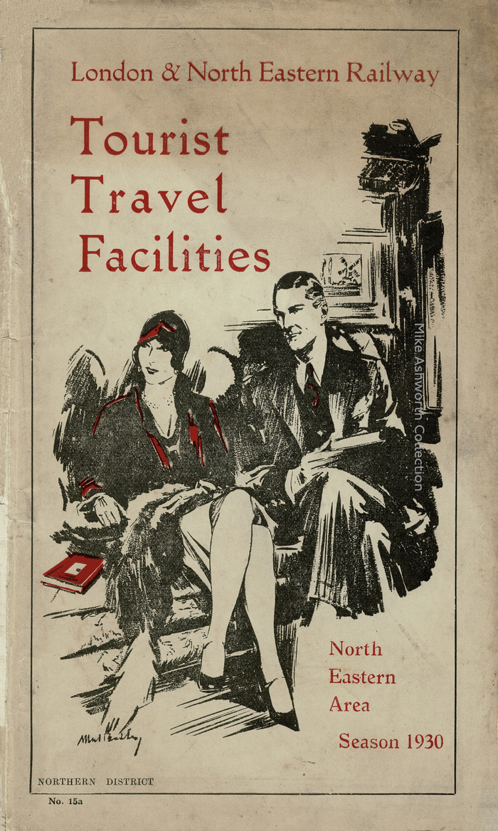
A substantial booklet that gives many details, by way of an alphabetical list, of tourist and holiday ticket availability and prices from stations in Northumberland and Co. Durham to a wide range of stations across the UK. The rather dated, for 1930, cover is somewhat at odds with the more contemporary feel of many other LNER publications and I suspect it is possible that this design was simply re-used and overprinted for area and date as required.
It shows a pair of very 1920s travellers in a railway compartment. I'm afraid that the artist's signature is indistinct.
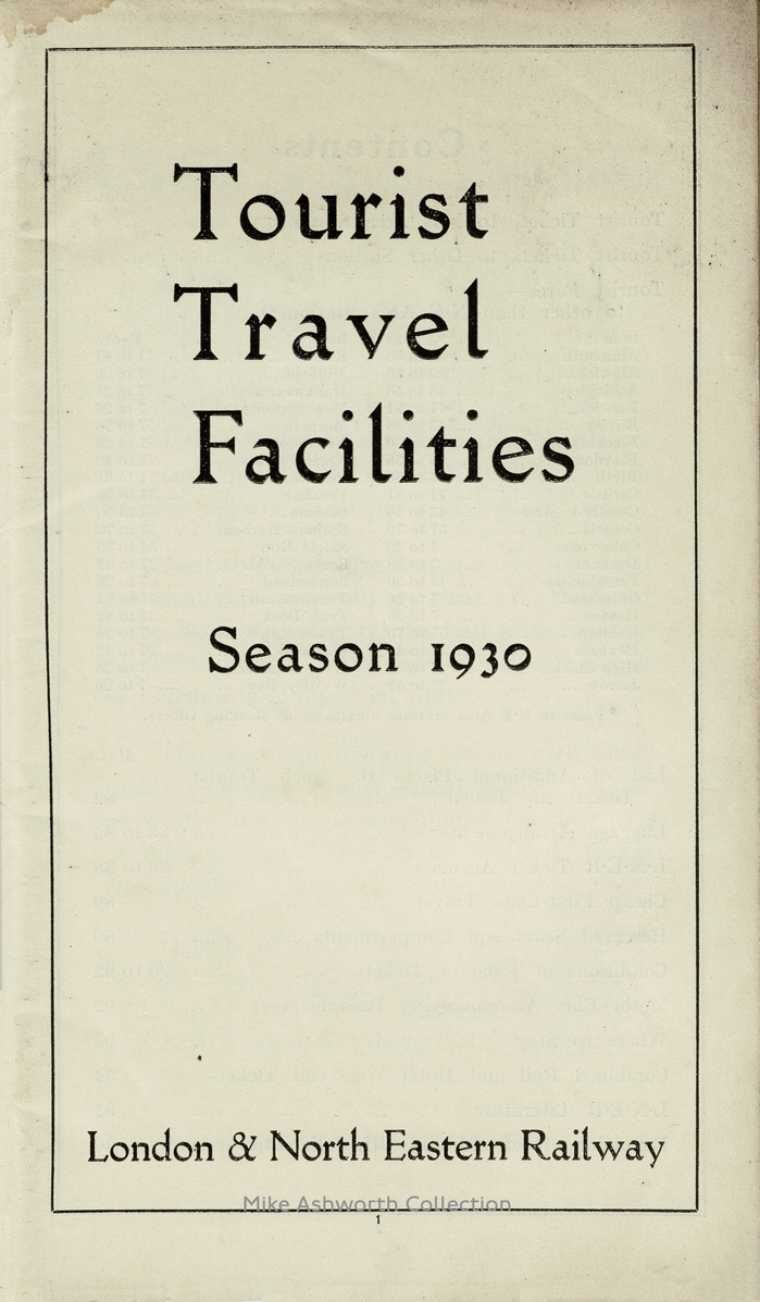
The title typeface is Ehmcke-Mediaeval, first cast by Stempel in 1922. This design inspired several loose interpretations in recent years, see Ehmcke Media (Fabian Harb, 2015), Store Norske Maleri (Arve Båtevik, 2020), and OPR Siegfried (Maximilian Inzinger, c.2022). “North Eastern Area Season 1930” is added in another oldstyle roman: it’s Italian Old Style, issued by the English Monotype around 1912.
Source: www.flickr.com Uploaded to Flickr by mikeyashworth and tagged with “ehmckemediäval”. License: All Rights Reserved.
This post was originally published at Fonts In Use