The Living Planet by David Attenborough


Source: archive.org Internet Archive. License: All Rights Reserved.
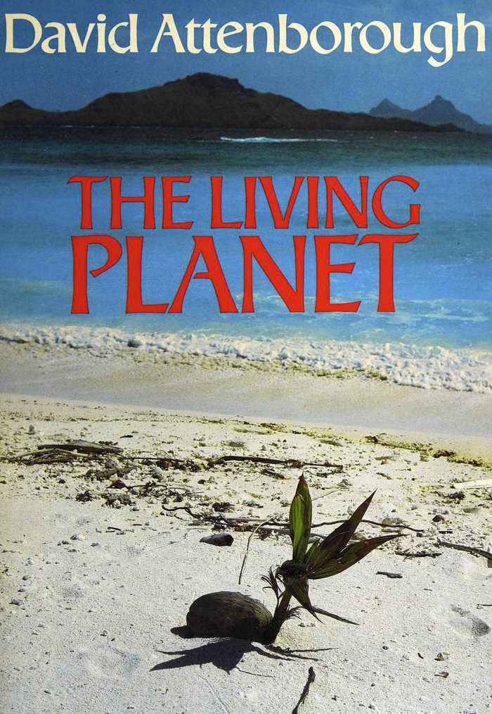
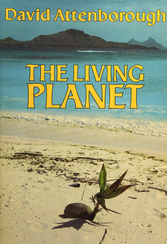
The photograph on the dust jacket is by Christian Zuber (Bruce Coleman Ltd) and shows a coconut sprouting on a tropical beach.
In 1984, when the BBC first aired the 12-part nature documentary The Living Planet, Collins together with BBC Publications also published a book of the same title. In the preface, David Attenborough explains:
The book was written at the same time as the programmes were being filmed. The one is not, therefore, the direct descendant of the other. Rather the two are cousins, both descended from the same body of research and years of travel.
For the typography, the book’s designers followed the lead of Margaret Perry’s titles and likewise used Ageratum as the titling typeface.
Source: archive.org Internet Archive. License: All Rights Reserved.
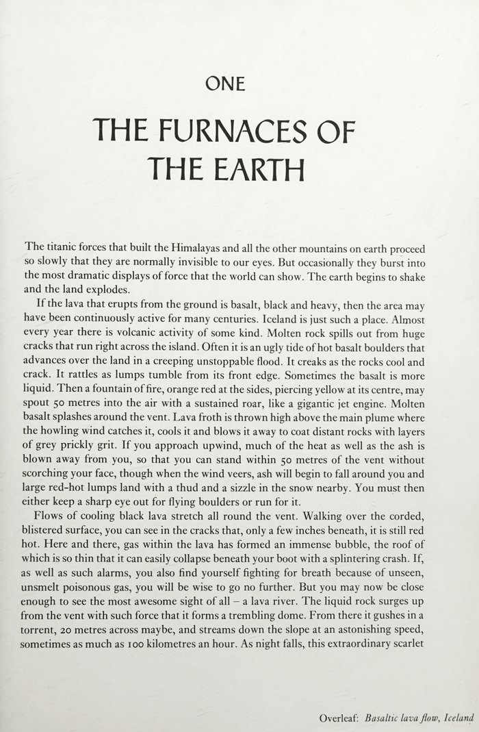
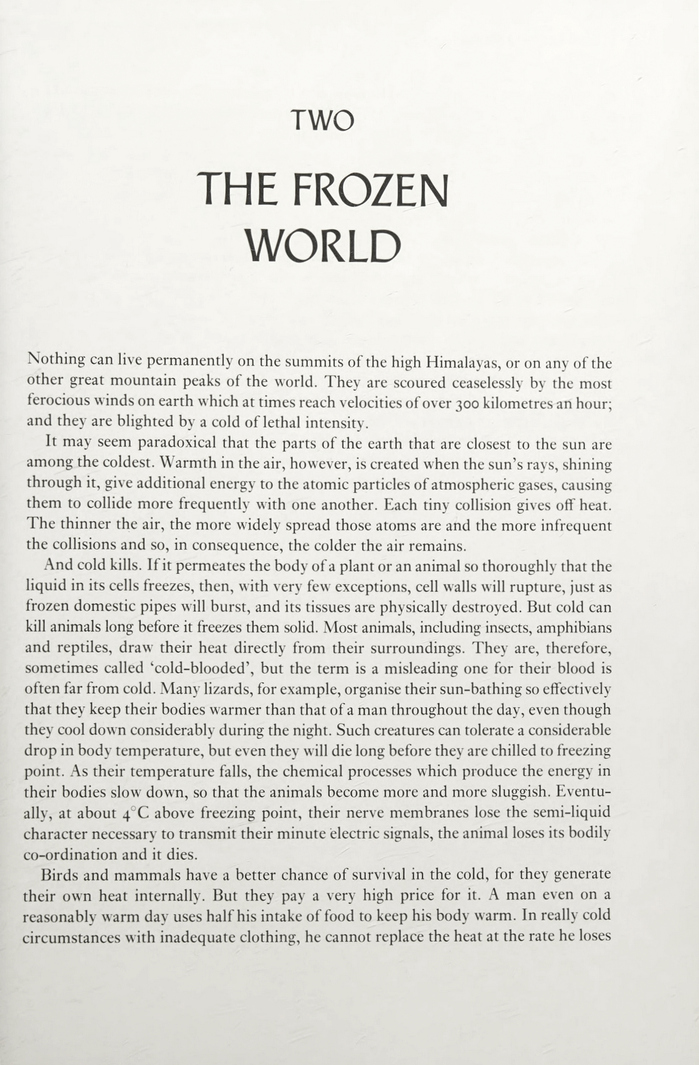
Chapter opening with the title in all-caps Ageratum
Source: archive.org Internet Archive. License: All Rights Reserved.
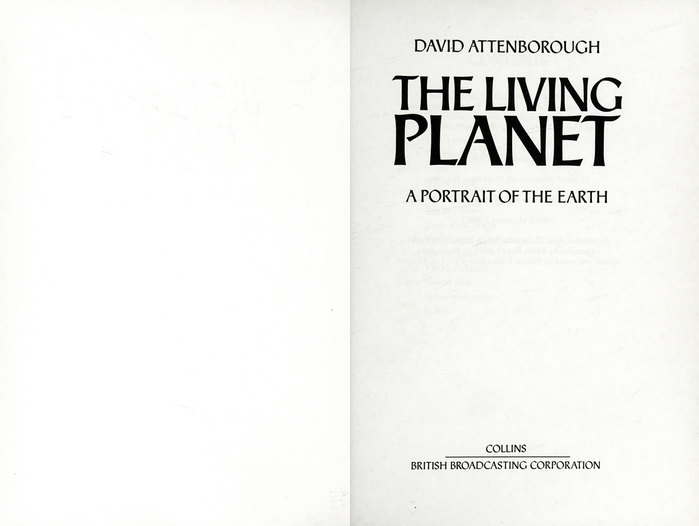
The body text was set in Monophoto Ehrhardt by Jolly & Barber Ltd, Rugby.
Source: archive.org Internet Archive. License: All Rights Reserved.
The Book Club Associates edition features the same basic design for the book jacket, but has all text in yellow, with a black contour.
This post was originally published at Fonts In Use