The Living Planet. A Portrait of the Earth titles
Source: archive.org Internet Archive. License: All Rights Reserved.

David Attenborough celebrates his 100th birthday today. The BBC pays tribute to the great natural historian and broadcaster, and the Guardian has a list of his 100 most spectacular TV moments.
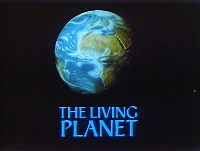
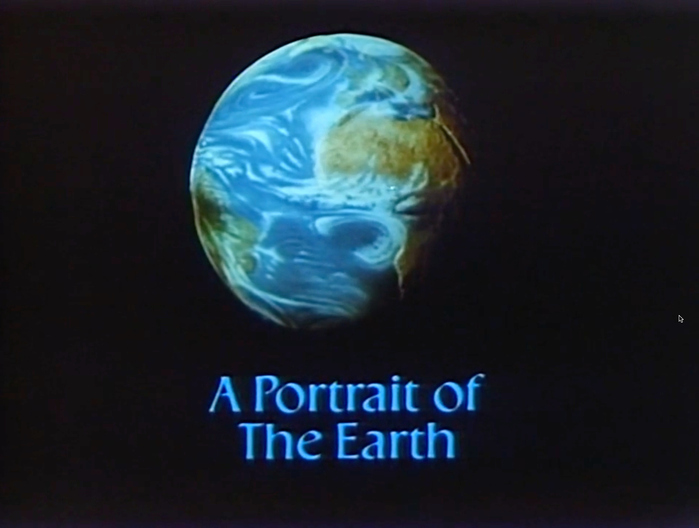
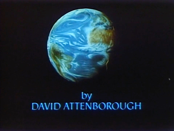
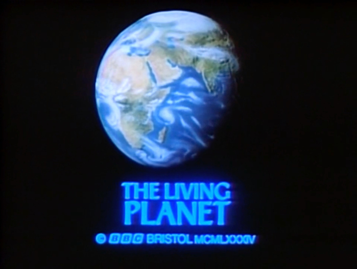
On Fonts In Use, we take a look at the titles for The Living Planet. A Portrait of the Earth. Written and presented by Attenborough, the BBC nature documentary series first aired in 1984.
From Wikipedia:
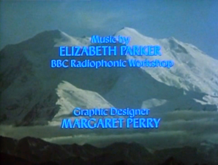
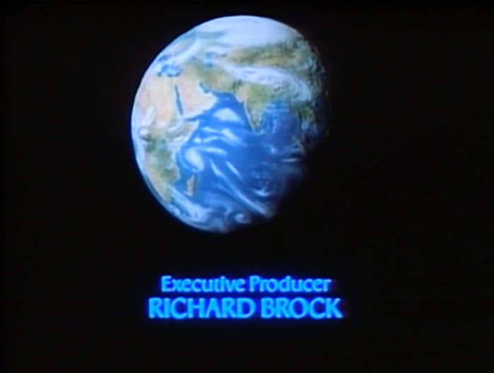
The sequel to his pioneering Life on Earth, it is a study of the ways in which living organisms, including humans, adapt to their surroundings. Each of the twelve 55-minute episodes (one fewer than his previous series) featured a different environment. The executive producer was Richard Brock and the music was composed by Elizabeth Parker of the BBC Radiophonic Workshop.
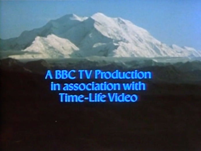
Title designer Margaret Perry worked with a typeface that hasn’t come up here before: it’s Ageratum, a serifless roman – or calligraphic sans – with distinct contrast, flared stems, and large x-height. It was issued in the 1970s for phototypesetting by Headliners. I haven’t found out the name of its designer yet. The name of the typeface is, quite fittingly, derived from the natural world: Ageratum is a genus of flowering plants in the Asteraceae family, and better known in the United States as whiteweed.
Source: archive.org Internet Archive. License: All Rights Reserved.
Source: archive.org Internet Archive. License: All Rights Reserved.
Source: archive.org Internet Archive. License: All Rights Reserved.
Source: archive.org Internet Archive. License: All Rights Reserved.
Source: archive.org Internet Archive. License: All Rights Reserved.
Source: archive.org Internet Archive. License: All Rights Reserved.
Source: archive.org Internet Archive. License: All Rights Reserved.
This post was originally published at Fonts In Use