Le Gué : culture sous guerre exhibition
Source: www.lafriche.org La Friche la Belle de Mai. License: All Rights Reserved.


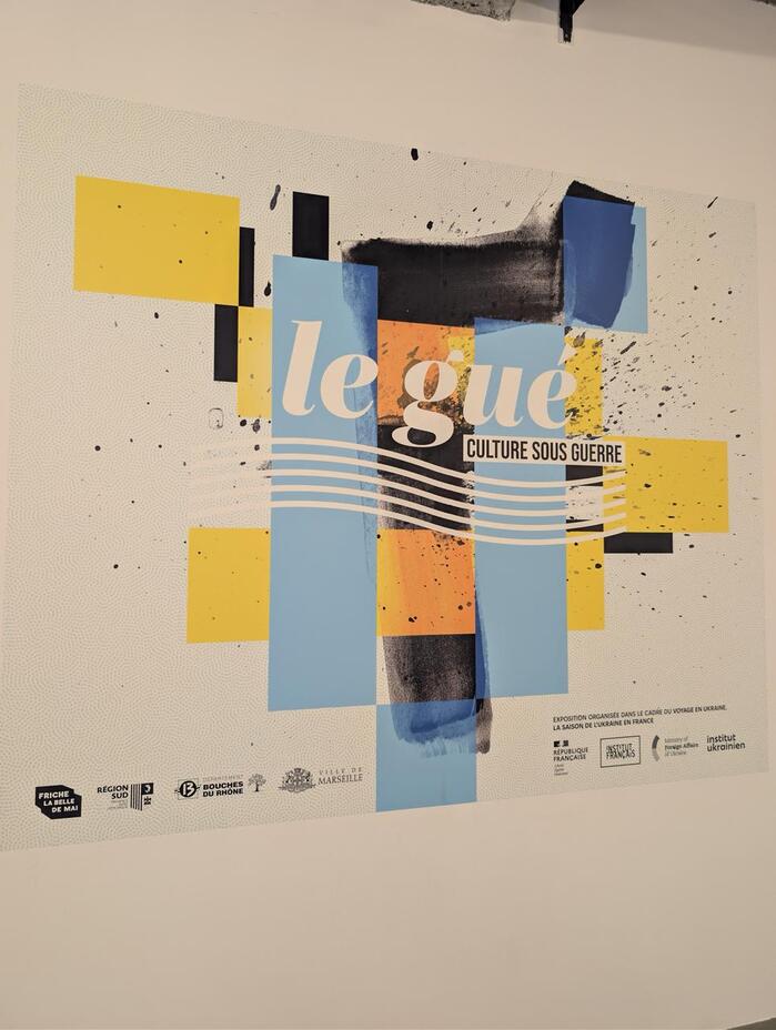
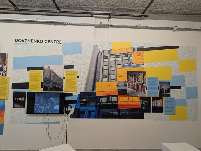
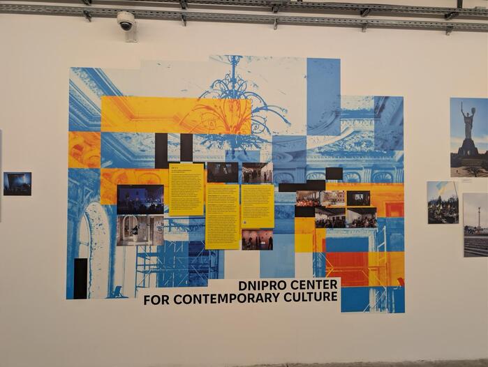
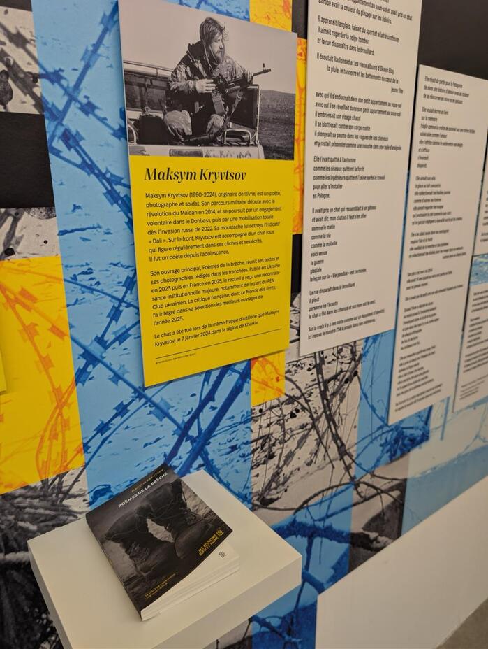
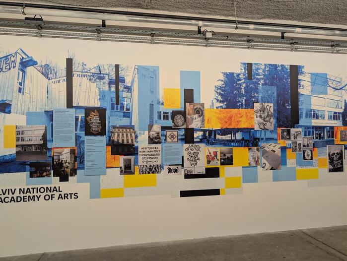
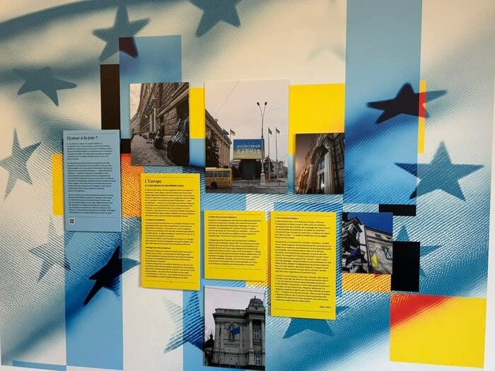
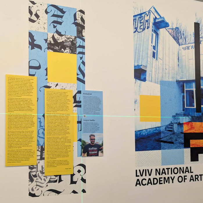
The exhibition Le Gué : culture sous guerre (“The Ghe: Culture Under War”), curated by Paul Ghiloni and hosted at La Friche la Belle de Mai in Marseille, offers a profound reflection on the role of cultural identity during times of existential threat. At the heart of this showcase is the Cyrillic letter Ґ (Ghe with upturn) – a character that was systematically suppressed during the Soviet era to homogenize the Ukrainian language with Russian. Today, this letter has transcended its linguistic function, evolving into a potent typographic emblem of resilience, sovereignty, and the distinctive “voice” of a nation under fire.
The visual identity of the exhibition, and the broader discourse on contemporary Ukrainian social design, is articulated through a sophisticated pairing of modern typefaces that balance historical weight with a forward-looking aesthetic.
Quinn Display (designed by Diana Ovezea and published by Bold Monday) is utilized for the primary titles. The choice of Quinn Display Bold Italic and Regular Italic provides a sharp, authoritative, yet humanistic presence. Its high contrast and resolute structure mirror the “sincerity and openness” that characterizes the current Ukrainian spirit. The italics, in particular, lend a sense of dynamic movement and urgency, fitting for a culture that refuses to remain static even under the pressure of war.
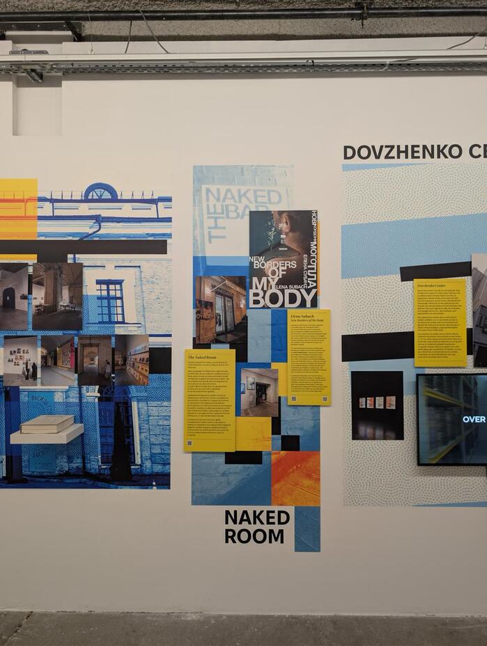
For the body text, the organizers selected Fixel Text in Medium and Regular weights. Developed by MacPaw in collaboration with the AlfaBravo foundry, Fixel is a “grotesque with a human touch.” It was specifically designed to be an adaptable, workhorse typeface for a new era of Ukrainian digital and print communication. In the context of Le Gué, Fixel’s open apertures and clean lines ensure maximum legibility while subtly reinforcing the project's connection to contemporary tech-forward Ukrainian design.
A notable typographic inclusion is Spaceland (designed by Oleh Lishchuk, Pepper Type), which is employed for narrow, high-impact headlines in Ukrainian. Spaceland’s ultra-condensed proportions are perfect for tight layouts where space is a premium, yet its architectural stability echoes the literal and metaphorical “reconstruction” of the Ukrainian identity.
This typographic hierarchy – from the expressive serifs of Quinn to the functional clarity of Fixel and the structural rigor of Spaceland – serves as more than just a stylistic choice. It is a visual manifestation of what Evgen Sadko describes as the “new Ukrainian typography”: a tool for decolonization and a medium through which a society communicates its defiance and its hope to the world.
Source: www.lafriche.org La Friche la Belle de Mai. License: All Rights Reserved.
Source: www.lafriche.org La Friche la Belle de Mai. License: All Rights Reserved.
Source: www.lafriche.org La Friche la Belle de Mai. License: All Rights Reserved.
Source: www.lafriche.org La Friche la Belle de Mai. License: All Rights Reserved.
La Friche la Belle de Mai. License: All Rights Reserved.
La Friche la Belle de Mai. License: All Rights Reserved.
Source: www.facebook.com La Friche la Belle de Mai. License: All Rights Reserved.
This post was originally published at Fonts In Use