Le Braquet

Source: www.nouvelleidee.work License: All Rights Reserved.


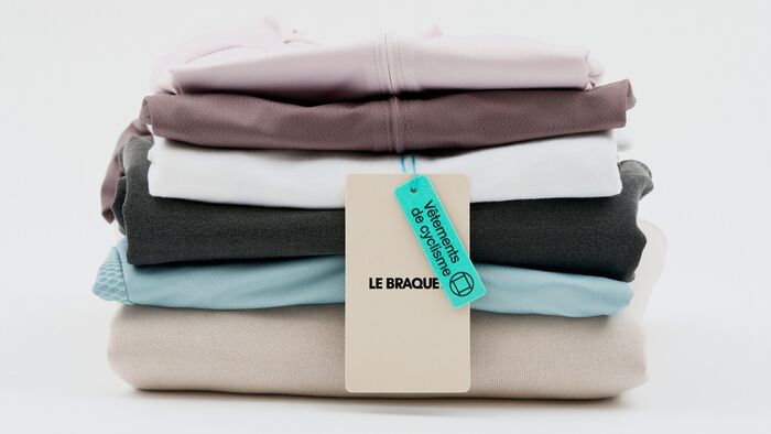
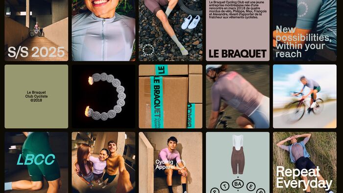
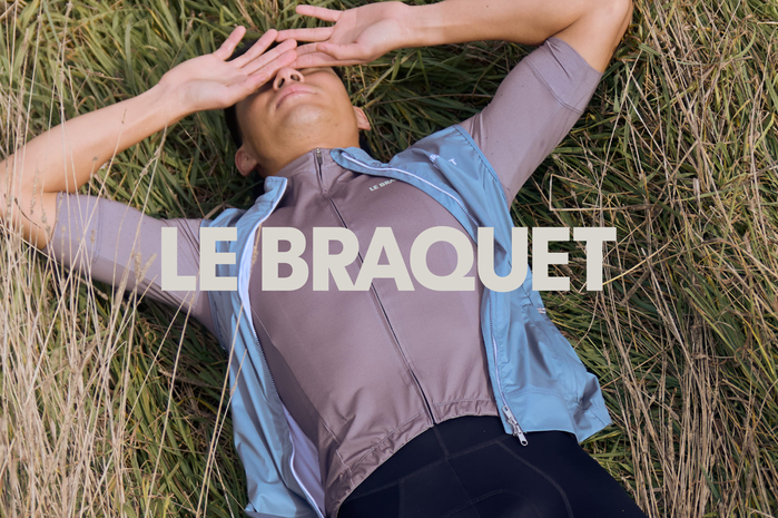
Nouvelle idée has crafted a striking new brand identity and website for Le Braquet, a specialist in technical cycling clothing. This visual transformation is designed to support Le Braquet’s international growth and assert its role as a benchmark for high-performance cycling apparel.
Typography plays a pivotal role in the new identity and the pairing of Store Norske Geita and Karrik creates a distinctive visual language. Karrik brings naive charm and personality, though its quirky, irregular letterforms make it best suited for expressive accents rather than extended text. To balance Karrik’s playful spirit, Store Norske Geita steps in as the workhorse—reliable, structured, and trustworthy, yet still carrying an approachable, charming character. Together, these typefaces reflect the duality at the heart of Le Braquet: technical expertise paired with bold, inviting design.

Source: www.nouvelleidee.work License: All Rights Reserved.

Source: www.nouvelleidee.work License: All Rights Reserved.

Source: www.nouvelleidee.work License: All Rights Reserved.

Source: www.nouvelleidee.work License: All Rights Reserved.

Source: www.nouvelleidee.work License: All Rights Reserved.

Source: www.nouvelleidee.work License: All Rights Reserved.

Source: www.nouvelleidee.work License: All Rights Reserved.

Source: www.nouvelleidee.work License: All Rights Reserved.

Source: www.nouvelleidee.work License: All Rights Reserved.

Source: www.nouvelleidee.work License: All Rights Reserved.

Source: www.nouvelleidee.work License: All Rights Reserved.

Source: www.nouvelleidee.work License: All Rights Reserved.

Source: www.nouvelleidee.work License: All Rights Reserved.

Source: www.nouvelleidee.work License: All Rights Reserved.

Source: www.nouvelleidee.work License: All Rights Reserved.
This post was originally published at Fonts In Use