The Last of Us video game series

License: All Rights Reserved.


From Wikipedia:
The Last of Us is an action-adventure video game series and media franchise created by Naughty Dog and published by Sony Interactive Entertainment. The series is set in a post-apocalyptic United States ravaged by cannibalistic humans infected by a mutated fungus in the genus Cordyceps.
Considering how most survival games during its era take a grungy approach to their UI (for example, Left 4 Dead 2), this series user interface sticks out like a sore thumb.
The official logo title is set in Press Gothic. The same is used for the TV show's logo.
FF DIN is used for a majority of the games user interface. Based on what I've extracted from Part 1, the Normal and Medium variant is used.
Neue Helvetica Bold is used in massive text and only during chapter transition sequences. What looks like Helvetica Condensed is used for the credits sequence in both Part 2 and Part 1, while the original just used Neue Helvetica.
Source: en.wikipedia.org License: All Rights Reserved.
Series’ logo
Source: www.gameuidatabase.com License: All Rights Reserved.
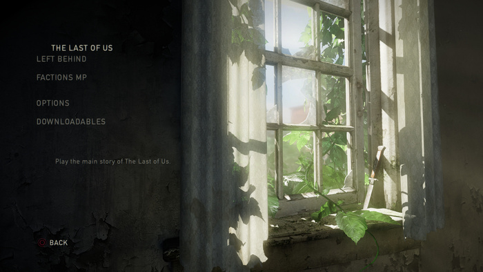
The Last of Us (2013), menu screen
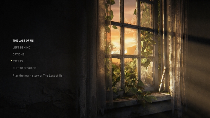
Photo: Alex Nguyen. License: All Rights Reserved.
The Last of Us: Part I (2022), menu screen

License: All Rights Reserved.
The Last of Us: Part II (2020), menu screen
License: All Rights Reserved.
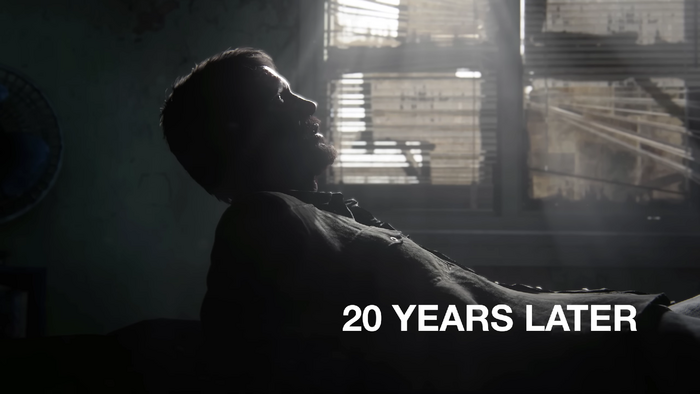
The Last of Us: Part I (2022), beginning of chapter 1.
Neue Helvetica Bold is used for big titles.
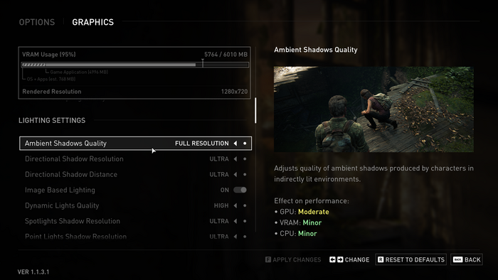
Photo: Alex Nguyen. License: All Rights Reserved.
The Last of Us: Part I (2022), options screen
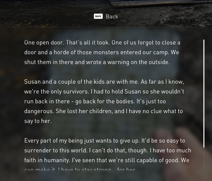
Photo: Alex Nguyen. License: All Rights Reserved.
The Last of Us: Part I (2022), reading a note
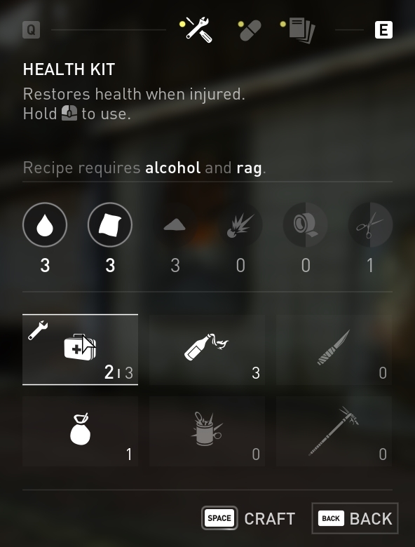
Photo: Alex Nguyen. License: All Rights Reserved.
The Last of Us: Part I (2022), crafting sequence
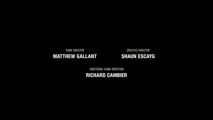
Photo: Alex Nguyen. License: All Rights Reserved.
The Last of Us: Part I (2022), credits sequence
This post was originally published at Fonts In Use