LABC Sandwich & Coffee
IGO STUDIO. License: All Rights Reserved.


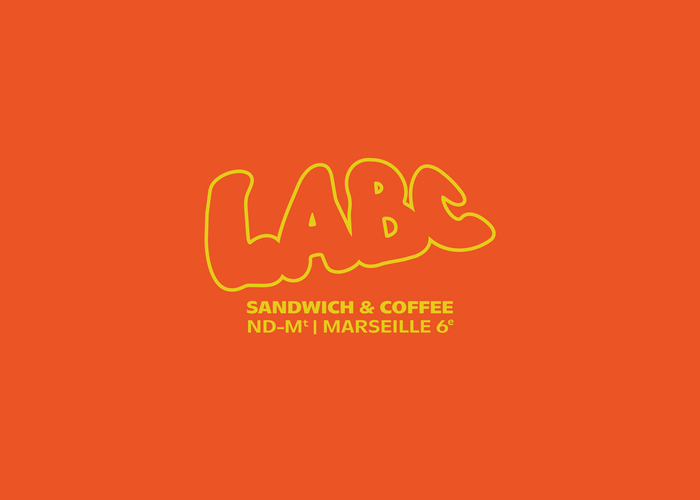
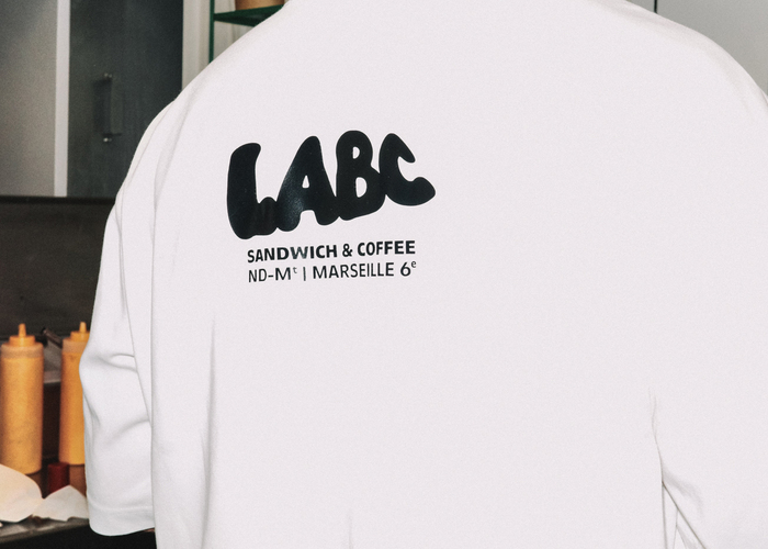
Located in Marseille’s vibrant and hybrid Notre-Dame-du-Mont neighborhood, LABC has just unveiled its new visual identity. Occupying the premises of a former local vinyl store, the venue has been a staple of the neighborhood's food scene since 2023. To reflect the constant mutation of this urban hub, designers Benjamin Puddu and Steven Mazzola crafted a rebranding that bridges local heritage and hard-hitting design.
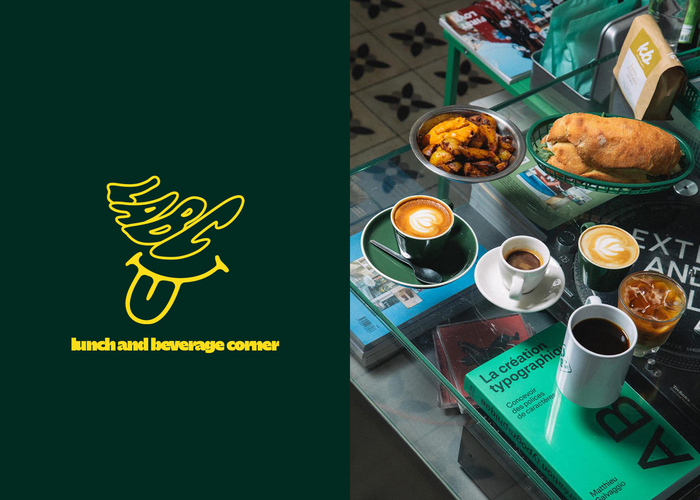
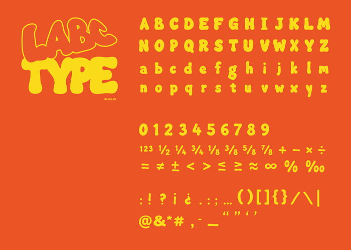
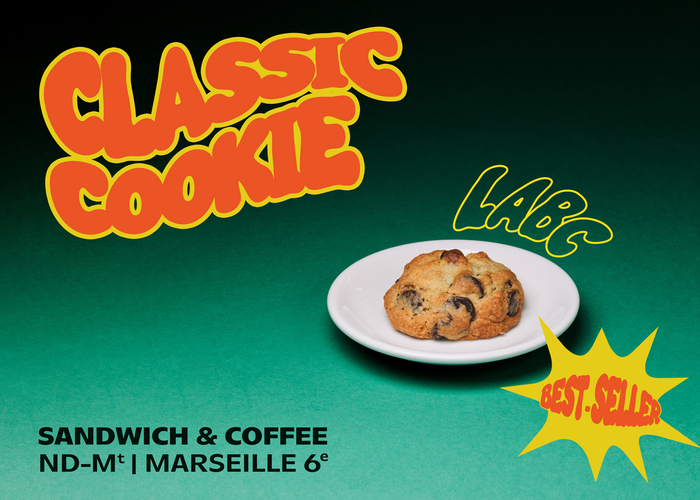
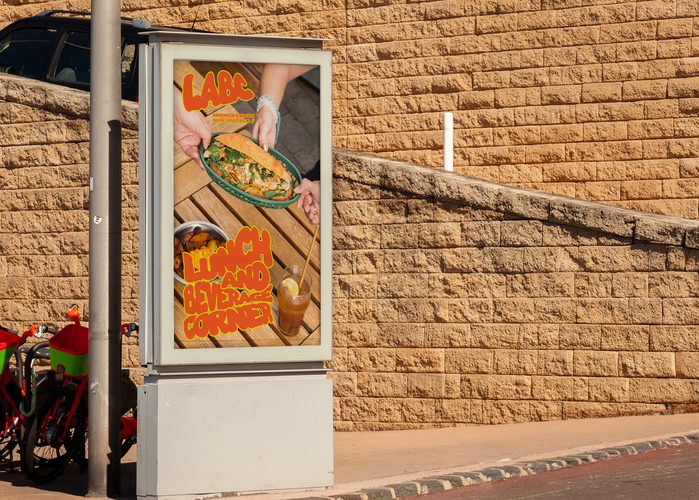
At the heart of this new visual era is LABC, a custom display typeface by Benjamin Puddu and Steven Mazzola. Used for the main logo and the brand's various graphic assets, it breaks away from the usual corporate aesthetics of the food industry. The typeface features a heavy, fluid, and high-contrast look that directly echoes the thick strokes of street art markers and the organic layering of a sandwich.
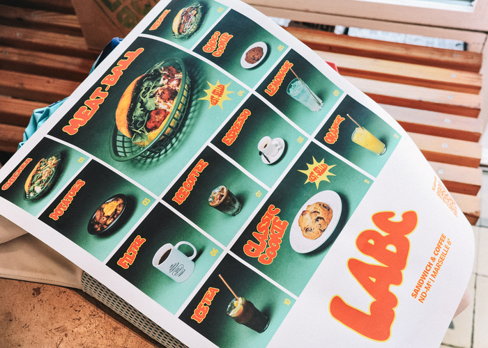
To balance the intensity of this custom typography, the designers selected Homie from Blaze Type foundry. Used for secondary text blocks, subtitles, and informational content, Homie brings a geometric contrast to the identity that is both structured and warm. Its generous, clean curves perfectly counterbalance the raw, liquid elasticity of the main logotype.
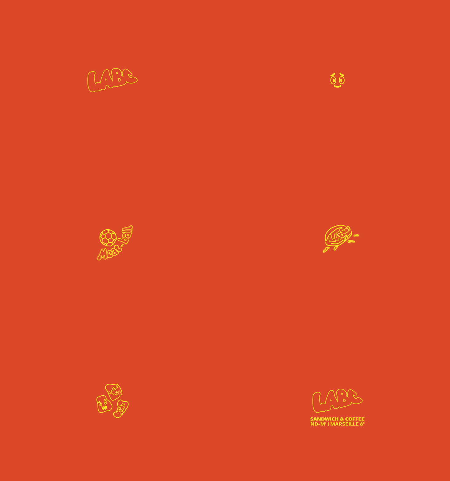
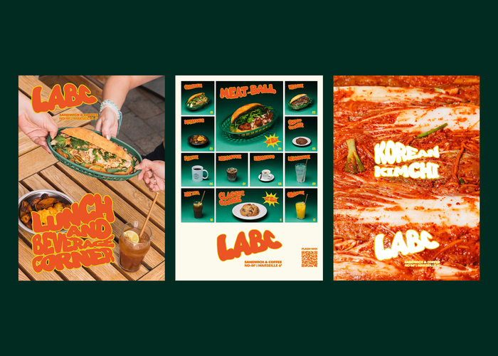
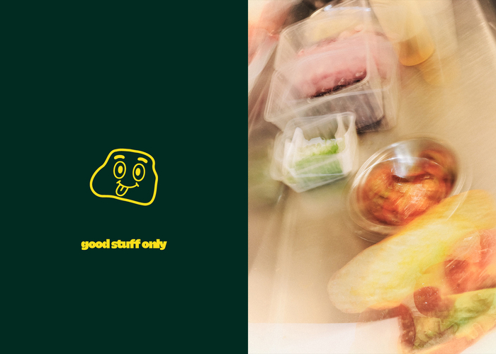
The typography unfolds dynamically across a vibrant palette of three bold, sun-drenched colors: a mix of orange, yellow, and green. The letters adapt to different formats, stretching, twisting, and interacting with local emblems or food mascots illustrated in a naive drawing style.
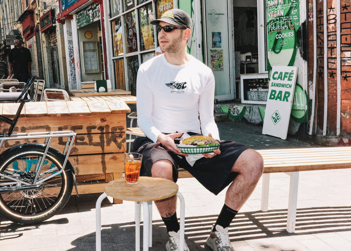
This visual reinvention fully comes to life through a lifestyle and product photo campaign captured by Igo Studio. This photoshoot anchors Benjamin Puddu's graphic design in the raw, sunlit, and textured reality of Marseille's streets.
IGO STUDIO. License: All Rights Reserved.
IGO STUDIO. License: All Rights Reserved.
IGO STUDIO. License: All Rights Reserved.
IGO STUDIO. License: All Rights Reserved.
IGO STUDIO. License: All Rights Reserved.
IGO STUDIO. License: All Rights Reserved.
IGO STUDIO. License: All Rights Reserved.
IGO STUDIO. License: All Rights Reserved.
IGO STUDIO. License: All Rights Reserved.
IGO STUDIO. License: All Rights Reserved.
This post was originally published at Fonts In Use