La Ciudad by Scientific American (Alianza Editorial, 1969)

Source: www.abebooks.com Papel y Letras. License: All Rights Reserved.


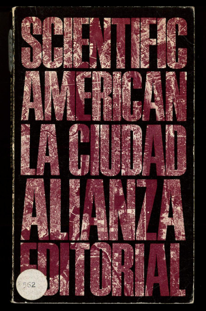
La Ciudad (“The City”) is the Spanish edition of a book by the editors of Scientific American, translated from the English by Guillermo Gayá Nicolau. The shown paperback was published by Alianza Editorial in 1969 in their series “El Libro de Bolsillo. Sección Ciencia y Técnica”.
Cover designer Daniel Gil chose a typeface that was among the ones offering the tightest packing at the time: Permanent Headline (1964) by Karlgeorg Hoefer. Especially in all caps, it’s similar to Walter Haettenschweiler’s Schmalfette Grotesk (1954) and Matthew Carter’s Helvetica Extra Compressed (1966), but can be distinguished by a number of details. For example, counters in O or R are even narrower, the waist of R and the middle in E sit lower, and the diagonal of N is heavier.
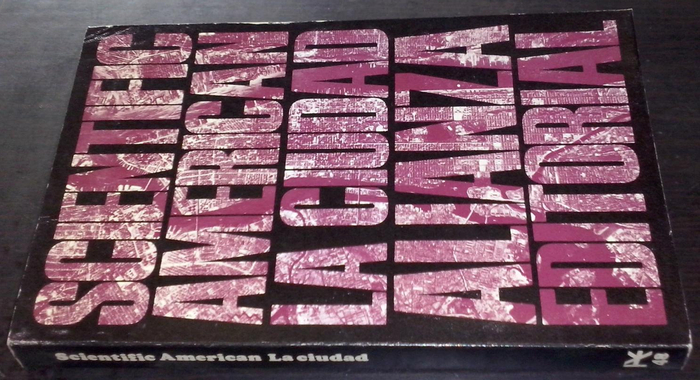
With the text arranged in five tightly spaced lines, stacked and justified, Gil could fill the letterforms with an aerial view of a city – without losing too much of the image information.

Source: www.abebooks.com Librería La Candela. License: All Rights Reserved.
The spine lettering is in Cooper Black.
This post was originally published at Fonts In Use