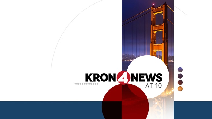
KRON 4 TV – Circa rebrand

Source: jonberrydesign.com License: All Rights Reserved.


In October 2024, KRON-TV introduced its Circa rebrand, a visual update designed by jonberrydesign to reflect the Bay Area’s identity with a clean, modern visual system. The new look uses circular forms and a color palette drawn from the local environment, creating a system that feels contemporary while still nodding to KRON’s past.
The primary typeface, Inter, was chosen for its clarity, flexibility, and legibility across screen sizes and weights – well suited to the rebrand’s minimal, geometric approach. Roboto Condensed appears in the news ticker to clearly separate it from the other on-screen graphics. Meanwhile, Corporate S remains in the station’s logo, maintaining a visual link to KRON’s legacy.
Together, the type choices support a visual identity that’s modern, approachable, and locally grounded. More images and video compilation reel available here: KRON Circa broadcast design.

Source: jonberrydesign.com License: All Rights Reserved.

Source: jonberrydesign.com License: All Rights Reserved.

Source: jonberrydesign.com License: All Rights Reserved.

Source: jonberrydesign.com License: All Rights Reserved.

Source: jonberrydesign.com License: All Rights Reserved.

Source: jonberrydesign.com License: All Rights Reserved.
This post was originally published at Fonts In Use