Krakage Karaoke
Source: www.ogaf.studio Ogaf Studio. License: All Rights Reserved.




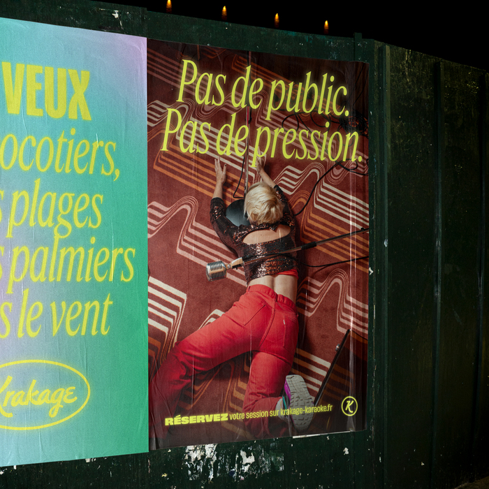
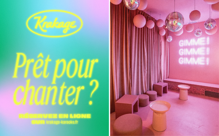
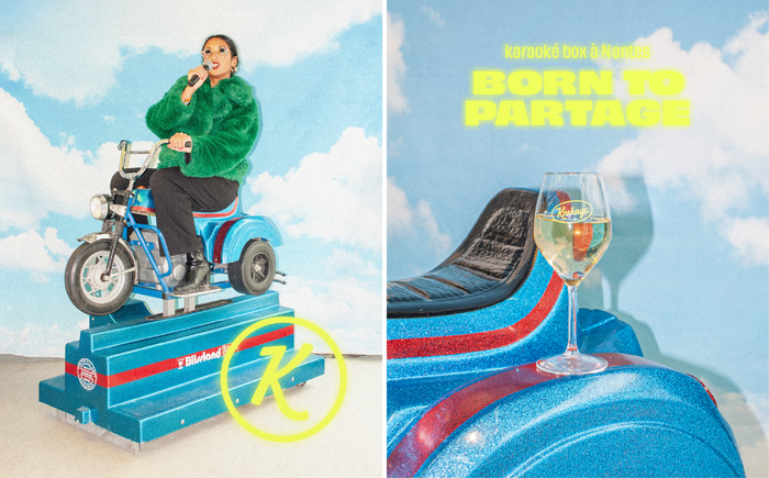
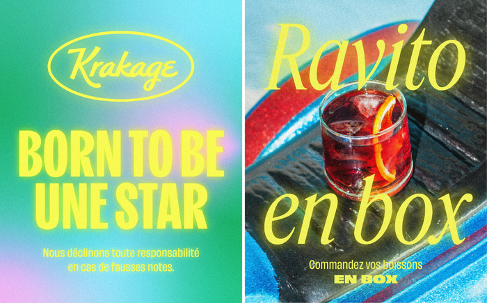
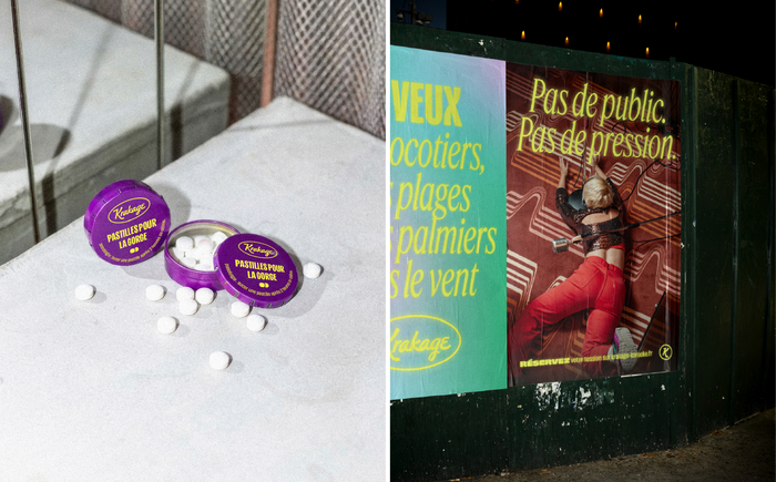
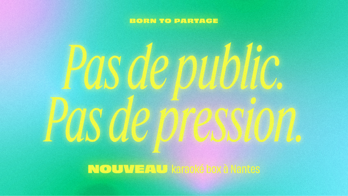
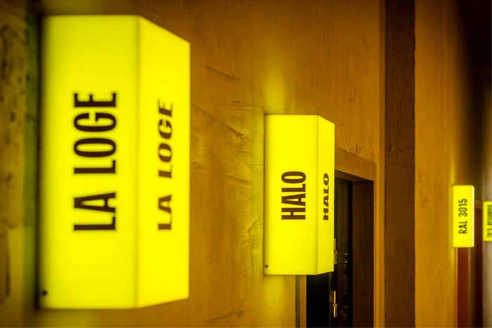
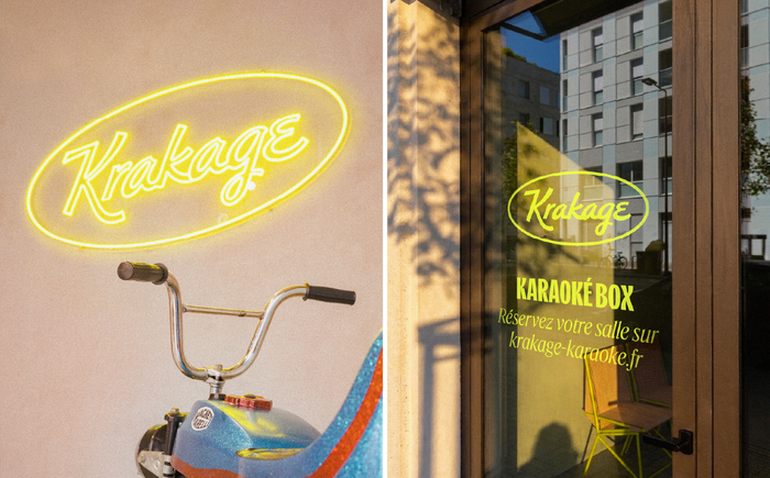
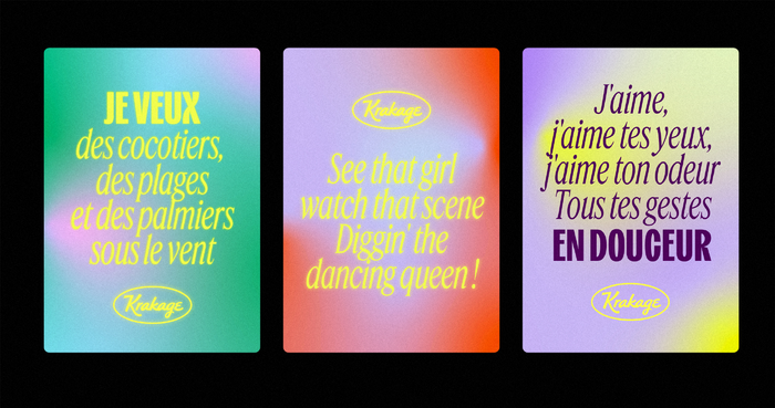
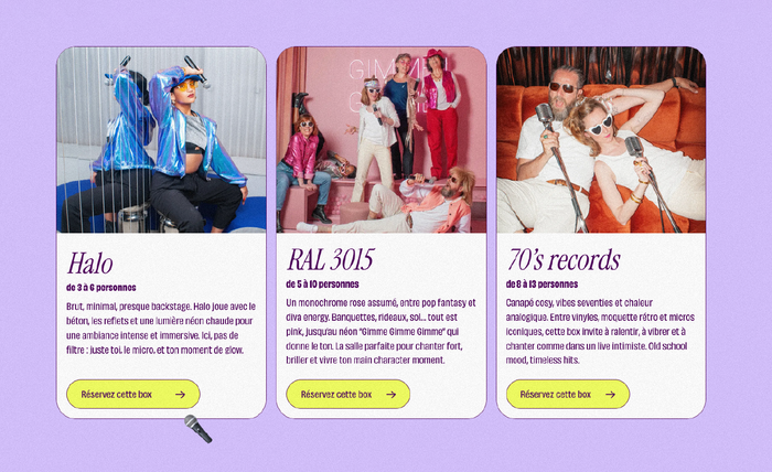
Krakage is karaoke with a ‘glow-up’ twist. For this project, our art direction reimagines the conventions of karaoke with a neo-retro brand identity featuring contemporary kitsch, embodying a spirit of glitz and total letting go. Extending from the décor to social media, this pop universe draws on the power of Obviously by OH no Type Co. to establish its visual identity with modern, striking confidence.
The graphic rhythm is dictated by a bold, contrasting typographic duo. Structural and ultra-condensed, Kensington by Jen Hood (Hoodzpah Design) delivers maximum visual impact, inspired by concert posters. Finally, the elegant fluidity of Feature Display designed by Berton Hasebe counterbalances this raw power by injecting the essential dose of sophistication, brilliance and tongue-in-cheek humour that the experience requires. On the website, Feature is substituted by Rodrigo Fuenzalida’s Instrument Serif.
Source: www.ogaf.studio Ogaf Studio. License: All Rights Reserved.
Source: www.ogaf.studio Ogaf Studio. License: All Rights Reserved.
Source: www.ogaf.studio Ogaf Studio. License: All Rights Reserved.
Source: www.ogaf.studio Ogaf Studio. License: All Rights Reserved.
Source: www.ogaf.studio Ogaf Studio. License: All Rights Reserved.
Source: www.ogaf.studio Ogaf Studio. License: All Rights Reserved.
Source: www.ogaf.studio Ogaf Studio. License: All Rights Reserved.
Source: www.ogaf.studio Ogaf Studio. License: All Rights Reserved.
Source: www.ogaf.studio Ogaf Studio. License: All Rights Reserved.
This post was originally published at Fonts In Use