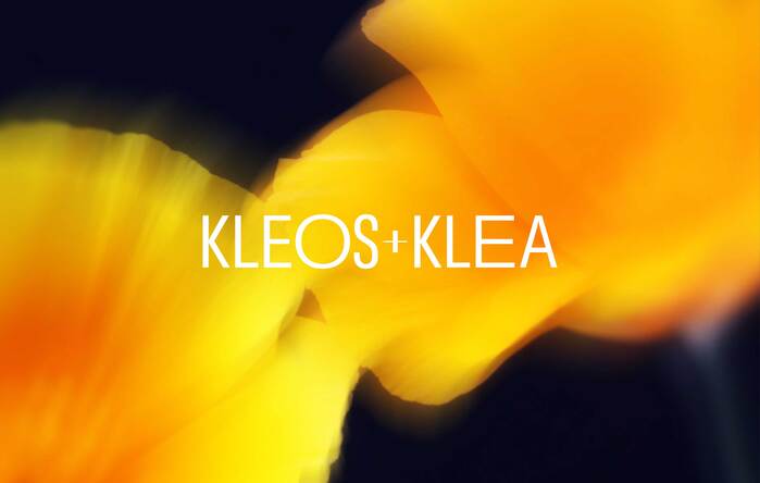
KLEOS+KLEA
Source: voodoovoodoo.net License: All Rights Reserved.


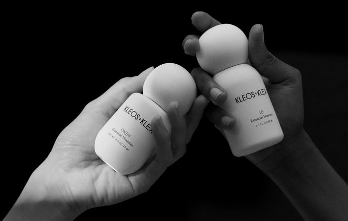
Voodoo Voodoo created a 360° visual identity for the new skincare brand KLEOS+KLEA, including brand and product naming, as well as a distinctive packaging system, product design, and art direction.
Working alongside founder Tammy Demos, we identified a unique creative opportunity for KLEOS+KLEA, reflecting Tammy’s commitment to natural ingredients and transparency.
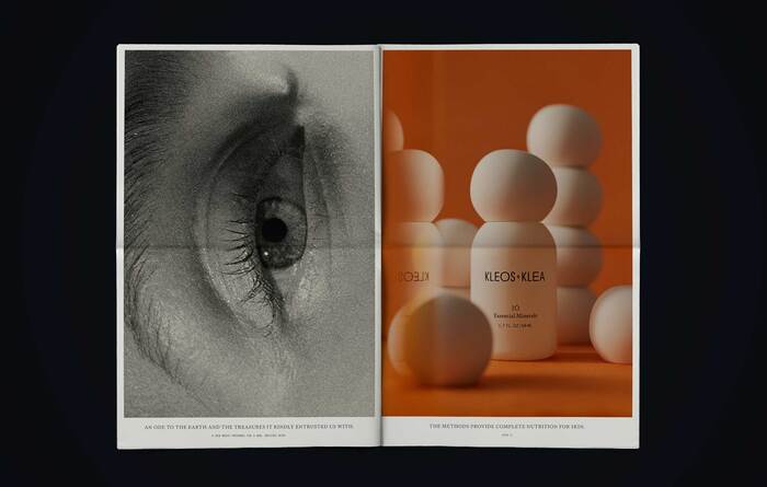
As environmental consciousness becomes central to modern luxury, KLEOS+KLEA pioneers a new approach to skincare, integrating natural ingredients into meticulously curated formulas.
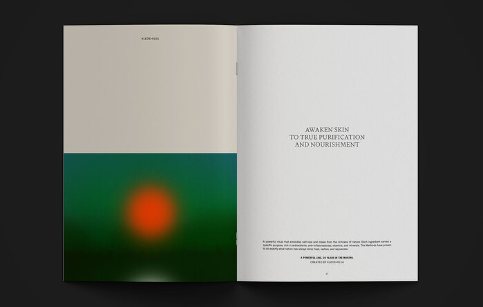
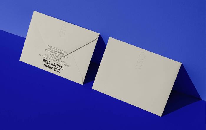
For the brand, we established a design language inspired by nature’s vibrancy, fluidity, and precision, enriched with storytelling elements.
We chose Signifier and GT America to bring the visual identity to life.
Signifier, designed by Kris Sowersby of Klim Type Foundry, is inspired by classic serif forms but introduces a modern edge with its precisely sculpted letterforms. It is both elegant and highly legible, making it ideal for storytelling and long-form copy, while its lighter weights add sophistication to large titles.
GT America, designed by Noël Leu and published by Grilli Type, offers remarkable versatility with its range of widths, creating a sense of rhythm that emphasises growth and movement—perfectly reflecting the gradual transitions of the seasons, which underpin the essence of KLEOS+KLEA’s natural products. Its bold style is ideal for strong, attention-grabbing statements.
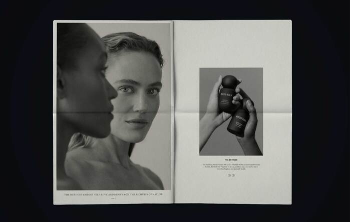
Together, these typefaces complement each other not only through their contrasting weights but also by reinforcing the key dichotomies at the heart of the brand: poetry vs science, masculine vs feminine, day vs night.
See the full case study at voodoovoodoo.net.
Source: voodoovoodoo.net Lina Zanders. License: All Rights Reserved.
Source: voodoovoodoo.net License: All Rights Reserved.
Source: voodoovoodoo.net License: All Rights Reserved.
Source: voodoovoodoo.net License: All Rights Reserved.
Source: voodoovoodoo.net License: All Rights Reserved.
Source: voodoovoodoo.net License: All Rights Reserved.
Source: voodoovoodoo.net License: All Rights Reserved.
Our logo strikes a balance between boldness and delicacy, with condensed and expanded characters suggesting growth and movement. Our creative direction captures this duality, blending nature’s vibrant energy with a sense of focused purity.
Source: voodoovoodoo.net Lina Zanders (right). License: All Rights Reserved.
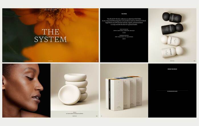
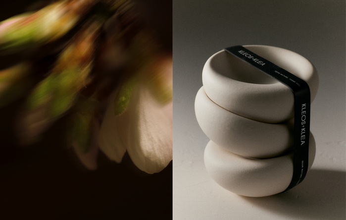
These potent formulas are activated with the Thallo bowl, also designed by Voodoo Voodoo studio. This custom ceramic piece features a gently textured surface and refined silhouette. Designed to fit in the palm of the hand, it guides the fingers and enhances the sensory experience. Each bowl is slightly unique, reflecting a handmade process.
This post was originally published at Fonts In Use