Kimbara
Source: www.blockbranding.com License: All Rights Reserved.


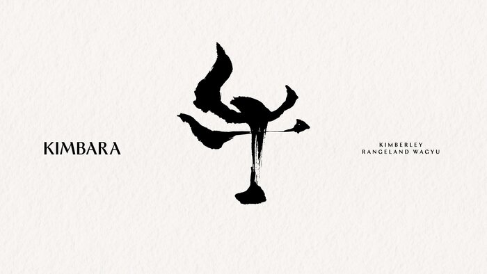
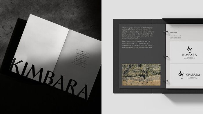
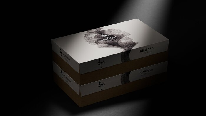
Branding for Kimbara premium waygu, Japanese-style beef from Kimberly, Australia. The design is minimalist, mostly black and white, and relies on typography and calligraphy to make it distinctive. Two display typefaces are combined: Ergon for the main wordmark and Chap for titles and headlines.
From the words of Block, the branding studio behind the project:
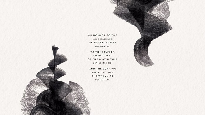
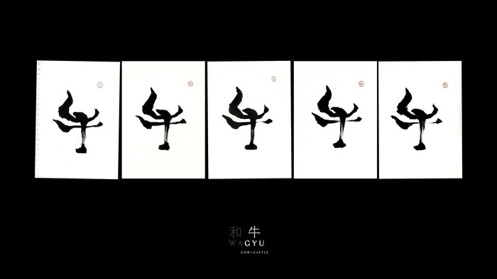
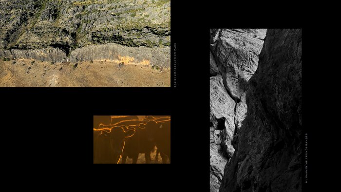
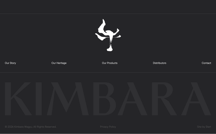
The brand is built from contrast. Japanese bloodlines, raised in the wilds of the Kimberley. Refined craft, grounded in rugged country. Kimbara’s identity draws directly from this terrain – a mineral-rich palette inspired by the region’s iconic black rock formations. At its heart is the Wagyu itself, introduced through a bespoke logomark based on the Japanese character for ‘GYU’ (cow).
To bring this to life, master Japanese calligrapher Maki Shimano was commissioned. Her brushstrokes – elegant, angular and expressive – gave the mark both cultural resonance and visual power. Paired with a bold, modern wordmark, the final identity is a collision of heritage and place. It speaks fluent Wagyu, but with an unmistakable Australian accent.
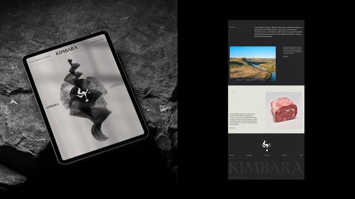
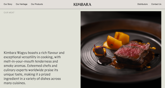
The website was built by Start and additionally uses TT Commons for small text.
Source: www.blockbranding.com License: All Rights Reserved.
Source: www.blockbranding.com License: All Rights Reserved.
Source: www.blockbranding.com License: All Rights Reserved.
Source: www.blockbranding.com License: All Rights Reserved.
Source: www.blockbranding.com License: All Rights Reserved.
Source: www.blockbranding.com License: All Rights Reserved.
Source: kimbarawagyu.com License: All Rights Reserved.
Source: kimbarawagyu.com License: All Rights Reserved.
This post was originally published at Fonts In Use