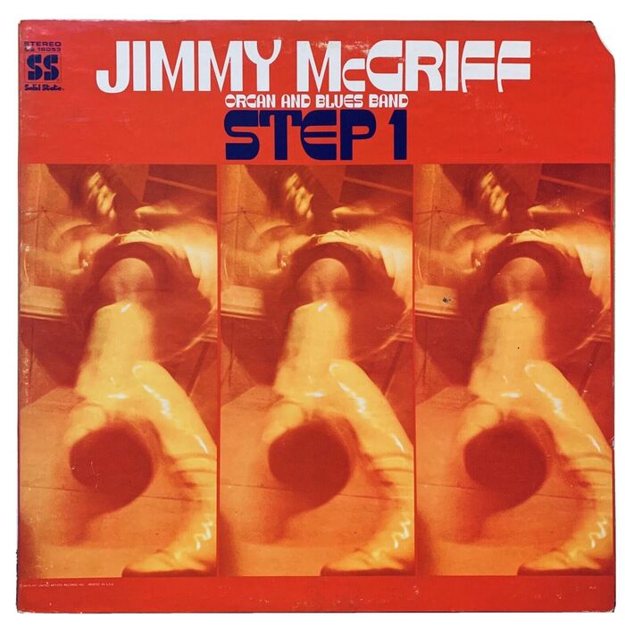
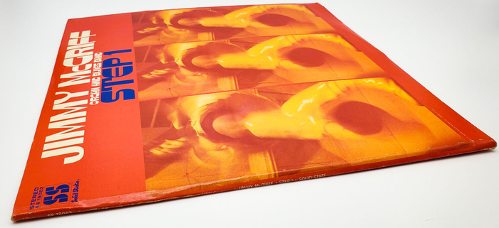
Jimmy McGriff Organ and Blues Band – Step 1 album art
Source: www.ebay.com benny_5326. License: All Rights Reserved.


1969 release by jazz organist Jimmy McGriff (1936–2008) and his band on Solid State, a subsidiary of United Artists Records
The display typeface with the unusual contrast – sometimes horizontal, sometimes vertical, but always high – is Oring Title. To quote from a previous post:
This phototypeface is an adaptation of an unnamed alphabet (caps plus numerals) shown by Paul Carlyle and Guy Oring in their Letters and Lettering from 1938. I don’t know who turned the piece of lettering into a typeface, and how it was originally named. It was used already in 1969. In 1999, Dan X. Solo showed it in his book Moderne Alphabets under the name Oring Title.
Source: www.ebay.com hk-resale (edited). License: All Rights Reserved.
Source: www.ebay.com hk-resale (edited). License: All Rights Reserved.
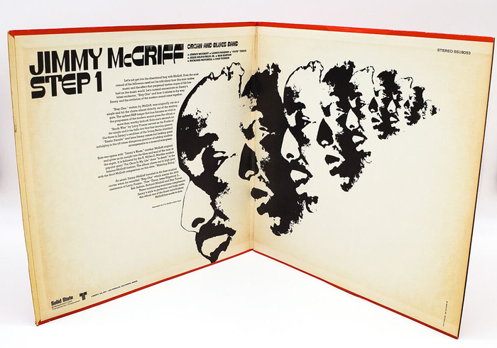
Liner notes on the gatefold are set in what looks like Memphis, wrapped around a repeating halftone portrait.

Source: www.ebay.com hk-resale. License: All Rights Reserved.
Track names on the back ar ein Optima.
This post was originally published at Fonts In Use