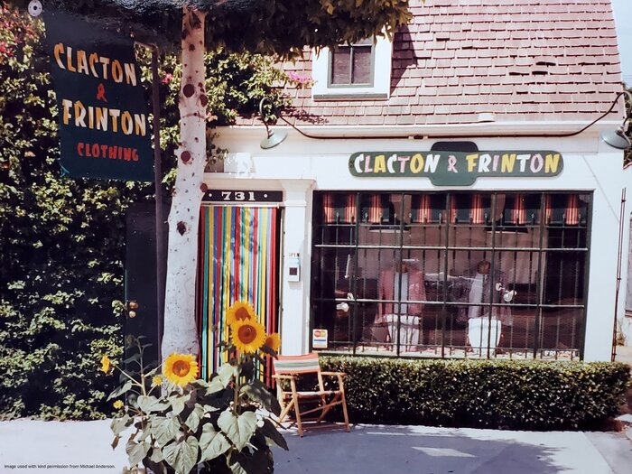
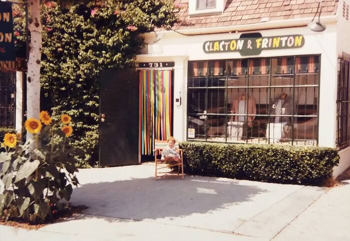
Clacton & Frinton sign
Source: www.adsausage.com Photo by Michael Anderson via Adsausage. License: All Rights Reserved.

Opened in 1980 by British designers Hilary and Michael Anderson, Clacton & Frinton provided fussy shoppers with silk boxers and bow ties, pocket handkerchiefs, and their staple of exquisitely tailored suits; think broad shoulders and full-pleated pants. After the store closed in the 1990s, the husband and wife team launched an outdoorsy-oriented store in Santa Barbara.
The shop signs featured a modified Banco, perhaps hand-cut. (Among the differences from the typeface: the A leans left; the F has an extended horizontal stroke; and the T is wider.) The 1950s typeface was an appropriate choice for a shop known for its “late 1940s, early 1950s Robert Mitcham style suits,” in the words of owner Michael Anderson. The building sign had alternating glyph colors while the hanging sign had a two-tone effect in each letter.
Source: www.facebook.com Photo by Michael Anderson. License: All Rights Reserved.
This post was originally published at Fonts In Use