Jacques Rougerie – Habiter avec la mer exhibition
Source: www.instagram.com License: All Rights Reserved.
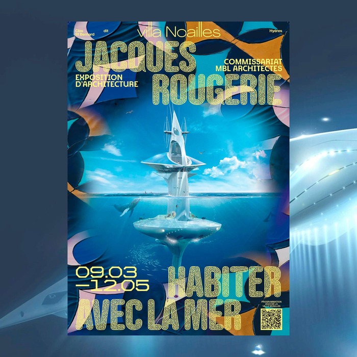
Exhibition poster


The relation of content and form might be the number one topic in every discourse about graphic design. The visuals presented in this post provide a very interesting example in this regard.
Jacques Rougerie, born 1945, is a French architect mainly known for his interest in hostile habitats such as the outer space and the deep sea. Inspired by adventure novels like Jules Verne’s Twenty Thousand Leagues Under the Seas and by the groundbreaking diving explorations of Jacques-Yves Cousteau, Rougerie began to conceive underwater architecture in 1973. Under the title Jacques Rougerie – Living with the sea, the Villa Noailles dedicates a comprehensive exhibition to this pioneer architect. The venue is located in the city of Hyères on the French Mediterranean coast and thereby within a stone’s throw of some of the sites where Rougerie realized aquatic projects.
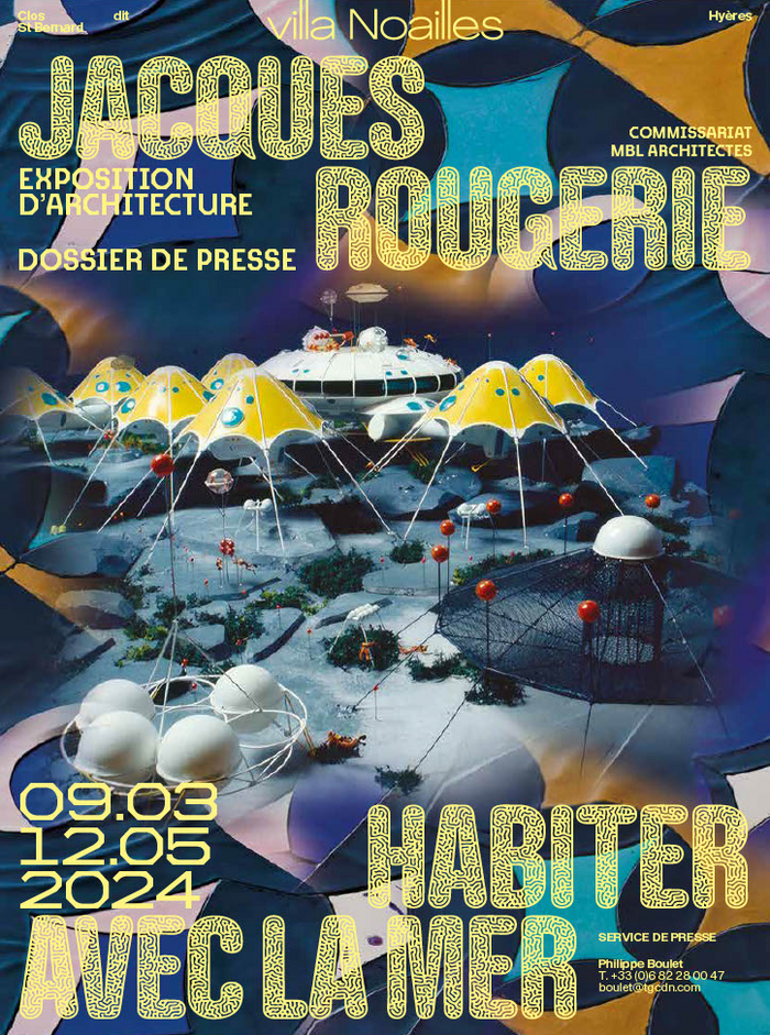
The advertising materials to promote the show build upon drawings, computer renderings, and architectural models that tell a story of technical advance as much as a history of science fiction visualization. Rougerie’s formal language evidently is inspired by nature itself. It’s in this aspect that the typographic choice is so interesting: the main display type used here is Gothic Lab, designed in collaboration between Production Type and Ivan Murit, a specialist in generative design.
Gothic Lab is based on the condensed, monolinear skeleton of Antique Gothic that – coincidentally – shows similarities to the sans-serif used on the title to Jules Verne’s seminal novel around the Nautilus and to the frontispiece with regards to the way in which the stems of the letters are brought to life through special effects. Gothic Lab comes with five different “skins”, patterns inspired by nature and size-specifically generated: Elephant, Croco, Snake, Mantis and Gecko, the latter used here in the LD variant with has less detailing than the HD style.
To draw a conclusion on content and form, both the images and the predominant typeface stem from an exploration of natural forms. As a result, there’s a great feeling of convergence without one part merely mimicking the other.
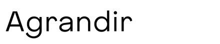
The other typefaces that complement the main act are Kreuz and Enduro, both by Emmanuel Besse and likewise available from Production Type, and Pangram Pangram’s Agrandir, used to typeset the logo of Villa Noailles.
Source: twitter.com License: All Rights Reserved.
Cover of the press kit
Source: villanoailles.com License: All Rights Reserved.
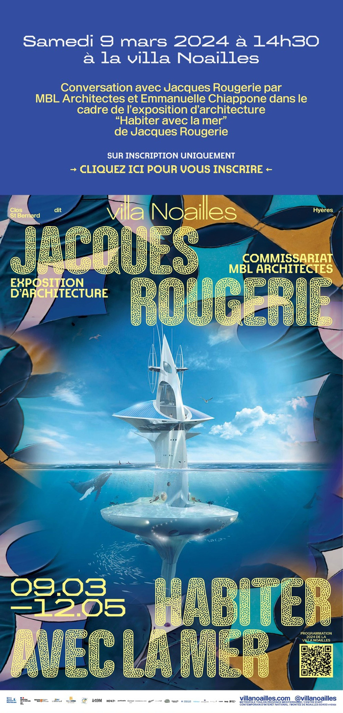
Newsletter announcement
This post was originally published at Fonts In Use