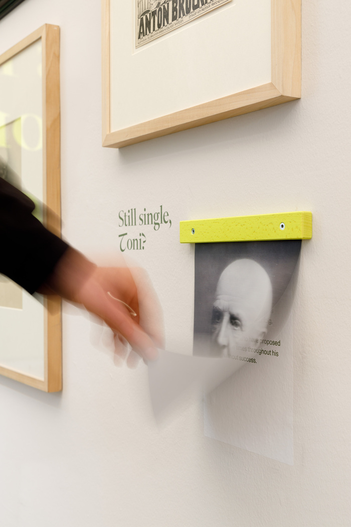
It’s me, Toni at Nordico Stadtmuseum Linz

Gregor Graf. License: All Rights Reserved.

In 2024, Austria—particularly Upper Austria—celebrated the 200th anniversary of organ virtuoso and visionary composer Anton Bruckner. To mark this occasion, the Nordico Stadtmuseum Linz presented It’s me, Toni! Eine Suche nach der Identität Anton Bruckners, an exhibition that challenges conventional clichés. The exhibition design offers a contemporary, fresh perspective on Anton Bruckner’s legacy.
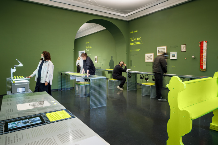
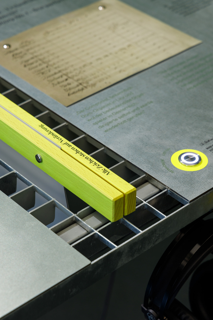
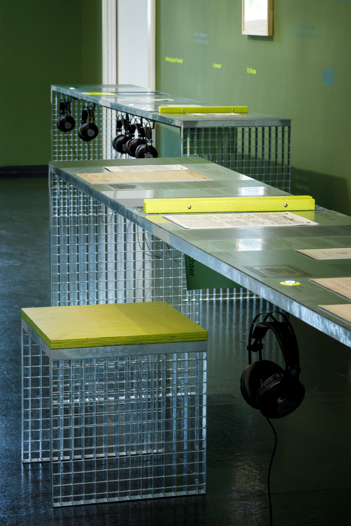
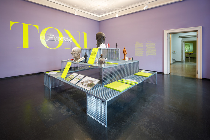
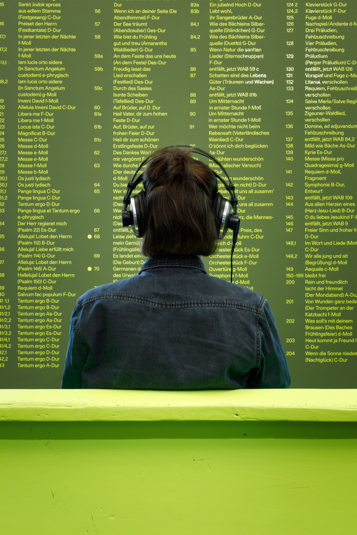
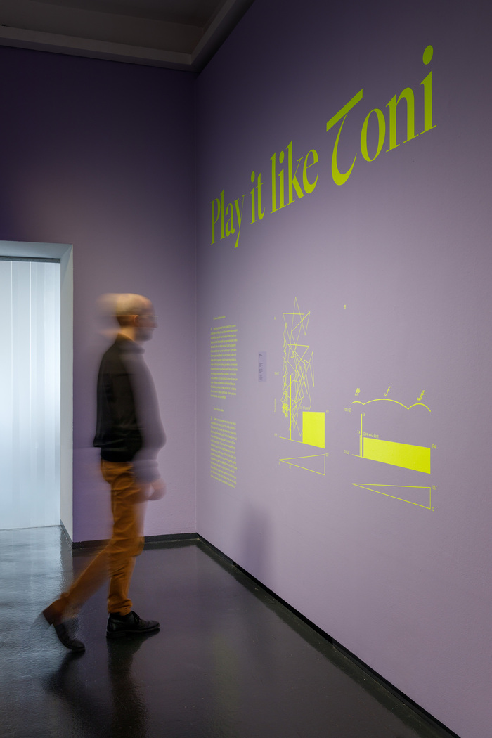
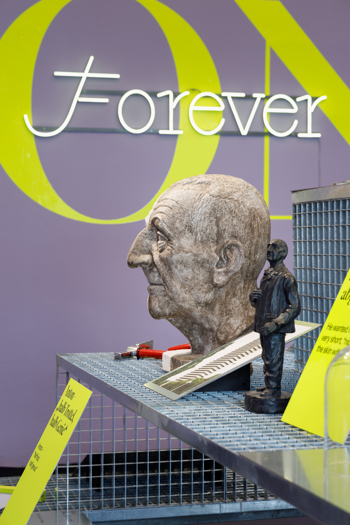
A distinctive color scheme structures the exhibition space into two thematic zones: deep green represents Bruckner’s biography, while vibrant purple emphasizes contemporary interpretations of his work. Neon yellow serves as a striking accent color, primarily marking interactive stations where visitors can actively engage with Bruckner’s world.
The interplay of music, art, and contemporary design extends into the exhibition’s architecture. The scenography features open, permeable grid structures, evoking the atmosphere of a study hall or classroom in the exhibition’s first section—a nod to Bruckner’s early career as a teacher and organist.
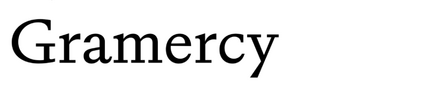
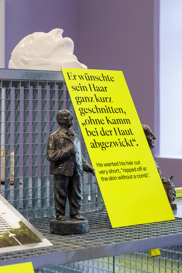
Typography plays a central role in shaping the exhibition’s visual identity. The serif typeface Gramercy was selected for its subtle references to classical music notation, visually echoing Bruckner’s musical heritage. With its distinctive alternate letterforms, Gramercy incorporates elements reminiscent of musical notation, bridging the gap between music and typography.
Complementing this, the exhibition features LL Unica77, the museum’s house typeface. Its clean, modern design—contemporary and highly legible—creates a dynamic contrast to the expressive Gramercy. This balance of tradition and modernity enriches the exhibition’s typographic concept, seamlessly connecting music and design.
Gregor Graf. License: All Rights Reserved.
Gregor Graf. License: All Rights Reserved.
Gregor Graf. License: All Rights Reserved.

Gregor Graf. License: All Rights Reserved.
Gregor Graf. License: All Rights Reserved.
Gregor Graf. License: All Rights Reserved.
Gregor Graf. License: All Rights Reserved.
Gregor Graf. License: All Rights Reserved.
Gregor Graf. License: All Rights Reserved.
Gregor Graf. License: All Rights Reserved.
A monolinear adaptation of Gramercy for a neon sign, complete with swash capital
This post was originally published at Fonts In Use