Inventure
Source: www.underconsideration.com Bedow Design. License: All Rights Reserved.

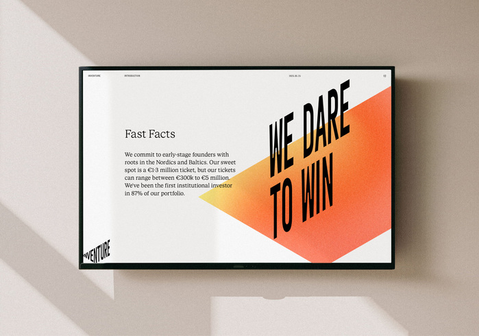
Inventure is an investor commited “to early-stage founders with roots in the Nordics and Baltics”. From Bedow:
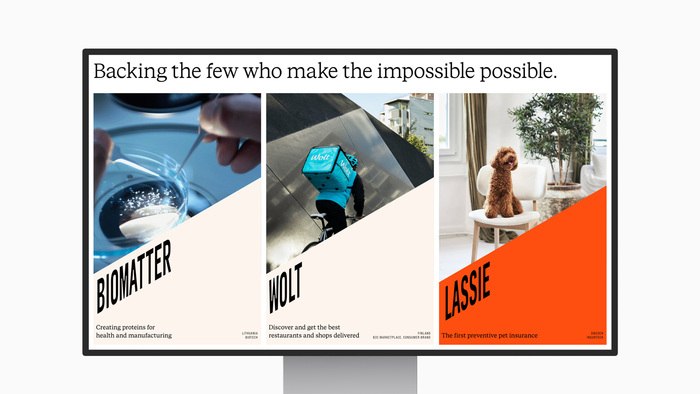
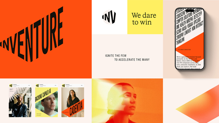
Brand strategy and design for Inventure – Ignite the Few, to Accelerate the Many.
Many talk boldly. But only a scarce bunch dare to walk the talk. Inventure is one of those rare firms that turn words into action. They back the few – and when they do, they go all in. Because true imagination doesn’t just build companies. It makes life better for all of us.
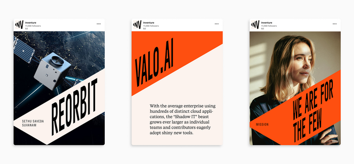
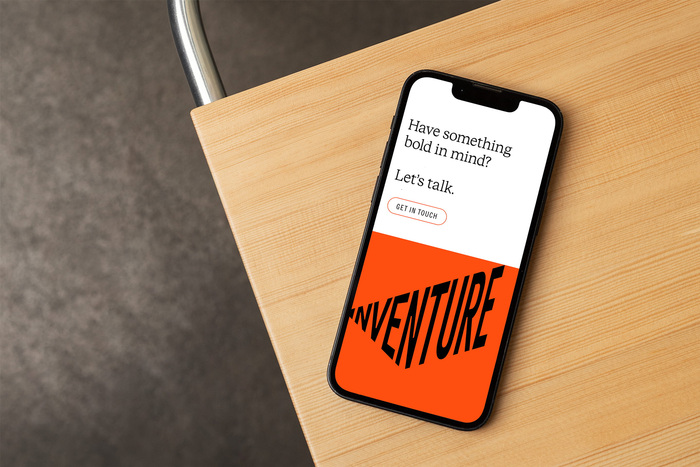
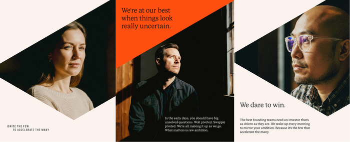
Ignition and acceleration became the cornerstones of the logotype. The first part sparks. The second races forward, tilting upward with momentum. But an identity is more than a logo. Headlines were designed as vessels of acceleration, pushing into a brighter future. Colours and gradients nod to the flame – the spark that sets everything in motion. The result: an identity that dares to win.
The typefaces used for the identity are Varp by Maksym Kobuzan, Marcin Antique by Feliciano Type and STK Bureau Serif by Smuss Type Kiosk.
Source: www.underconsideration.com Bedow Design. License: All Rights Reserved.
Source: www.underconsideration.com Bedow Design. License: All Rights Reserved.
Source: www.underconsideration.com Bedow Design. License: All Rights Reserved.
Source: www.underconsideration.com Bedow Design. License: All Rights Reserved.
Source: www.underconsideration.com Bedow Design. License: All Rights Reserved.
Source: www.underconsideration.com Bedow Design. License: All Rights Reserved.
Source: www.underconsideration.com Bedow Design. License: All Rights Reserved.
This post was originally published at Fonts In Use