Houdini’s Magic Kit
Source: www.peculiarmanicule.com The Peculiar Manicule. License: All Rights Reserved.


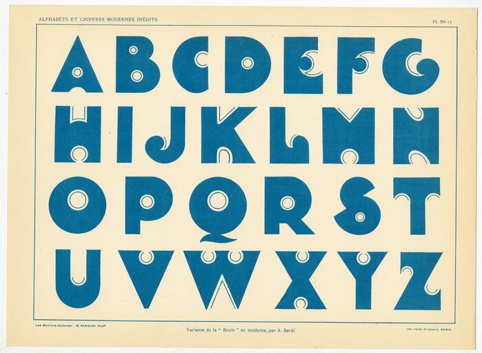
In 1931, Les Editions Guérinet in Paris brought out a book titled Publicité Vignettes Lettres Chiffres Monogrammes (“Advertising, Vignettes, Letters, Numerals, Monograms”). One of the alphabets reproduced in it is titled “variante de la ‘Boule’ en moderne” and credited to lettering artist A. Bardi. Sometime between 1950 and 1960, Photo-Lettering in New York turned it into a typeface named Halloween (shout-out to Jay Mellor for finding the source).
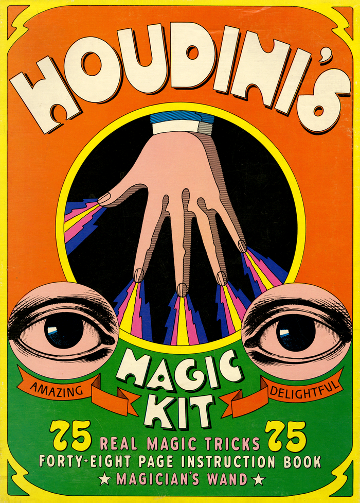
In 1967, the Halloween typeface was used for Houdini’s Magic Kit. This beautifully designed paper assembly kit was issued by Platt & Munk, a publisher of children’s books, jigsaw puzzles and educational materials, probably best known for The Little Engine That Could. The box set includes a magician’s wand and a forty-eight page instruction book and allows for 75 different magic tricks.
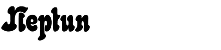
The other typefaces on the box lid are from Photo-Lettering’s library, too: the sans-serif caps used for the words “Amazing” and “Delightful” in the ribbons are from Ventura. The numerals for “75” belong to Xenotype 3471, PLINC’s adaptation of Neptun. Last but not least, the rounded sans is the Shaded A style of Republic, a family that appeared already in PLINC’s 979 Basic Alphabets from 1946.
See the Peculiar Manicule for more images of the kit.
Source: www.facebook.com Mart > Archivio del ’900. License: All Rights Reserved.
A. Bardi’s “variante de la ‘Boule’ en moderne” as shown in Publicité Vignettes Lettres Chiffres Monogrammes
Source: www.ebay.com jes-3402. License: All Rights Reserved.
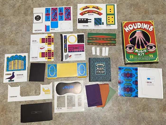
The contents of the kit
Source: www.peculiarmanicule.com The Peculiar Manicule. License: All Rights Reserved.
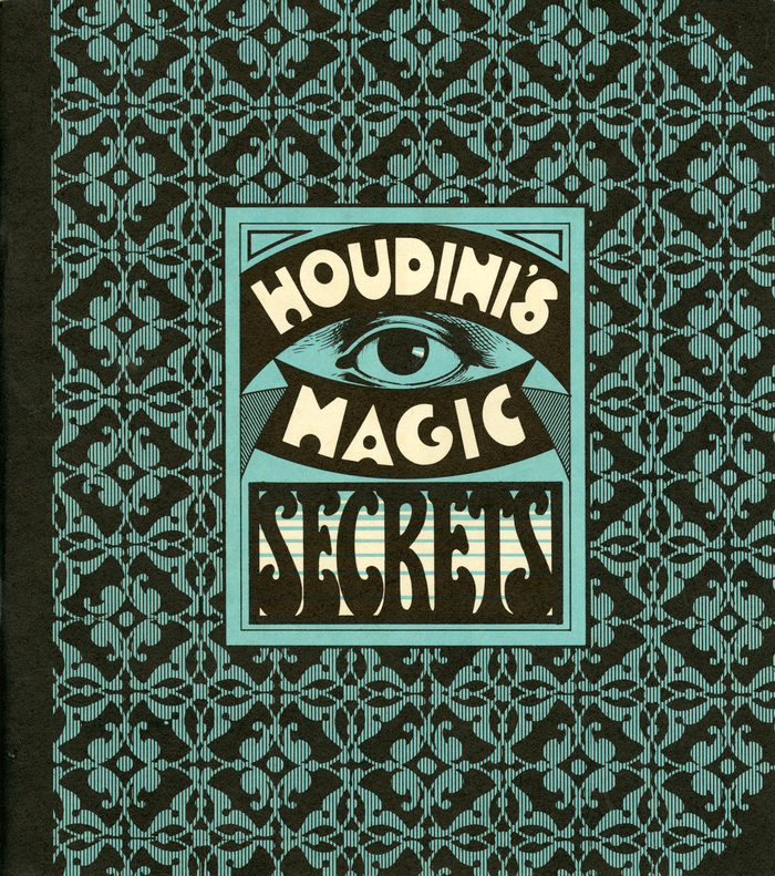
The cover of the instruction booklet pairs Halloween with a hand-drawn bottom-heavy serif of condensed proportions.
Source: www.peculiarmanicule.com The Peculiar Manicule. License: All Rights Reserved.
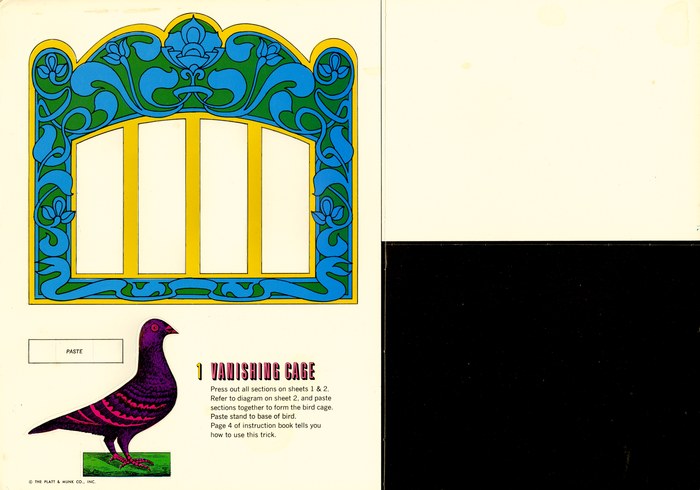
The titles on the sheet are in bichromatic Graphique, with instructions set in News Gothic.
Source: www.peculiarmanicule.com The Peculiar Manicule. License: All Rights Reserved.
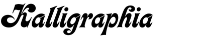
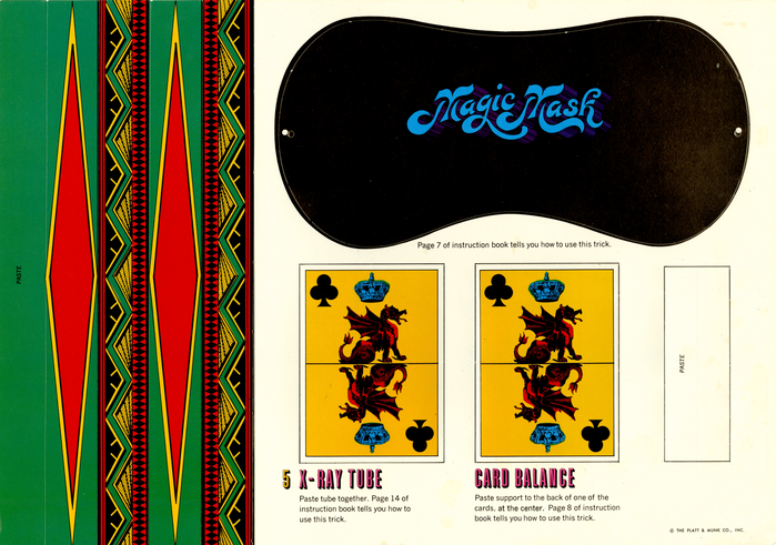
“Magic Mask” is free-form lettering, patterned after Kalligraphia.
This post was originally published at Fonts In Use