hirro rebranding
Source: notinparisnow.com License: All Rights Reserved.


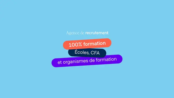
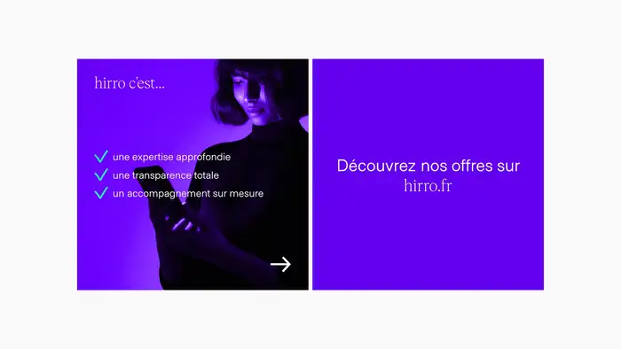
Albra from Ultra Kuhl and Metro Sans from Studio Few are used for the rebrand of hirro, a recruitment agency specializing in the training sector.
From design studio Not In Paris Now (translated):
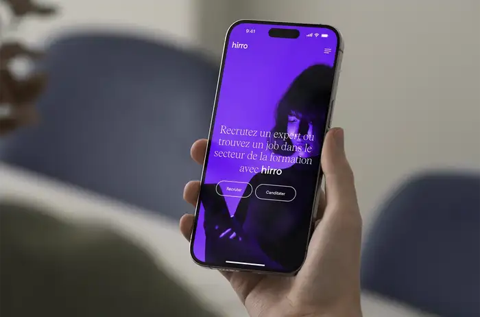
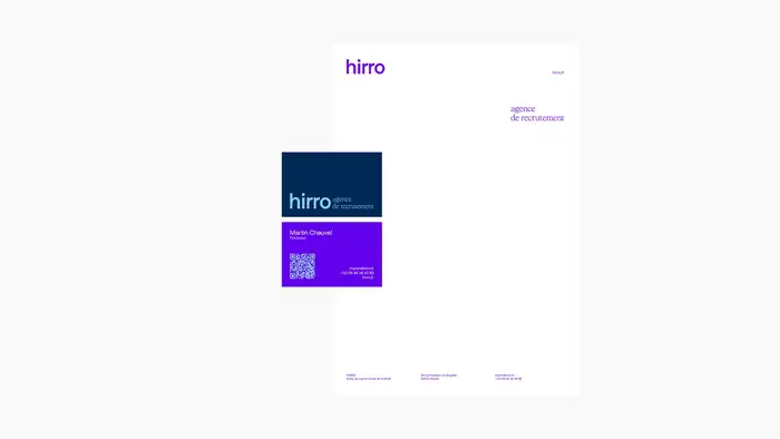
Not In Paris Now is supporting hirro in a comprehensive transformation of its brand image and web platform, from visual identity to the creation of social media content, including website and stationery.
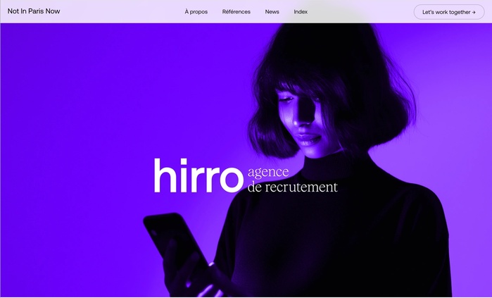
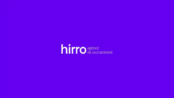
Hirro’s visual identity is intended to be sober, minimal, and controlled. It emphasizes the use of strong, distinctive iconography, notably through portraits set in an atmosphere imbued with the agency’s accent colors. The typographic system combines two visually distinct typefaces, highlighting both the contemporary and innovative aspect of the agency while enhancing its position as a confirmed leader among independent recruitment agencies in the training sector.
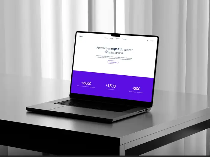
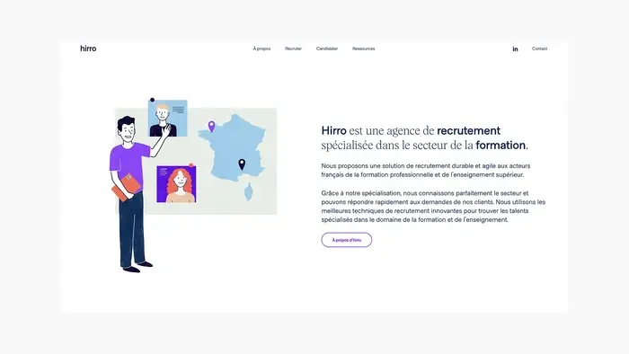
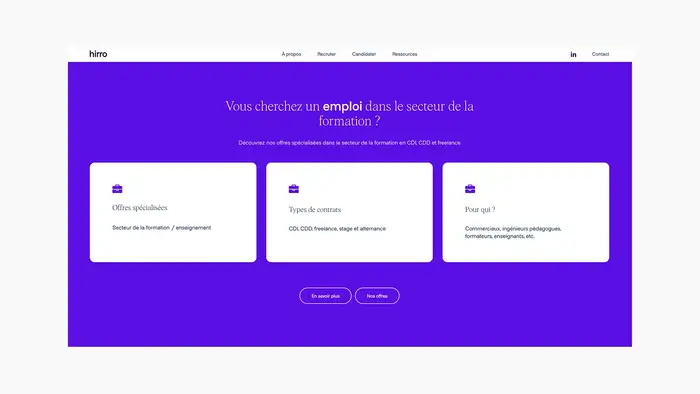
A true brand platform centered on recruitment, the website is designed to streamline contact initiation and highlight the various recruitment packages offered by hirro.
Source: notinparisnow.com License: All Rights Reserved.
Source: notinparisnow.com License: All Rights Reserved.
Source: notinparisnow.com License: All Rights Reserved.
Source: notinparisnow.com License: All Rights Reserved.
Source: notinparisnow.com License: All Rights Reserved.
Source: notinparisnow.com License: All Rights Reserved.
Source: notinparisnow.com License: All Rights Reserved.
Source: notinparisnow.com License: All Rights Reserved.
This post was originally published at Fonts In Use