Herrat (2025 redesign)
Published November 15, 2026
By FontsInUse
Contributed by Julian Grönberg
Simbayu Studios. License: All Rights Reserved.

Simbayu Studios. License: All Rights Reserved.
Simbayu Studios. License: All Rights Reserved.
Simbayu Studios. License: All Rights Reserved.
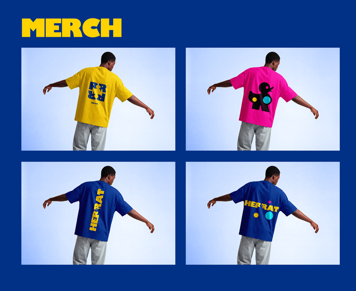
Simbayu Studios. License: All Rights Reserved.
This post was originally published at Fonts In Use
Simbayu Studios. License: All Rights Reserved.
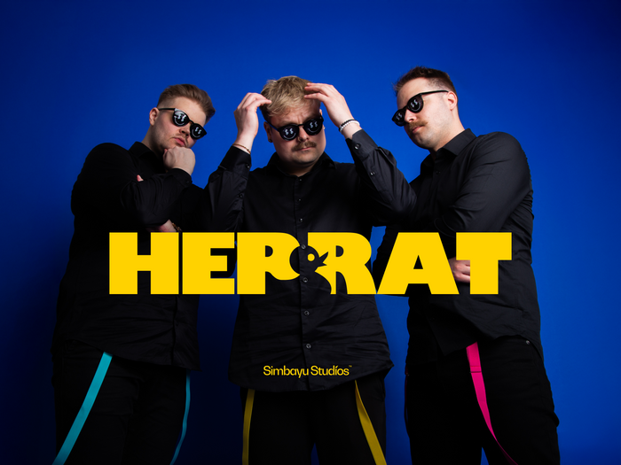
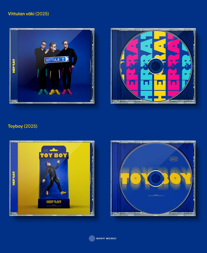
This showcase presents the redesign of Finnish musical trio Herrat, introducing a bold and playful visual identity across releases, stage visuals, merchandise and logo design.
The new duck motif, referencing their hit “Kumiankka”, serves as a distinctive visual signature, capturing the trio’s retro-inspired energy and humour. Gill Kayo, an exceptionally bold and expressive typeface, was used throughout the logo design, cover artwork and headlines, bringing consistency and a strong typographic character to the overall identity.
Simbayu Studios. License: All Rights Reserved.
Simbayu Studios. License: All Rights Reserved.
Simbayu Studios. License: All Rights Reserved.
Simbayu Studios. License: All Rights Reserved.
This post was originally published at Fonts In Use
Read full story.
WRITTEN BY
FontsInUse
An independent archive of typography.
More from FontsInUse