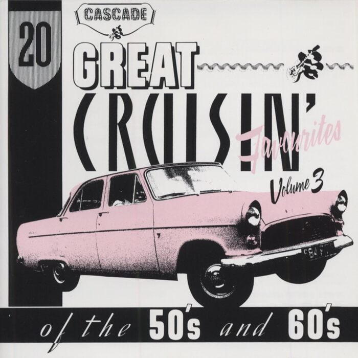
20 Great Cruisin’ Favourites of the 50’s and 60’s, Vol. 3 album art
Source: www.amazon.co.jp License: All Rights Reserved.



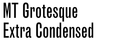


20 Great Cruisin’ Favourites of the 50’s and 60’s is a three-volume series of albums with rock’n’roll and doo wop music by the likes of Little Richard, Everly Brothers, Sam Cooke, and The Chiffons. Compiled by Ted Carroll, it was released 1987–1988 by Cascade Records, a dedicated reissue label from London.
The covers were designed by Phil Smee (of Motörhead logo fame) at Waldo’s Design, who sourced a smorgasbord of period typefaces. For volume 3, he opted for Filmotype Ginger (1954) and its open and shaded variant Vanity (1955), both of which were digitized by Mark Simonson in 2008.

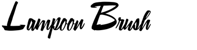
The brush script with the tall bold capitals was shown by Dan X. Solo in his Brushstroke and Free-Style Alphabets (1977) as Lampoon Brush. Nick Curtis, whose Fuller Brush NF (2007) is a digital version of this design – albeit with upright letters – credits the source to C. Milnes, an Australian lettering artist who showed this alphabet in The New Lone Pine ABC of Showcard and Ticketwriting, published by Ruskin Press in Melbourne in 1946.
The streamline italic seen in the band at the bottom matches Brimley. This can’t be the font used here, though: Brimley was created in 2003, fifteen years after this album was released. It must be the unnamed typeface that Chank intern Tim Drabandt referenced for his design.
My personal favorite of the lot is Lettera-Grotesk as used for “CRUISIN’”. This capital alphabet was drawn by Walter Haettenschweiler in 1954, based on lettering by fellow Swiss graphic artist Pierre Gauchat. Reproduced in the first volume of Lettera, Dan X. Solo later turned it into a photo typeface dubbed Maharaja. You can read more about Lettera-Grotesk and its background in a previous article on Fonts In Use.
Hrvoje Živčić was inspired to start a typeface after seeing related lowercase letters on a “schenk ein buch” poster shown in the 2022–2023 Haettenschweiler from A to Z exhibit at the Museum für Gestaltung Zürich. He extrapolated the limited set of letters into five weights with upper- and lowercase letters. The resulting Schenk was released with Commercial Type last week. It’s not a direct digitization of Lettera-Grotesk, but rather elaborates on Haettenschweiler’s minimal shapes, turning them into a complete family ready for contemporary use.
Side note: The Cascade logo at the top is in Abramesque, a phototype revival of an ornamented version of Caslon Rounded that was shown by the Caslon foundry in the 1840s. In 2019, Tim Ripper made a digital version of this design for Commercial Classics.
This post was originally published at Fonts In Use