Hera nei Campi
Published January 29, 2024
By FontsInUse
Contributed by Margot Lévêque Studio
Source: multiversestudio.it License: All Rights Reserved.


Source: multiversestudio.it License: All Rights Reserved.
Source: multiversestudio.it License: All Rights Reserved.
Source: multiversestudio.it License: All Rights Reserved.

Source: multiversestudio.it License: All Rights Reserved.

Source: multiversestudio.it License: All Rights Reserved.

Source: multiversestudio.it License: All Rights Reserved.
Source: multiversestudio.it License: All Rights Reserved.

Source: multiversestudio.it License: All Rights Reserved.
Source: multiversestudio.it License: All Rights Reserved.
This post was originally published at Fonts In Use
Source: multiversestudio.it License: All Rights Reserved.
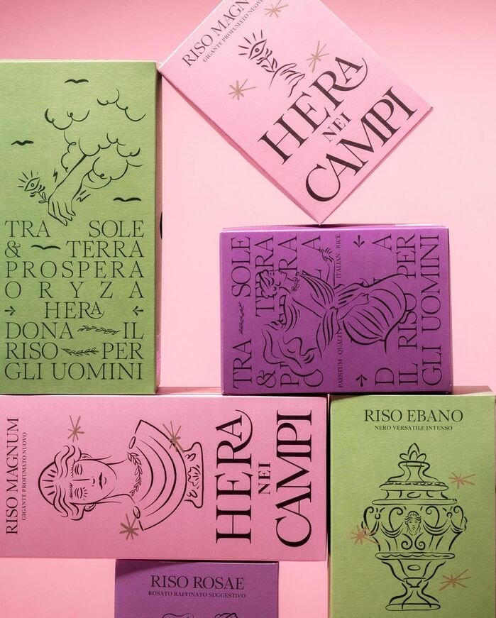
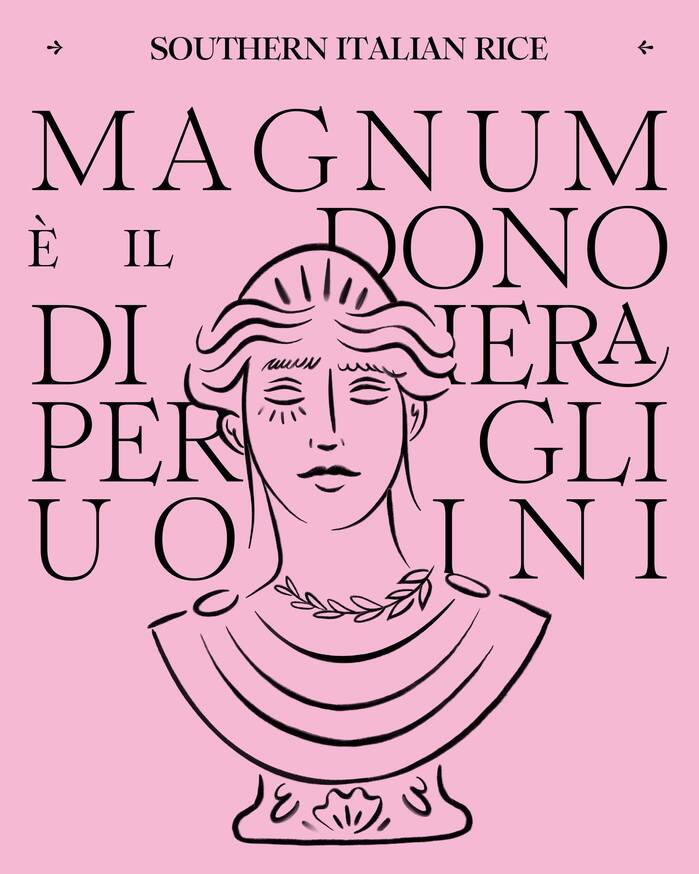
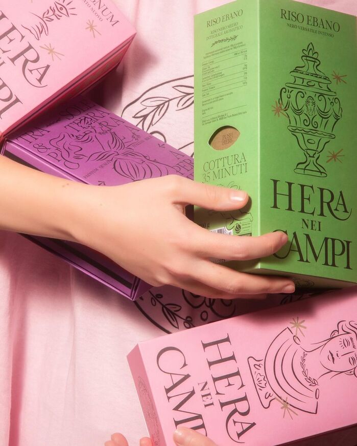
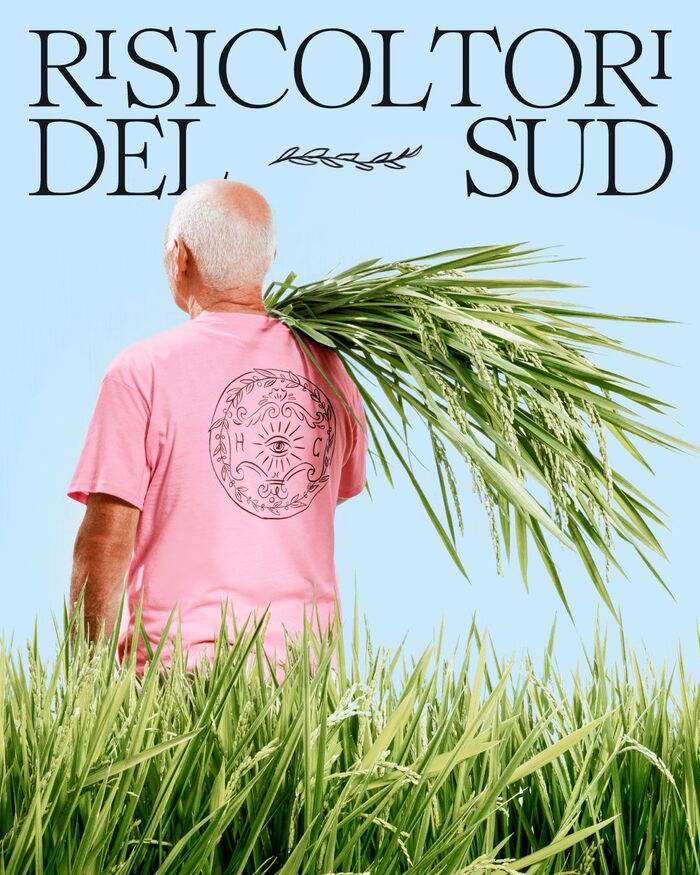
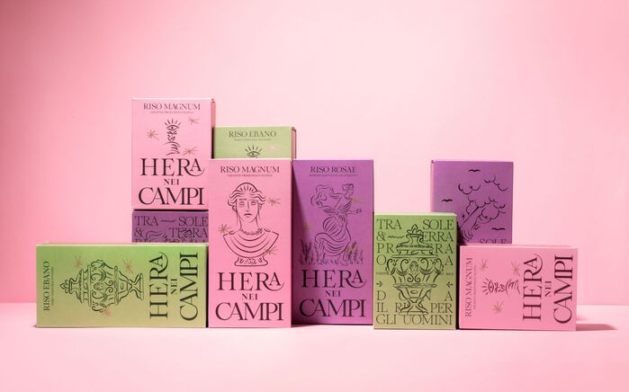
Designed by Multiverse Studio, Hera nei Campi revives rice cultivation in Southern Italy with innovative technology and a new rice variety, Magnum. The project features uniquely designed packaging and labels that reflect the local Piana del Sele region, enhancing user interaction and storytelling through detailed illustrations and typography that narrate the legend of Hera and the origins of rice.
The typeface in use is Romie by Margot Lévêque.
Source: multiversestudio.it License: All Rights Reserved.
Source: multiversestudio.it License: All Rights Reserved.
Source: multiversestudio.it License: All Rights Reserved.
Source: multiversestudio.it License: All Rights Reserved.
Source: multiversestudio.it License: All Rights Reserved.
Source: multiversestudio.it License: All Rights Reserved.
Source: multiversestudio.it License: All Rights Reserved.
Source: multiversestudio.it License: All Rights Reserved.
Source: multiversestudio.it License: All Rights Reserved.
This post was originally published at Fonts In Use
Read full story.
WRITTEN BY
FontsInUse
An independent archive of typography.
More from FontsInUse