Hauptsache, es rollt by Rainer Rosenberg
Published April 10, 2026
By FontsInUse
Contributed by David Einwaller
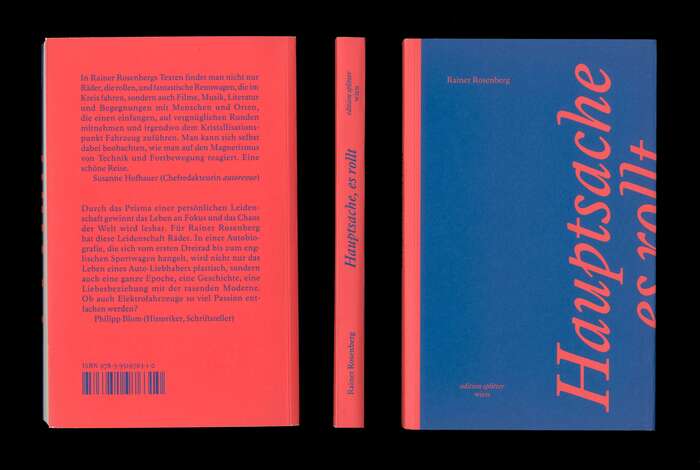
Photo: David Einwaller. License: All Rights Reserved.
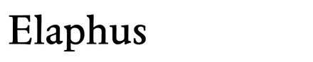
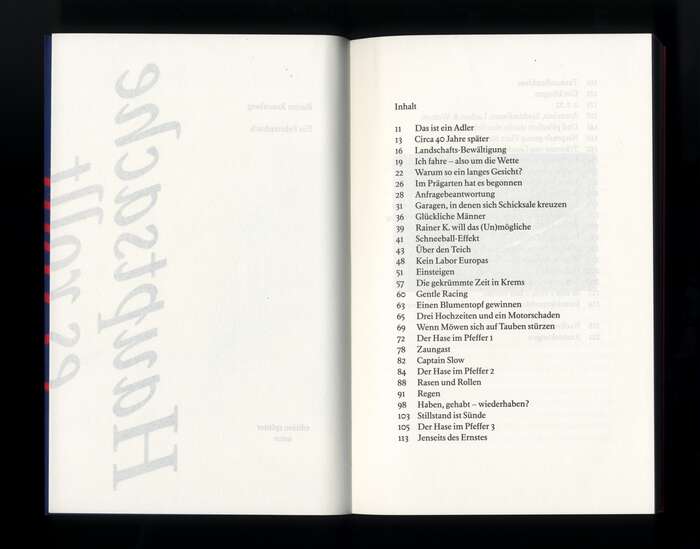
Photo: David Einwaller. License: All Rights Reserved.
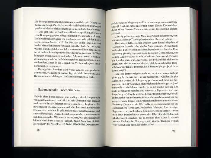
Photo: David Einwaller. License: All Rights Reserved.
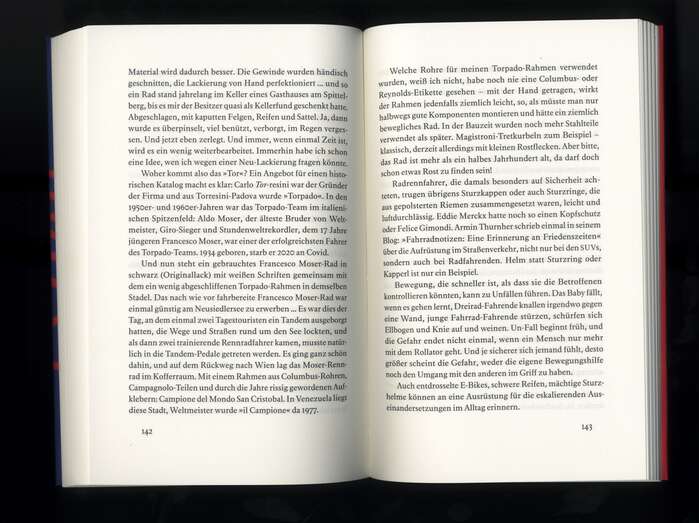
Photo: David Einwaller. License: All Rights Reserved.
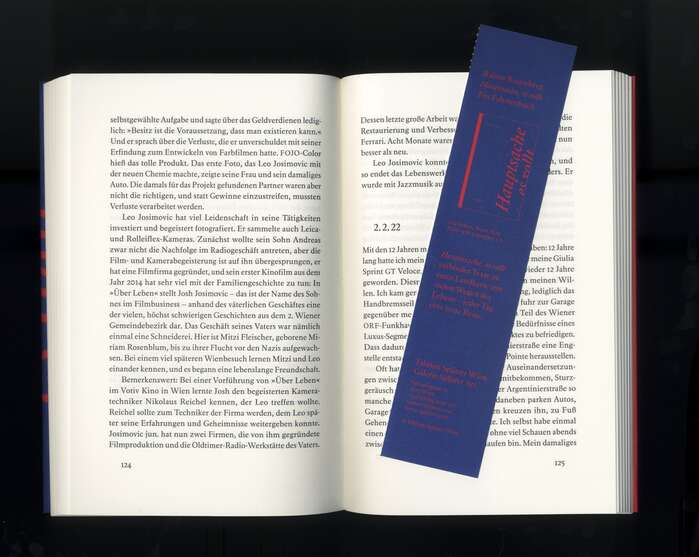
Photo: David Einwaller. License: All Rights Reserved.
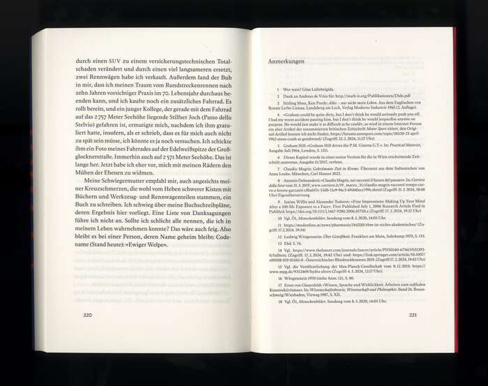
Photo: David Einwaller. License: All Rights Reserved.
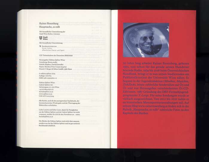
Photo: David Einwaller. License: All Rights Reserved.
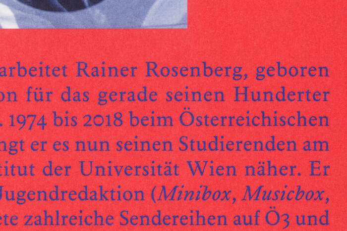
Photo: David Einwaller. License: All Rights Reserved.
This post was originally published at Fonts In Use
Photo: David Einwaller. License: All Rights Reserved.
In Hauptsache, es rollt, published by Edition Splitter in spring 2025, the warm serif typeface Elaphus takes the lead. Elaphus’s open counters and soft, unforced curves give the text a fluid, storytelling quality—ideal for the book’s themes of movement and flow. At small sizes especially, its warm texture and even rhythm make reading feel like a gentle conversation with the page. The slightly more adventurous italic, rooted in historical craft, adds an expressive undercurrent. Rather than dominating the imagery, Elaphus supports it—offering structural clarity without imposing.
Photo: David Einwaller. License: All Rights Reserved.
Photo: David Einwaller. License: All Rights Reserved.
Photo: David Einwaller. License: All Rights Reserved.
Photo: David Einwaller. License: All Rights Reserved.
Photo: David Einwaller. License: All Rights Reserved.
Photo: David Einwaller. License: All Rights Reserved.
Photo: David Einwaller. License: All Rights Reserved.
This post was originally published at Fonts In Use
Read full story.
WRITTEN BY
FontsInUse
An independent archive of typography.