Grieg Seafood
Published December 31, 2024
By FontsInUse
Contributed by Jan Maack

Source: en.mission.no License: All Rights Reserved.


Source: en.mission.no License: All Rights Reserved.
Source: en.mission.no License: All Rights Reserved.
Source: en.mission.no License: All Rights Reserved.
Source: en.mission.no License: All Rights Reserved.
Source: griegseafood.com License: All Rights Reserved.
This post was originally published at Fonts In Use
Source: en.mission.no License: All Rights Reserved.
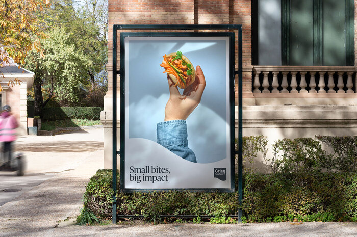
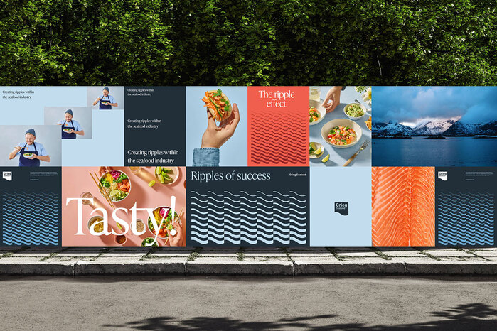
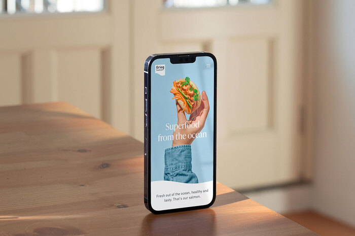
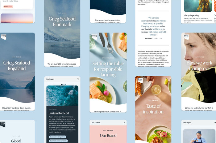
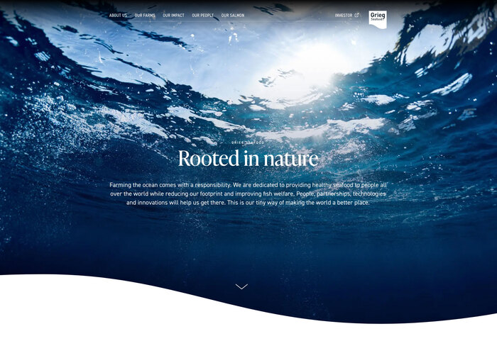
Grieg Seafood isone of the world’s largest salmon farming companies with brands in the USA, Canada, and Europe.
Mission Design made a new visual identity for Grieg Seafood built around a wave-like shape inspired by a creative concept titled “Ripple Effect”, symbolizing how small changes create far-reaching impact. This became the foundation of a flexible graphic system with vibrant colors, dynamic layouts, and an updated tone of voice. New imagery highlighted taste, connection, and the joy of eating, bringing the brand’s story to life.
The headline font chosen for this is IvyPresto. On the website, it’s paired with both FF DIN and DIN 2014.
Source: en.mission.no License: All Rights Reserved.
Source: en.mission.no License: All Rights Reserved.
Source: en.mission.no License: All Rights Reserved.
Source: en.mission.no License: All Rights Reserved.
Source: griegseafood.com License: All Rights Reserved.
This post was originally published at Fonts In Use
Read full story.
WRITTEN BY
FontsInUse
An independent archive of typography.