Grazegrind
Source: www.instagram.com License: All Rights Reserved.

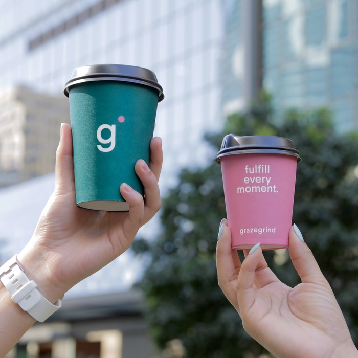
Grazegrind is a restaurant and caterer located in Brisbane, Australia. Their identity was designed by Studio Gangplank, and is set entirely in Type Dynamic’s Larsseit Medium. The typeface’s iconic double-storey g has been entirely replaced by the alternate single story g, which means the single-letter logo is one that features only alternate glyphs. The logo and rest of the identity feature punctuation set in pink to contrast the rest of the text set in a dark teal colour.
Larsseit and other “quirky geometrics” seem to have fallen out of favour a bit since their popularity spike in the early to mid-2010s, so I am interested to see if the genre ever makes a comeback, or gets some sort of reboot in a few decades. For now, I still enjoy seeing Larsseit.
Source: www.grazegrind.com.au License: All Rights Reserved.
Source: www.grazegrind.com.au License: All Rights Reserved.
Source: www.grazegrind.com.au License: All Rights Reserved.
This post was originally published at Fonts In Use