Graeter’s ice cream rebrand
Source: www.underconsideration.com Dewhaus. License: All Rights Reserved.


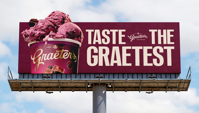
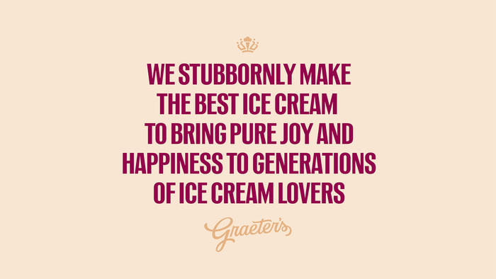
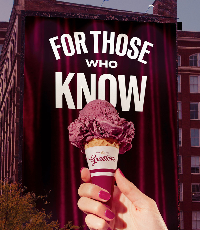
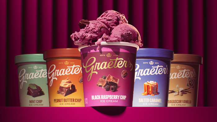
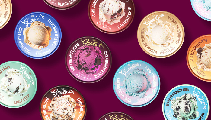
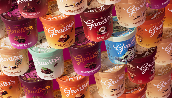
Matria, Klub 11 and Klub 08 make the typographic palette of this rebrand for Graeter’s, a fifth-generation family-owned, regional ice cream chain based in Cincinnati, Ohio, and one of the few (if not the only remaining) small-batch ice cream maker using the French Pot method.
I was happy to see Matria in use for this project that’s rooted in tradition/history.
Quick story about Matria: I found a sample of a typeface in my birth certificate and went on a journey to find its origins and design a typeface around it. It turns out it was based on Reform-Grotesk, a typeface from the turn of the 20th century (dated 1908) that’s led to so many well-known fonts.
My spin on it was to make it into a high-waist contemporary palette that goes from very thin condensed to black extended. I was just scrolling through this beautiful case study (lured by the amazing logo) only to have my day made by seeing this use.
Source: www.underconsideration.com Dewhaus. License: All Rights Reserved.
Source: www.underconsideration.com Dewhaus. License: All Rights Reserved.
Source: www.underconsideration.com Dewhaus. License: All Rights Reserved.
Source: www.underconsideration.com Dewhaus. License: All Rights Reserved.
Source: www.underconsideration.com Dewhaus. License: All Rights Reserved.
This post was originally published at Fonts In Use