GQ magazine, Manual section (c. 2005–2009)
Anton Ioukhnovets. License: All Rights Reserved.

A small sampling of the brilliant work by designer Anton Ioukhnovets for the Manual section of GQ magazine, circa 2005–2009. Under the direction of magazine legend Fred Woodward, the GQ design team of that period included, among others, Ioukhnovets as well as Thomas Alberty, both of whom would go on to top positions at W and New York respectively.
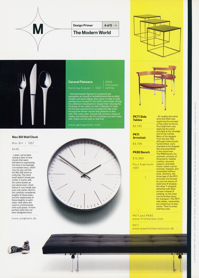
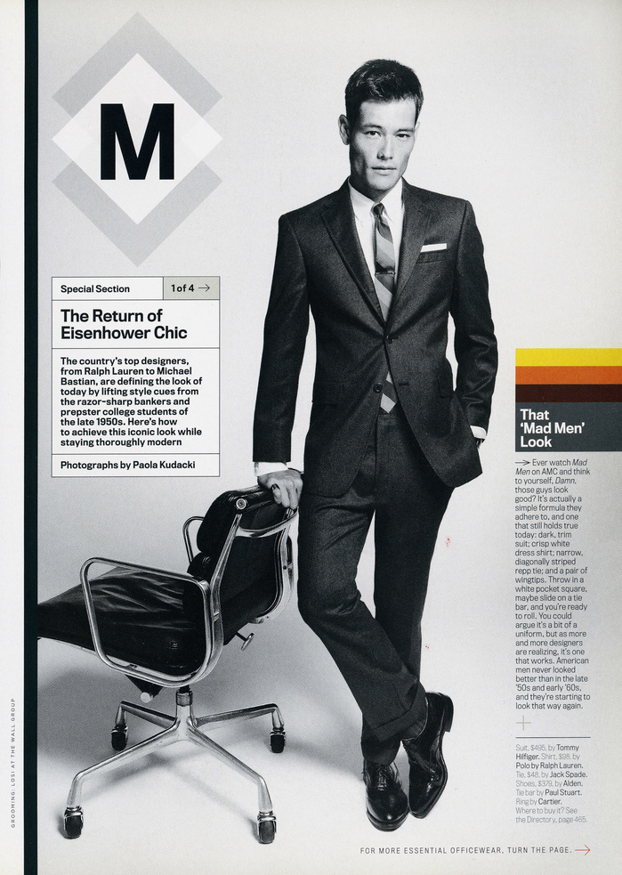
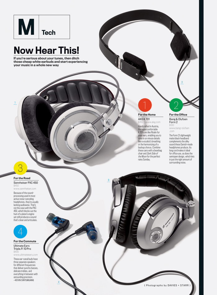
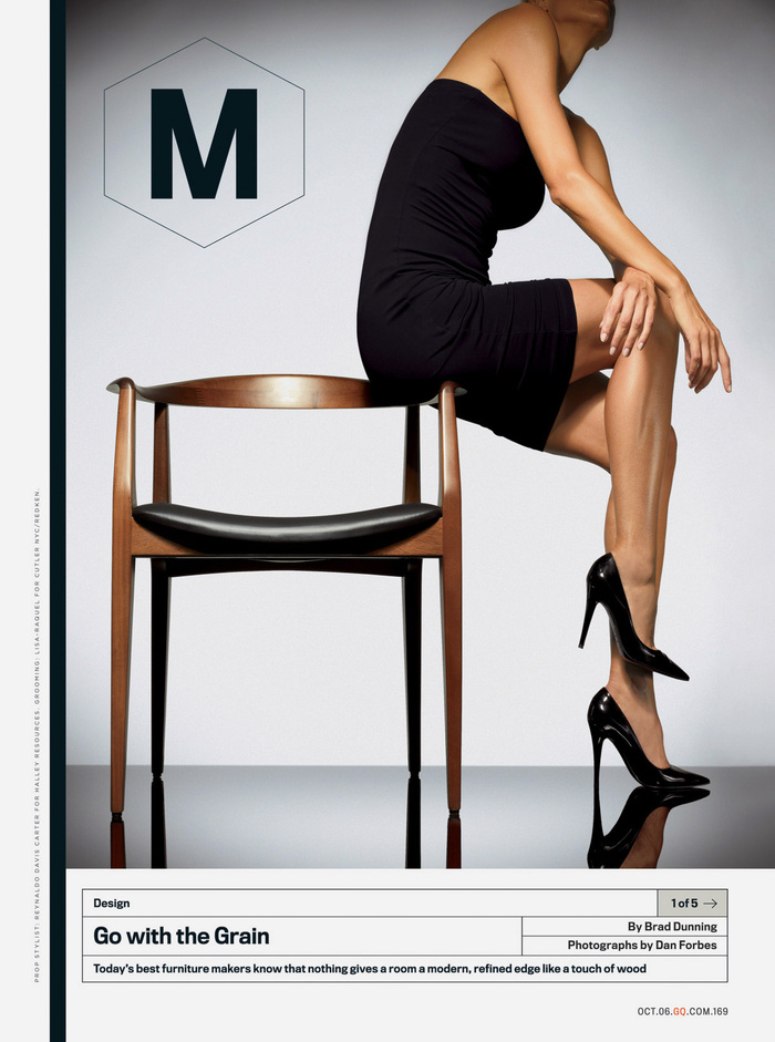
Manual was the first editorial section to greet the reader within each issue of GQ. A surprising aspect of the Manual section was the total reliance on a single typeface, the versatile FB Titling Gothic designed by David Berlow (Font Bureau). The strict adherence to a single family for such a dense section of diverse content might seem like a dubious approach but the results speak for themselves. In describing Manual, designer Anton Ioukhnovets says he often “likes to embracing limitations” and therefore opted for a minimum of elements in the section, a typeface, a few line rules, and the images. “I wanted the beauty of the layouts to come from the actual structure,” remarked Ioukhnovets. “I was inspired by the modularity of Excel docs.”
Often the first sections of magazines (called the FOB or Front of Book) are somewhat compromised in terms of their design. Layouts will appear adjacent to ads which can compete visually, and the smaller budgets for the FOB pages might rely on “pick-up” art rather than custom commissions. What made GQ’s Manual section so special was that it made these dense pages as visually appealing as features, and did so largely through the attention to detail of the typography and the dynamic compositions.
Although I can't prove it, I always suspected the Manual section likely had a wider impact on the magazine design world—shifting the paradigm towards structured grids. Manual predates other notable examples, (Monocle and Francesco Franchi's work at Il) by several years and might possibly have had some influence on them.
Anton Ioukhnovets. License: All Rights Reserved.
Anton Ioukhnovets. License: All Rights Reserved.
Anton Ioukhnovets. License: All Rights Reserved.
Anton Ioukhnovets. License: All Rights Reserved.
Anton Ioukhnovets. License: All Rights Reserved.
Anton Ioukhnovets. License: All Rights Reserved.
This post was originally published at Fonts In Use