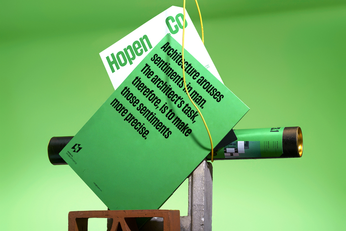
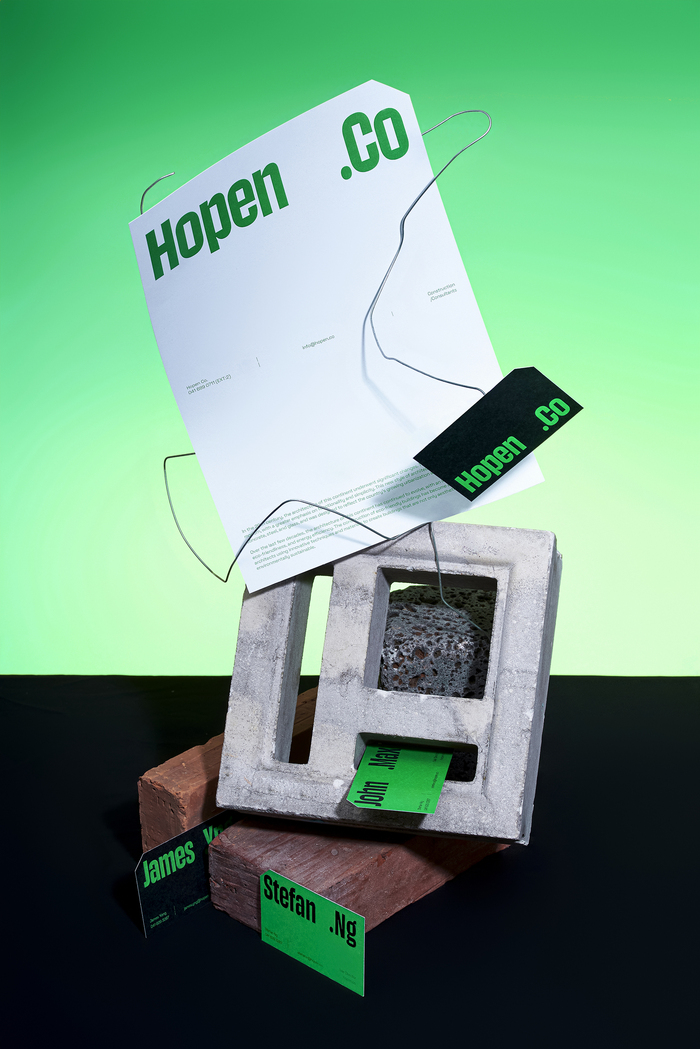
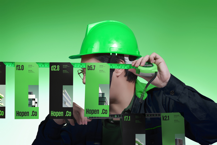
Hopen.Co
Source: layolab.com Designed by Layo Lab. License: All Rights Reserved.


In the midst of the pandemic, Lay Lab had the opportunity to partner with an Australian-based architectural/interior design and construction consulting firm, with a dream of building a future safe foundation for communities. Lay thức Lab has accompanied the company to shape identity and brand experience, while developing the best brand-name in SDFC method, formula formation: [Hope - Hope] + [Open - Open] + [Co - Company/Collab] = Hopen.Co. In the meantime, Hopen.co has closed doors.
To fully embody the brand spirit of Hopen.Co, we have independently designed an exclusive typeface named Hopen Sans. This typeface has brought a distinctive language and identity to the brand by integrating architectural elements such as building height, structural shapes, layers of doors, and living spaces into each character.
Hopen Sans highlights the raw, straightforward nature of architectural structures, focusing more on functionality than unnecessary decorative details. This ensures legibility and recognizability in layout design and typography, creating an elegant and minimalist look that effectively conveys messages and enhances brand recognition.

Source: layolab.com Designed by Layo Lab. License: All Rights Reserved.
Source: layolab.com Designed by Layo Lab. License: All Rights Reserved.
Source: layolab.com Designed by Layo Lab. License: All Rights Reserved.

Source: layolab.com Designed by Layo Lab. License: All Rights Reserved.
This post was originally published at Fonts In Use