Goro: Prince of Pain
Published July 26, 2023
By FontsInUse
Contributed by tabmok99
Source: archive.org License: All Rights Reserved.


Source: archive.org License: All Rights Reserved.

Source: archive.org License: All Rights Reserved.
This post was originally published at Fonts In Use
Source: archive.org License: All Rights Reserved.
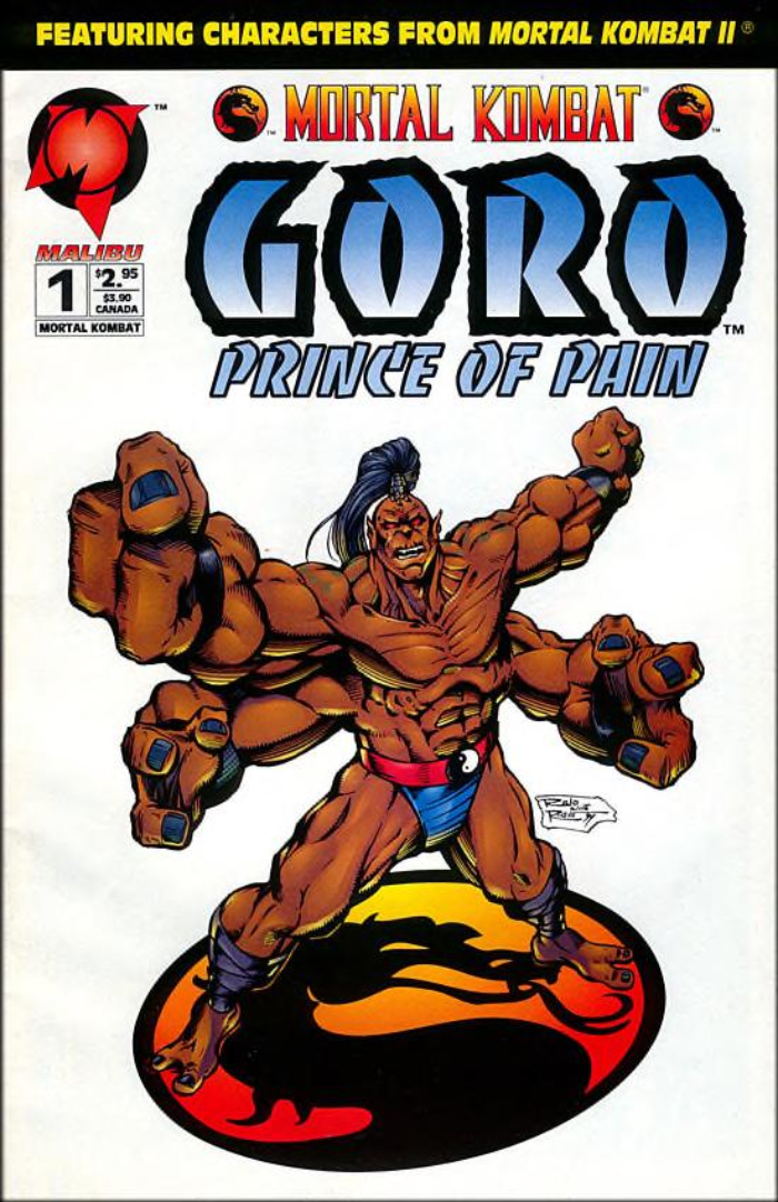
The Malibu Comics adaptation of the Mortal Kombat video games storyline. For the Goro: Prince of Pain series, the title and subtitle were both written in the Banco typeface. The lettering for “Goro” was modified slightly to be straightened out, while the lettering for “Prince of Pain” is unmodified. This was a three-part miniseries that ran from September to November 1994.
The secondary typeface used for the price info but also for the line “featuring characters …” is another design by Roger Excoffon: Antique Olive Compact. The Mortal Kombat logo is probably custom.
Source: archive.org License: All Rights Reserved.
Source: archive.org License: All Rights Reserved.
This post was originally published at Fonts In Use
Read full story.
WRITTEN BY
FontsInUse
An independent archive of typography.
More from FontsInUse