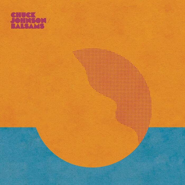
Chuck Johnson – Balsams album art
Source: www.instagram.com SEEN. License: All Rights Reserved.

According to Olivier Nineuil, Black Boton was originally designed in 1970 at Paris-based publisher Delpire where Albert Boton was a design director at the time. The extrabold geometric face with hardly any counters has a lot in common with Milton Glaser’s Baby Teeth, but is distinguished by a number of details (for example the more refined M with splayed legs) and, notably, the inclusion of a lowercase. Black Boton was distributed by the local phototype company Hollenstein and is shown in a catalog from 1974 as an exclusive design, in solid and outlined styles. In 1997, Boton reissued it in digital form with Monotype, unfortunately without the lowercase.
In 2017, Rob Carmichael of SEEN used it for the sleeve of Balsams, an ambient steel guitar album by Oakland-based artist Chuck Johnson released by VDSQ Records. He further increased the opacity of the letterforms by filling in the counters in the O’s.
Aside: when spelled out, the name of Steve Lowenthal’s instrumental guitar label is “Vin Du Select Qualitité”. I don’t know if Boton fancied wines – he reportedly loved cigars – but if he did, he certainly went with such of select quality.
Posted as part of a series that pays tribute to Albert Boton, one of the preeminent French type designers of the past sixty years. Albert Boton died on July 20, 2023, at the age of 91.
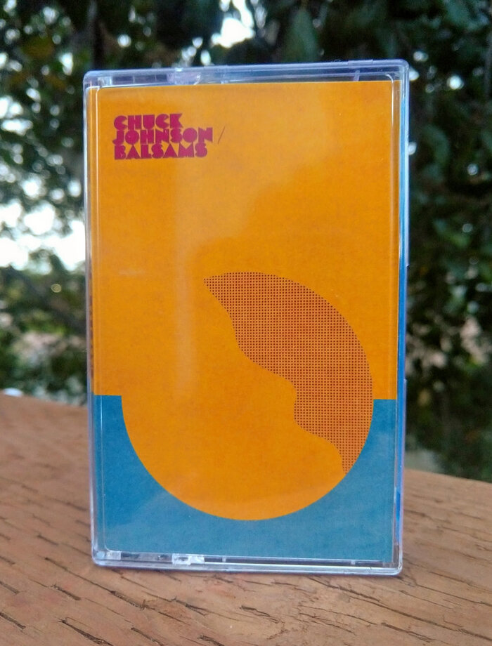
Source: chuckjohnson.bandcamp.com Chuck Johnson. License: All Rights Reserved.
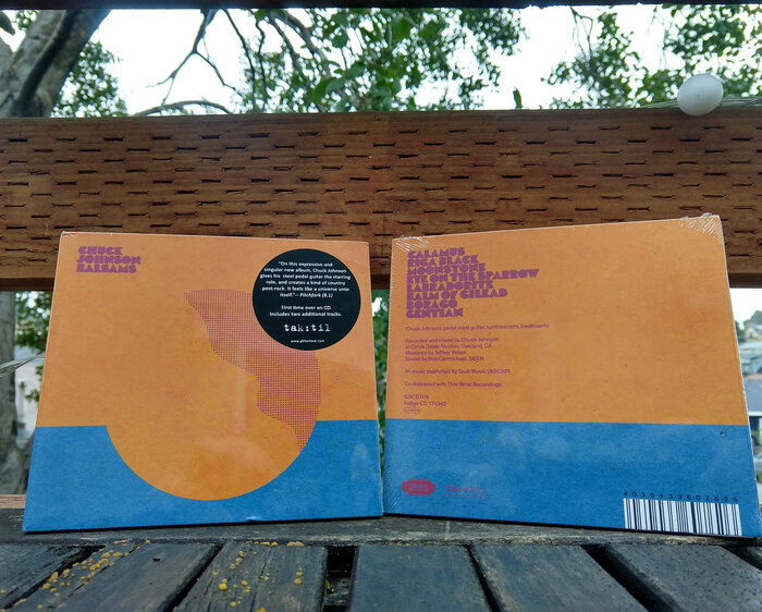
Source: chuckjohnson.bandcamp.com Chuck Johnson. License: All Rights Reserved.
This post was originally published at Fonts In Use