Goodbois D2 2023
Goodbois. License: All Rights Reserved.


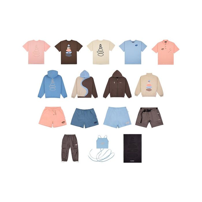
The latest Goodbois collection embodies an ongoing journey towards a minimalistic mindset, seamlessly mirrored in the selected typography. It also spotlights a heightened awareness of our planet’s resources.
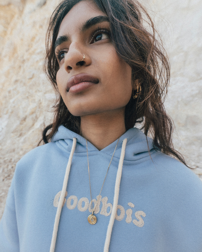
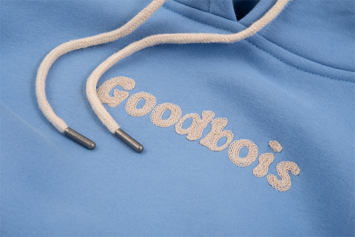
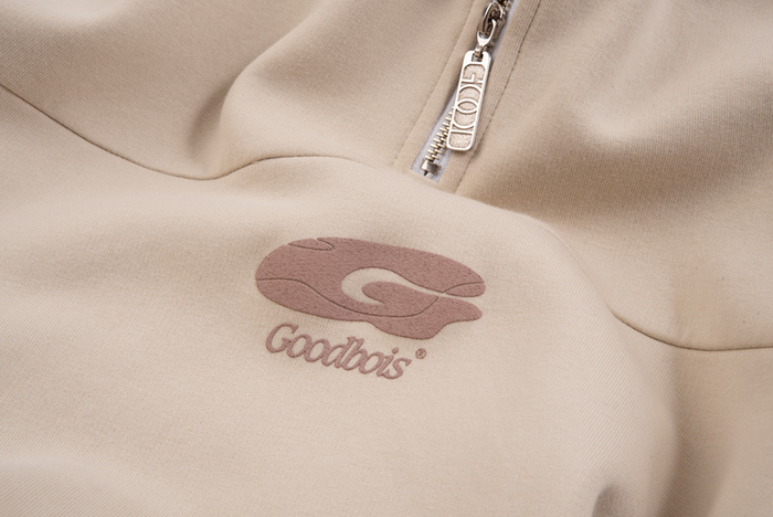
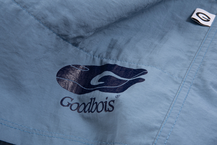
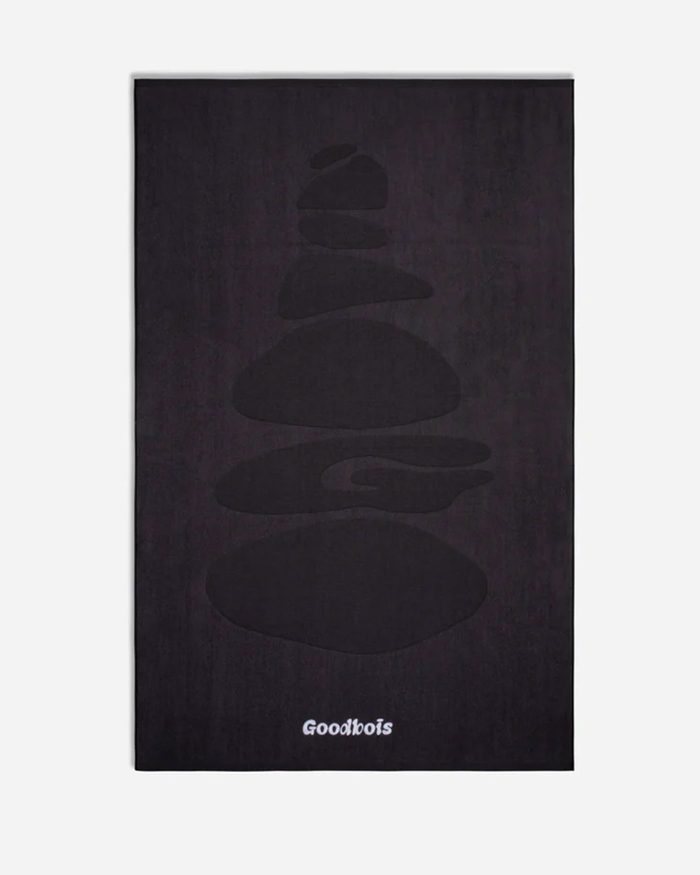
The lettering on most of the apparel is based on an upright style of Oakley and echoes the form of small rocks, akin to our prominent backprint where diverse stones harmoniously stack, symbolizing mutual support.
As for the second option, we've reintroduced the cherished classic Caxton. This reaffirms our brand’s identity and aligns with themes centered around the organic origins of nature’s elements.
To achieve the optimal cohesiveness for this collection’s CI, we’ve selected the timeless and neutral typeface Neufile Grotesk. This choice contributes to an overall design that is both contemporary and enduring
Goodbois. License: All Rights Reserved.
Goodbois. License: All Rights Reserved.
Goodbois. License: All Rights Reserved.
Goodbois. License: All Rights Reserved.
Goodbois. License: All Rights Reserved.

Goodbois. License: All Rights Reserved.
Goodbois. License: All Rights Reserved.
Goodbois. License: All Rights Reserved.
Goodbois. License: All Rights Reserved.
Goodbois. License: All Rights Reserved.
This post was originally published at Fonts In Use