The Good Food Guide 1972
Source: www.thegoodfoodguide.co.uk The Good Food Guid. License: All Rights Reserved.


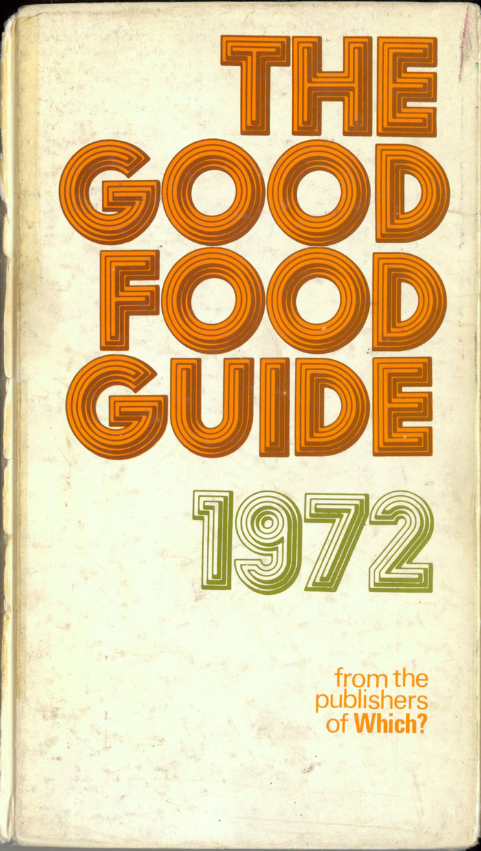
The Good Food Guide was first compiled by Raymond Postgate in 1951, and is “about empowering diners, helping readers to find the very best places to eat and encouraging restaurants to offer the best possible food, service and experience.” [Wikipedia]
The cover of the 1972 edition is adorned by a chromatic use of Stack. The aptly named display typeface was designed in 1969 by British designer Les Lawrence (b. 1945). Stack was initially released with Face Photosetting in London. Oher type providers soon adopted it, including by Photo-Lettering in New York and three manufacturers of dry transfer lettering, Letraset in England, Mecanorma in France, and Chartpak in the USA.
The guide was published by the Consumers’ Association, best known for their flagship publication Which? According to Paul Harpin in Eye magazine, “from 1964 to 1988 the title and its spin-offs were designed by Banks & Miles”. In his 2002 obituary for Colin Banks, James Alexander mentions the studio worked on Which? magazine and other CA magazines from 1964 until as late as 1993. Chances are Banks and Miles take credit for this typographic cover as well.
See also the cover for the previous edition, kindly contributed by James Alexander.
This post was originally published at Fonts In Use