German Design Council exhibition in Milan
Source: studiovedet.com Studio Vedèt.

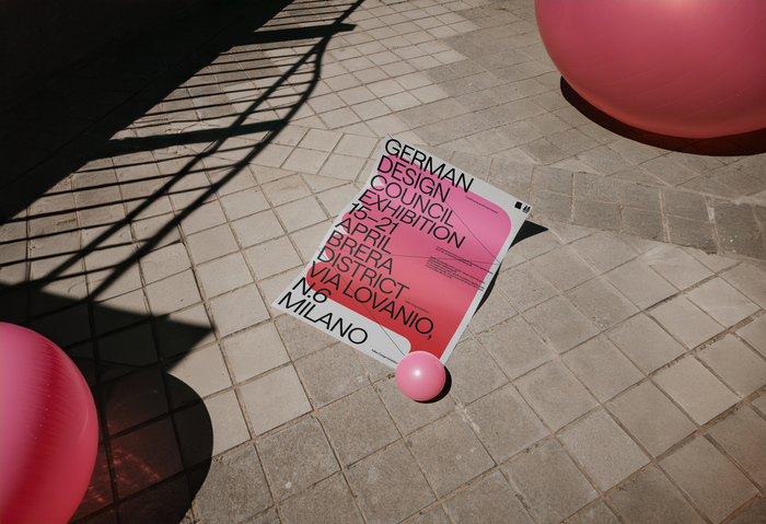
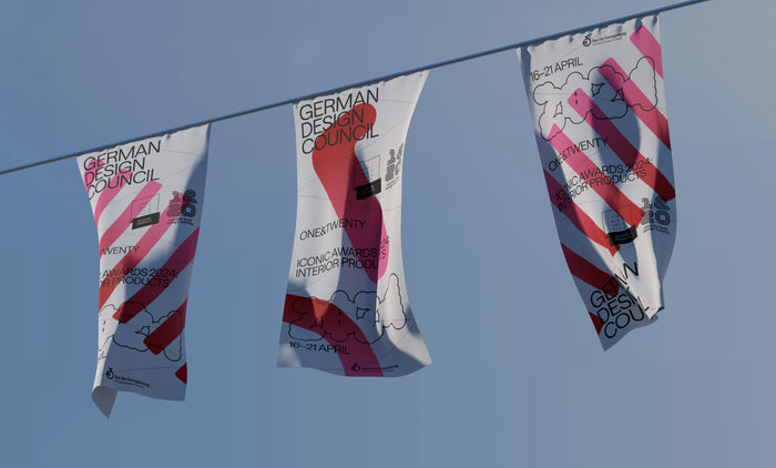
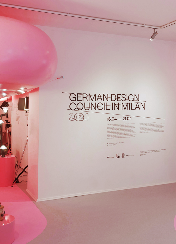
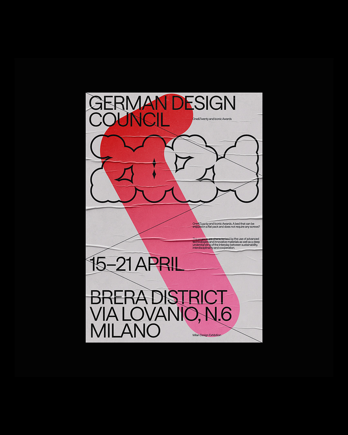
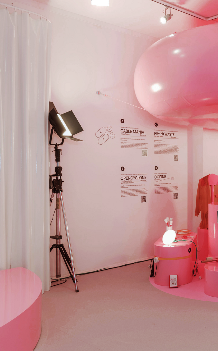
The visual identity for the German Design Council’s 2024 exhibition in Milan, Italy, embraces a dialogue between materiality and typography. The project plays with the contrast between Saans and Tiny, reflecting both the modernity of contemporary design and the soft, inflatable forms of the exhibition’s scenography.
Tiny, with its rounded, air-filled shapes, echoes the voluminous aesthetic of the space, establishing a playful yet structured typographic presence. In contrast, Saans introduces a sleek, modern touch, balancing the organic nature of Tiny with clean lines and a refined typographic rhythm.
This combination reinforces the exhibition’s duality – between experimentation and structure, between softness and precision – turning typography into an integral part of the spatial and graphic experience.
Source: studiovedet.com Studio Vedèt.
Source: studiovedet.com Studio Vedèt.
Source: studiovedet.com Studio Vedèt.
Source: studiovedet.com Studio Vedèt.
This post was originally published at Fonts In Use