Gemeinschaft Immanuel e.V.
Published February 13, 2026
By FontsInUse
Contributed by Dave Dennenmoser

Photo: Dave Dennenmoser. Dave Dennenmoser for Gemeinschaft Immanuel e.V. License: All Rights Reserved.


Photo: Dave Dennenmoser. Dave Dennenmoser for Gemeinschaft Immanuel e.V. License: All Rights Reserved.
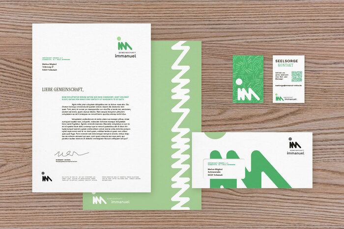
Photo: Dave Dennenmoser. Dave Dennenmoser for Gemeinschaft Immanuel e.V. License: All Rights Reserved.
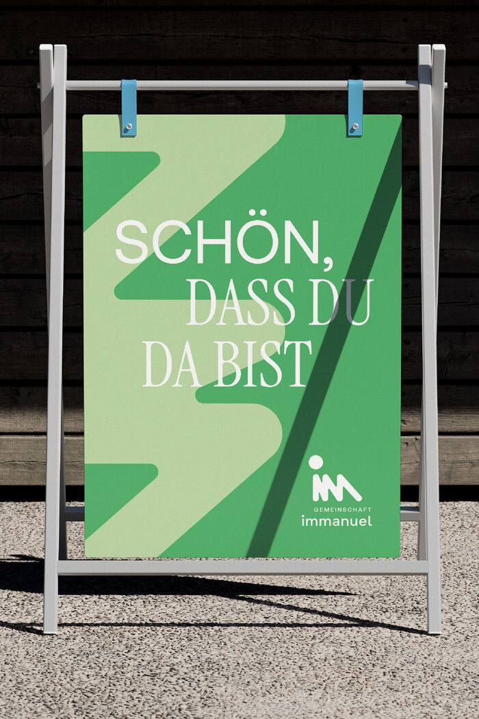
Photo: Dave Dennenmoser. Dave Dennenmoser for Gemeinschaft Immanuel e.V. License: All Rights Reserved.

Photo: Dave Dennenmoser. Dave Dennenmoser for Gemeinschaft Immanuel e.V. License: All Rights Reserved.
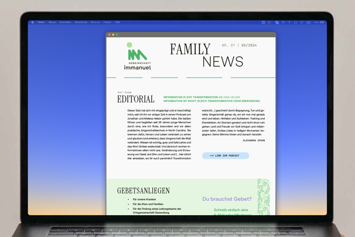
Photo: Dave Dennenmoser. Dave Dennenmoser for Gemeinschaft Immanuel e.V. License: All Rights Reserved.
This post was originally published at Fonts In Use
Photo: Dave Dennenmoser. Dave Dennenmoser for Gemeinschaft Immanuel e.V. License: All Rights Reserved.
This project involves a complete redesign of Gemeinschaft Immanuel e.V. – a Catholic community in Germany. The logo is based on the letters “iMM” and the idea that, if we focus on the things that unify rather than divide us, we move closer together. From this concept and the values of the community, the overall design language was developed.
Rather than relying solely on photography, typography plays a vital role in the design language. Aeonik is used as the default font, combined with the condensed and soft Instrument Serif. It is complemented by the monospaced JetBrains Mono on informational details, an intentional touch that simplifies the modification of dates and times.
Photo: Dave Dennenmoser. Dave Dennenmoser for Gemeinschaft Immanuel e.V. License: All Rights Reserved.
Photo: Dave Dennenmoser. Dave Dennenmoser for Gemeinschaft Immanuel e.V. License: All Rights Reserved.
Photo: Dave Dennenmoser. Dave Dennenmoser for Gemeinschaft Immanuel e.V. License: All Rights Reserved.
Photo: Dave Dennenmoser. Dave Dennenmoser for Gemeinschaft Immanuel e.V. License: All Rights Reserved.
Photo: Dave Dennenmoser. Dave Dennenmoser for Gemeinschaft Immanuel e.V. License: All Rights Reserved.
This post was originally published at Fonts In Use
Read full story.
WRITTEN BY
FontsInUse
An independent archive of typography.
More from FontsInUse