Bålder Quartet
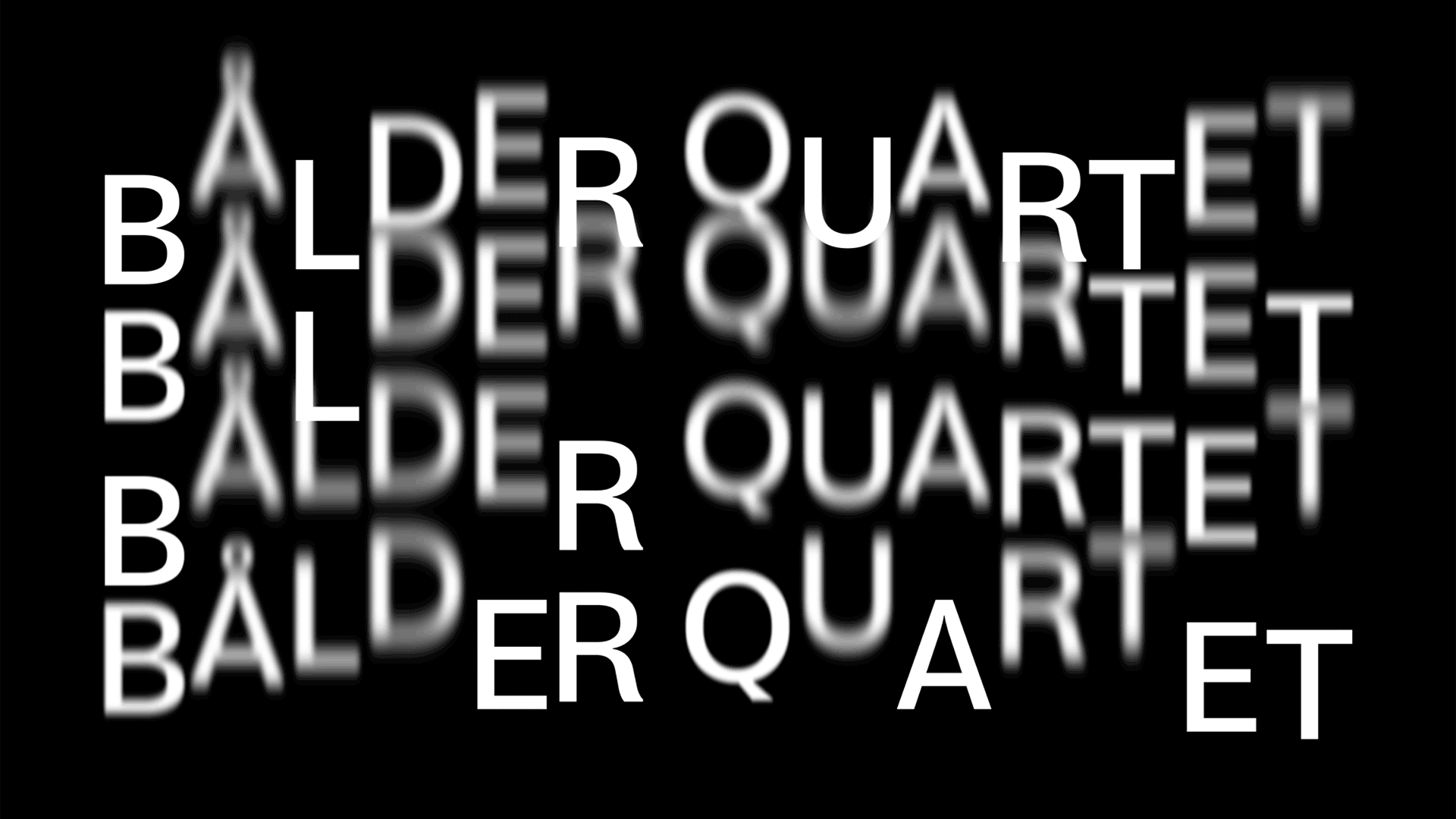
Photo: David Matos. License: All Rights Reserved.


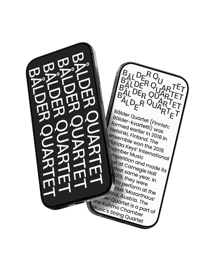
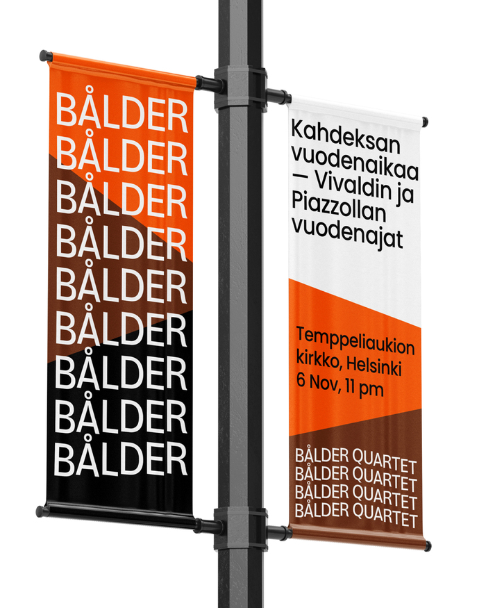
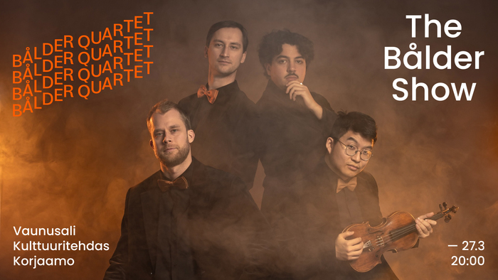
Bålder Quartet is a Finnish string quartet playing classical music together since their launch in 2018. In January 2026 they revealed a new visual identity, designed by David Matos / Shutupandance using Poppins throughout, plus Bloyd for the logo.
The stacked lines symbolise the core composition of a string quartet. It alludes to the two violins, the viola and the cello (and, by extension, the four musicians). Each line can also be seen as representing the four strings, common to all instruments in the quartet.
The logotype can take on different shapes by shifting characters, together or individually, along their vertical axis (i.e. baseline), evoking the sensation of sound, music, and rhythm. It can be animated in several ways — for example, reacting to sound as a backdrop projection in live settings.
.
License: All Rights Reserved.
License: All Rights Reserved.
License: All Rights Reserved.
This post was originally published at Fonts In Use