Batman: The Animated Series, season 1 episode title cards

License: All Rights Reserved.


From Paul Dini & Chip Kidd’s Batman Animated (1998):
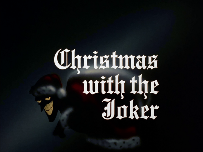
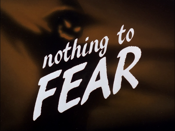
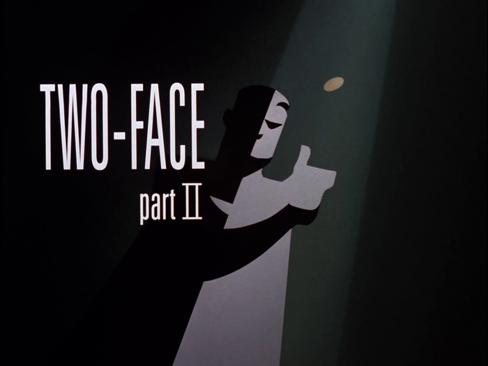
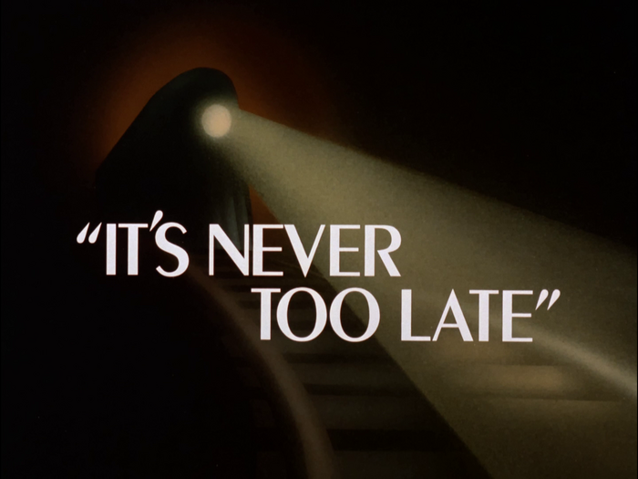
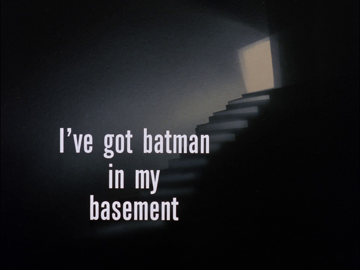
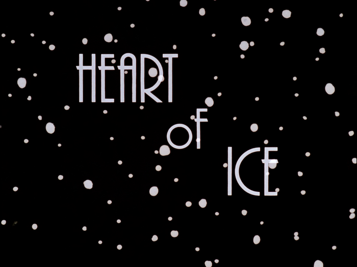
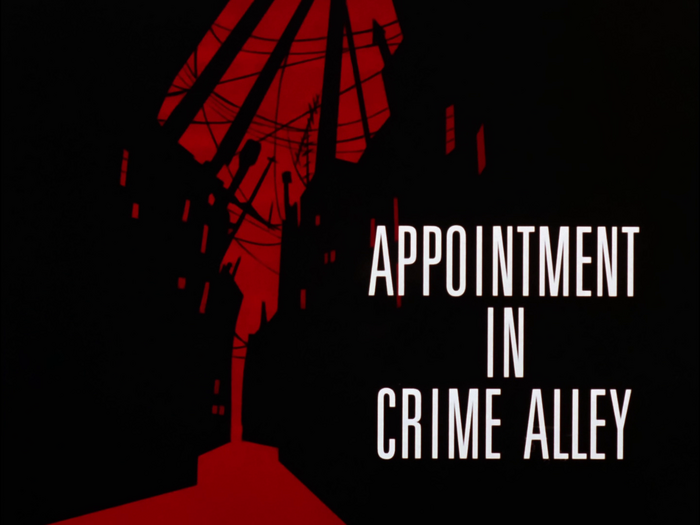
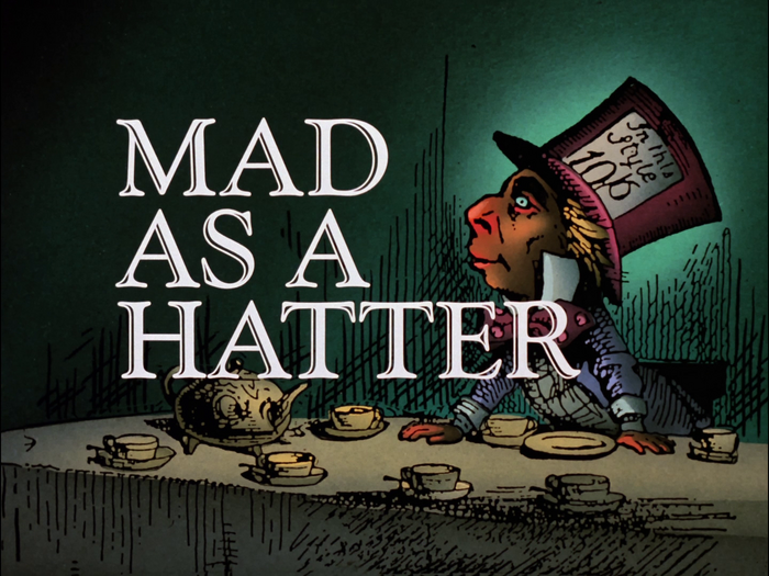
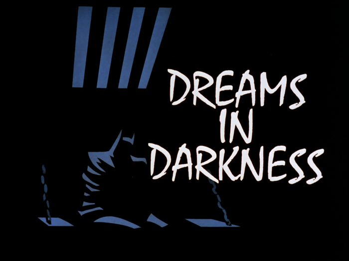
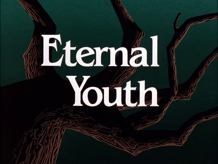
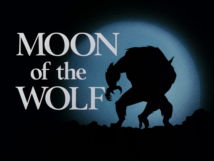
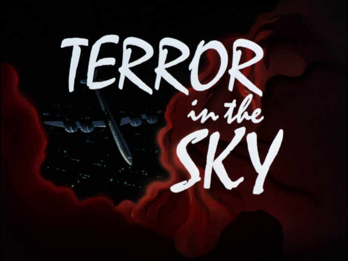
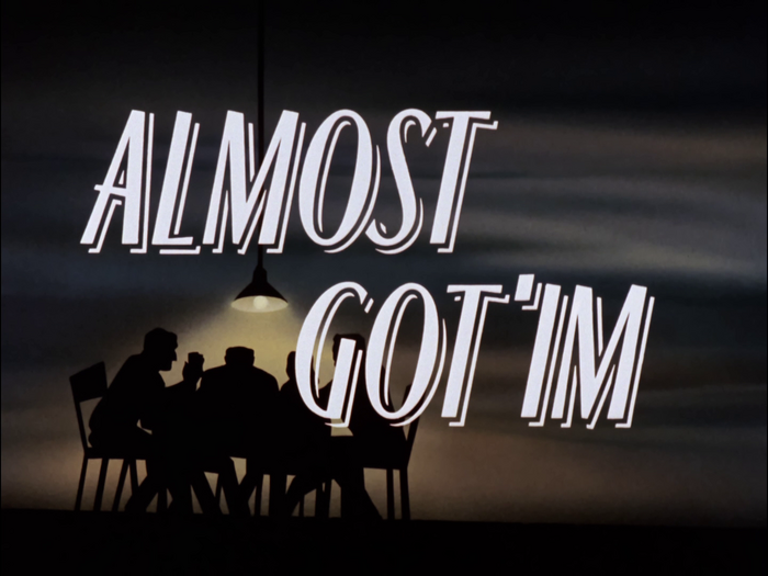
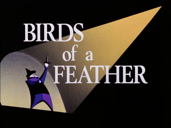
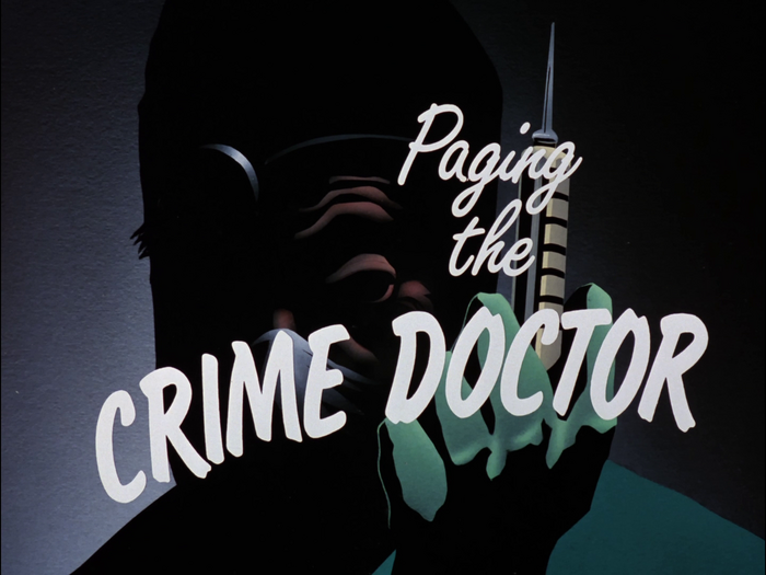
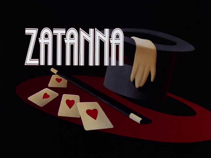
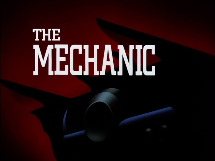
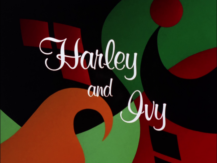
These imaginatively rendered title cards were a high point of each Batman episode. While some (like “Harley’s Holiday” and “Time out of Joint”) were character portraits, most often the cards depicted an emotional impression of the given episode’s theme. According to Eric Radomski, who designed many of the cards, “Going with the overall retro-forties feel we were giving the show, we wanted to treat the episodes as mini-movies. The title cards allowed us to create great drama in a very subtle fashion. It was a process of trying to capture what the overall episode was, and not just show a scene or moment from it.”
Most of the title cards of Batman: The Animated Series’ first season (which first aired in 1992–1993) use fonts that were available from Letraset.
See also the post on the series’ logos.
License: All Rights Reserved.
License: All Rights Reserved.

License: All Rights Reserved.
License: All Rights Reserved.
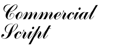
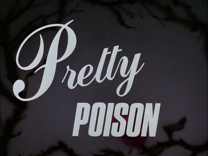
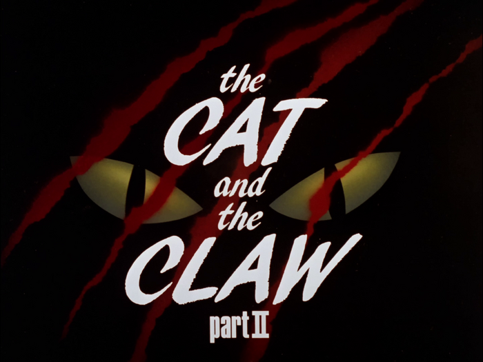
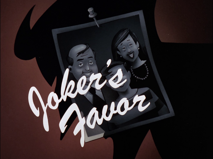
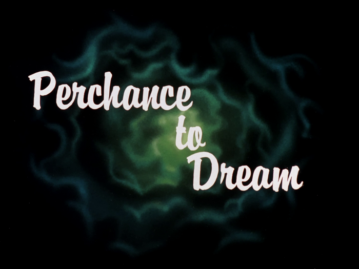
Commercial Script and Compacta Italic
License: All Rights Reserved.
License: All Rights Reserved.
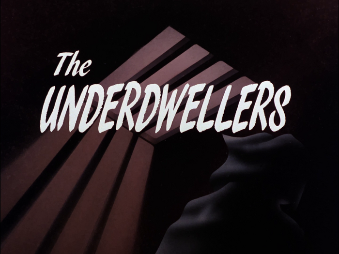
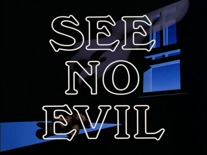
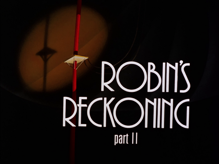
Cable (Kabel) Light
License: All Rights Reserved.

License: All Rights Reserved.
License: All Rights Reserved.
License: All Rights Reserved.
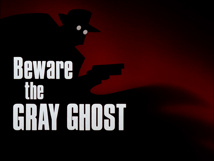
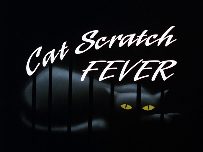
Peignot Medium
License: All Rights Reserved.
License: All Rights Reserved.
License: All Rights Reserved.
License: All Rights Reserved.
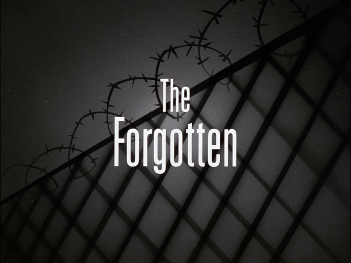
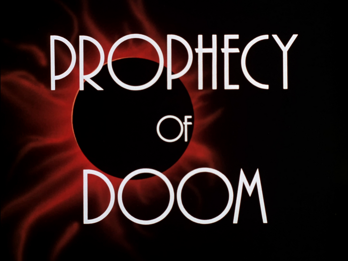
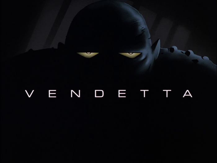
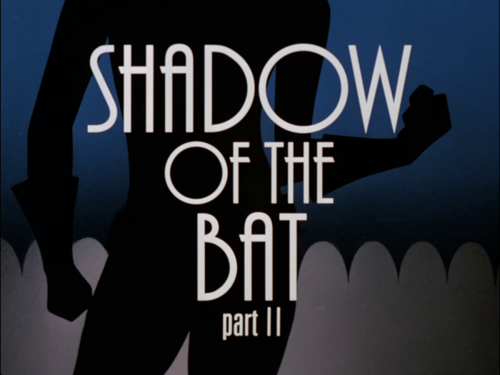
Windsor Bold Outline
License: All Rights Reserved.
License: All Rights Reserved.

License: All Rights Reserved.
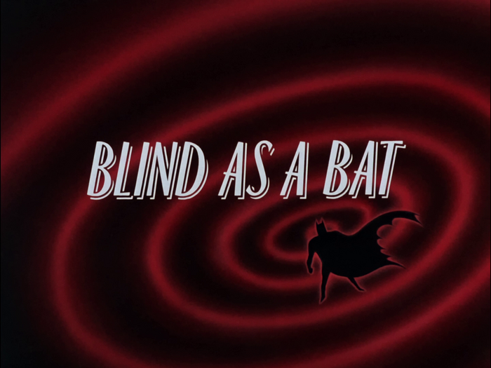
Peignot Medium
License: All Rights Reserved.
License: All Rights Reserved.
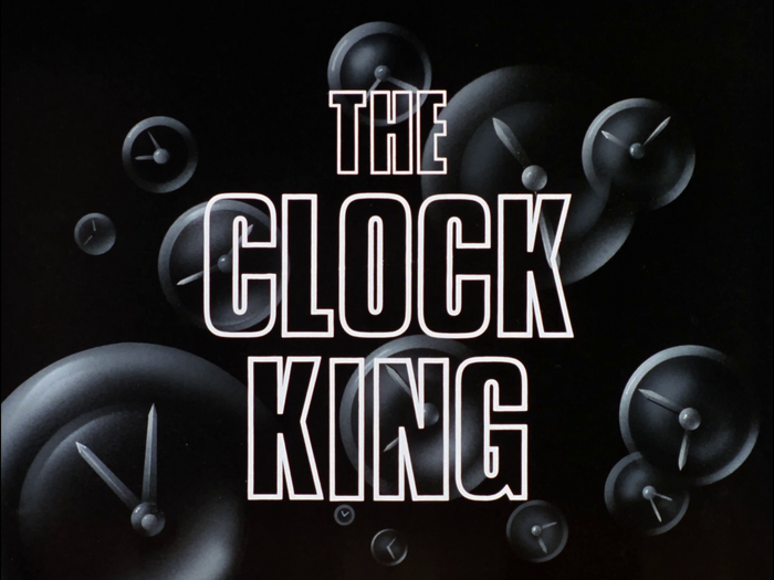
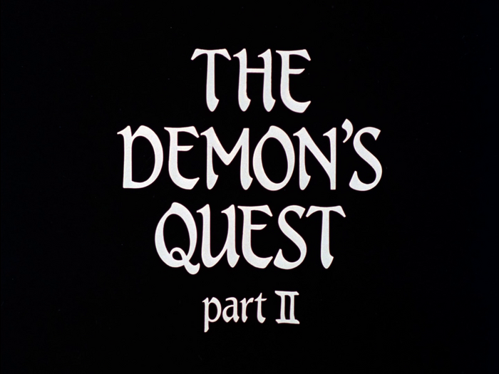
Microgramma Medium Extended
License: All Rights Reserved.
License: All Rights Reserved.
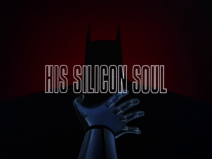
Compacta Bold Outline
License: All Rights Reserved.
License: All Rights Reserved.
License: All Rights Reserved.
License: All Rights Reserved.
License: All Rights Reserved.

License: All Rights Reserved.
License: All Rights Reserved.
Plaza and Univers 49
License: All Rights Reserved.
License: All Rights Reserved.
License: All Rights Reserved.
License: All Rights Reserved.
License: All Rights Reserved.

License: All Rights Reserved.
License: All Rights Reserved.
License: All Rights Reserved.
Berling Bold

License: All Rights Reserved.
License: All Rights Reserved.
License: All Rights Reserved.
License: All Rights Reserved.
Berling Bold
License: All Rights Reserved.
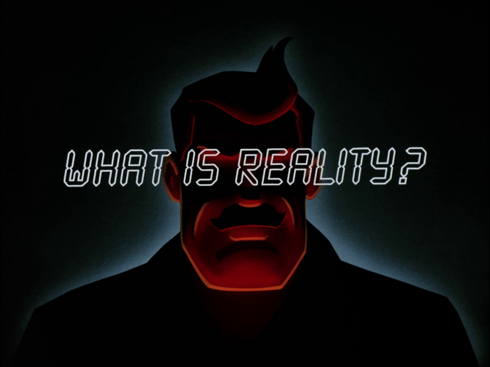
LCD Outline
License: All Rights Reserved.
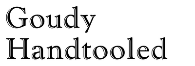
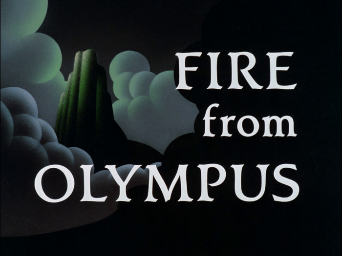
Cloister Bold
License: All Rights Reserved.

License: All Rights Reserved.
Helvetica Extra Light and Medium
License: All Rights Reserved.
License: All Rights Reserved.
License: All Rights Reserved.
Plaza Inline
License: All Rights Reserved.
City Medium
License: All Rights Reserved.
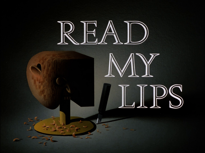
Murray Hill Bold
License: All Rights Reserved.
Plaza and Univers 49
License: All Rights Reserved.
License: All Rights Reserved.
License: All Rights Reserved.
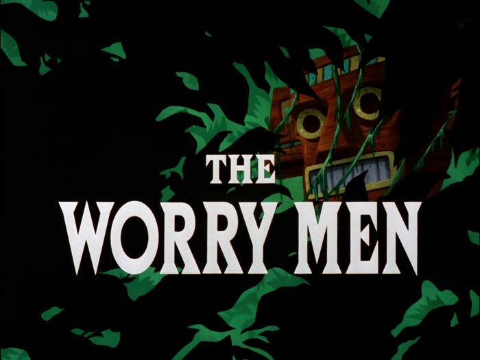
Compacta Outline
License: All Rights Reserved.
Titus Medium
License: All Rights Reserved.
License: All Rights Reserved.
This post was originally published at Fonts In Use