Gelau – Gelato Sardo
Source: gb22.it GB22. License: All Rights Reserved.

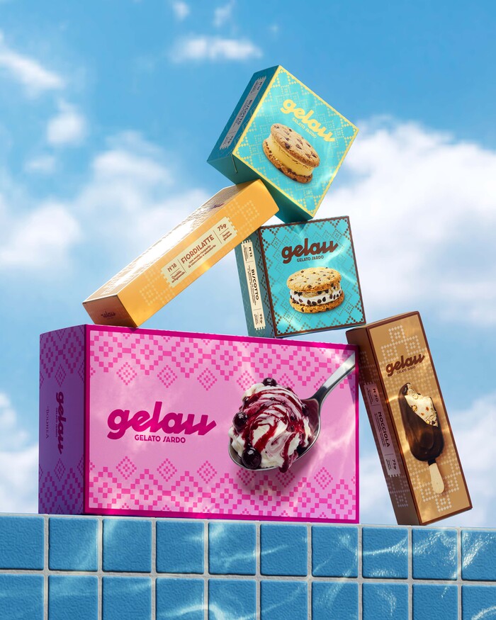
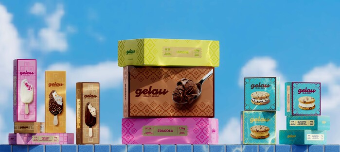
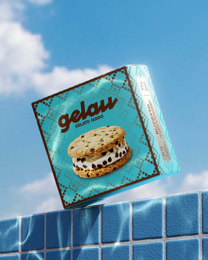
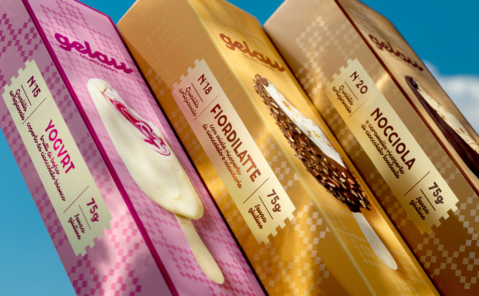
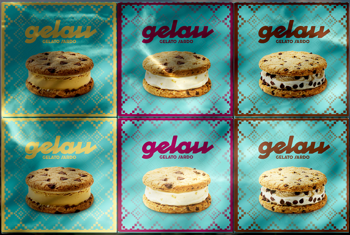
Gelau is a Sardinian gelato brand that brings a sunny, artisanal and deeply local imagination to the frozen dessert world. Its range includes gelato sandwiches, sticks and tubs, creating a broad yet recognizable offer designed to highlight taste, quality and origin.
The project built a brand system capable of bringing identity, packaging and communication together under one idea: tastier than sweet. A simple yet distinctive promise that shifts the story of gelato from sweetness alone to the quality of taste, the richness of ingredients and the pleasure of the experience. The strategy treats Sardinian identity as a contemporary value, not a folkloric one: a recognizable origin, reinterpreted through a fresh, pop and immediate language. Communication follows the same direction, turning the product into a brand with personality: direct, ironic and sensory, able to speak with lightness without losing credibility.
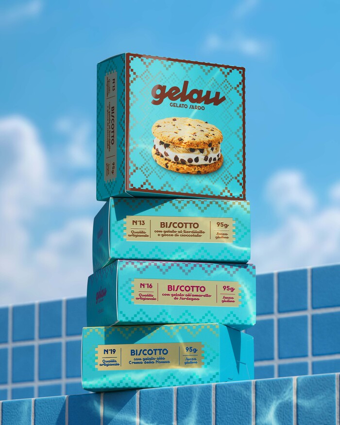
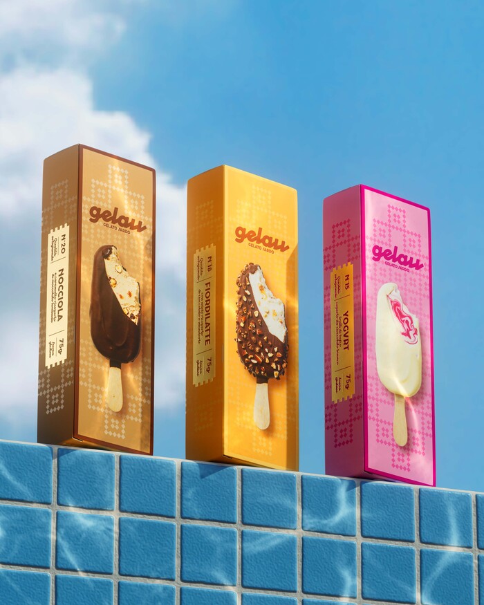
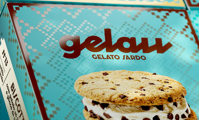
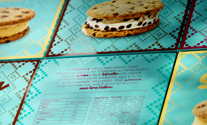
The visual identity, developed by GB22, is born from the meeting of tradition and appetite appeal. Geometric patterns, inspired by Sardinian textile imagery, become a modular sign that runs across packaging and communication materials, creating continuity between product, territory and brand. The packaging system organizes flavors and formats through vibrant colors, clear codes and high-impact product imagery, putting texture, creaminess and ingredients at the center. Each pack follows a numbered nomenclature that creates a sense of seriality across the range, while the back panel gives every flavor its own story, rooted in the Sardinian territory and its ingredients. Production details further elevate the system: each pack features a gold-paste printed cartouche with embossing, adding a tactile and premium feel to the product information area. The Sardinian graphic pattern is enhanced with UV varnish, turning a cultural reference into a distinctive visual and material element.
Communication extends the same language in the typographic direction: Cocosignum by Zetafonts is used both for the logo and the bold headlines, creating a strong visual typographic rhythm and an ironic tone, building a voice that is consistent with the brand promise.
The result is a fresh, distinctive and flexible brand system, able to make Sardinian gelato feel contemporary, memorable and desirable.
Source: gb22.it GB22. License: All Rights Reserved.
Source: gb22.it GB22. License: All Rights Reserved.
Source: gb22.it GB22. License: All Rights Reserved.
Source: gb22.it GB22. License: All Rights Reserved.
Source: gb22.it GB22. License: All Rights Reserved.
Source: gb22.it GB22. License: All Rights Reserved.
Source: gb22.it GB22. License: All Rights Reserved.
Source: gb22.it GB22. License: All Rights Reserved.
The small print including ingredients and nutrition facts is set in Chillax.
This post was originally published at Fonts In Use