Finemateria visual identity
Source: www.superness.info Photo: Superness. License: All Rights Reserved.

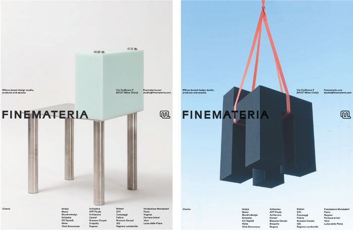
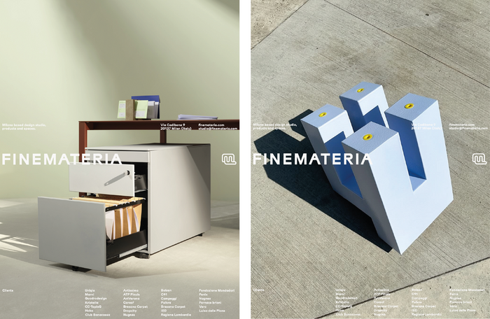
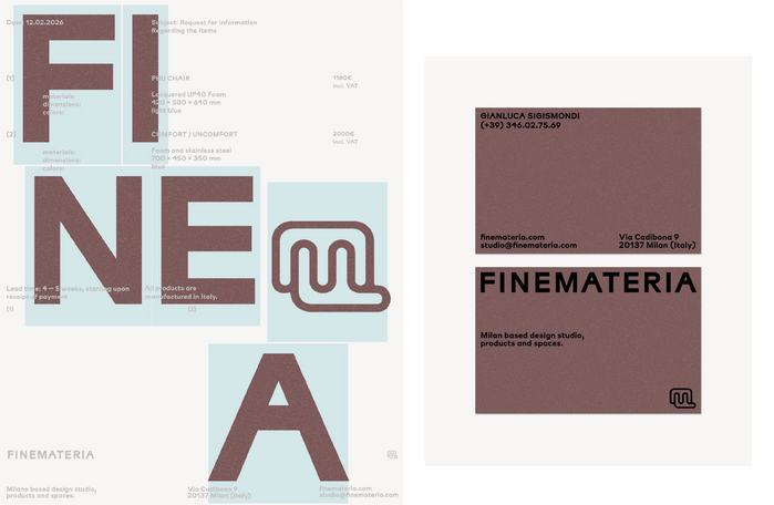
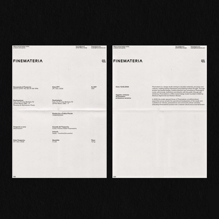
Finemateria is a Milan-based design studio founded in 2020 by Gianluca Sigismondi and Stefano Bassan.
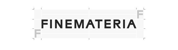
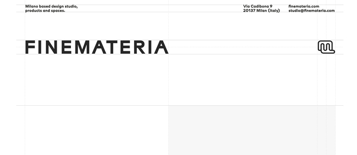
The Finemateria logotype features a custom version of Superness Modulo, a design that comes from a group of well known Milanese graphic designers. Modulo is a digital version of Nebiolo’s unreleased attempt to create a radical modular design based on mathematical ratio. It features almost no contrast overall and has a solid appearance that create a sense of established firm, static, neutral and solid.
Modulo is the core typefamily. All weights are used if needed, but the bold cut is the default voice of the identity. Overall the spacing is crafted to giving extra space between each glyphs and enhancing a unique – both strong yet relaxed – flavor.
The identity application is plain and self-aware, conceived as a flexible framework capable of show carefully crafted and well-defined projects, each distinct in character. The visual approach is paired with dusty, low-saturation tones, allowing the materic quality of the printed matter to emerge, so as to highlight the attention that Finemateria dedicates to materials, enhanced through a precise and thoughtful photographic perspective.

Source: www.superness.info Photo: Superness. License: All Rights Reserved.
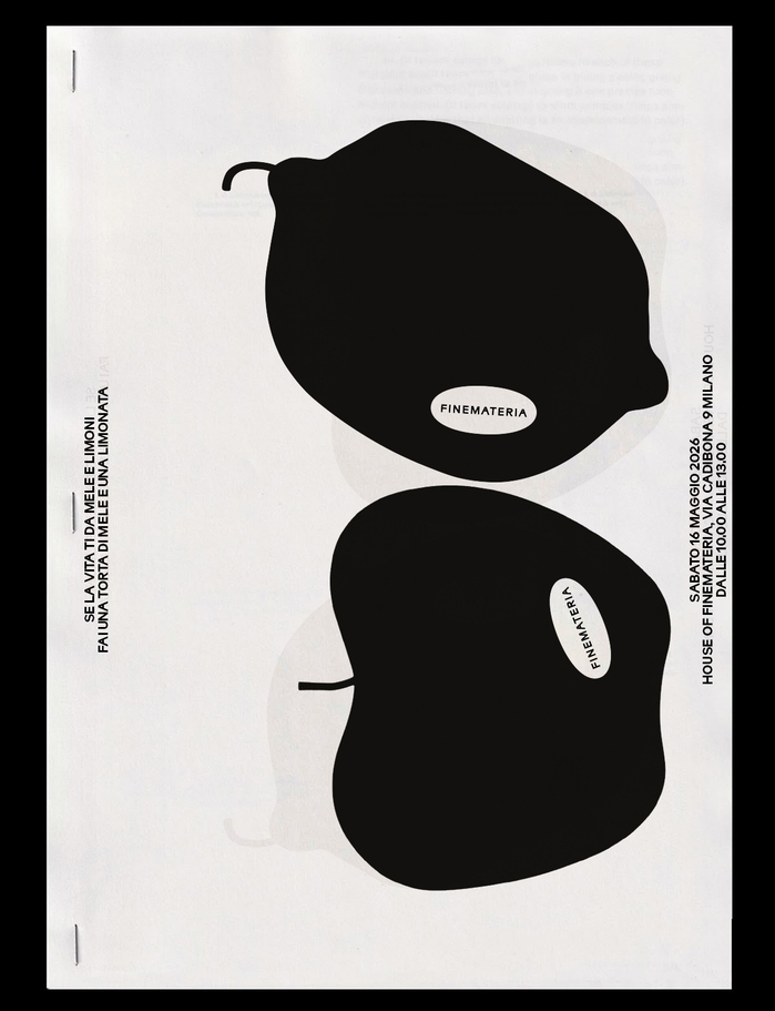
Photo: Superness. License: All Rights Reserved.
Source: www.superness.info Photo: Superness. License: All Rights Reserved.
Source: www.superness.info Photo: Superness. License: All Rights Reserved.
Source: www.superness.info Photo: Superness. License: All Rights Reserved.
Source: www.superness.info Photo: Superness. License: All Rights Reserved.
Source: www.superness.info Photo: Superness. License: All Rights Reserved.

Photo: Superness. License: All Rights Reserved.
This post was originally published at Fonts In Use