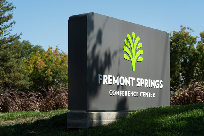
Fremont Springs Conference Center

Source: eaxelson.com Eric Axelson Studio. License: All Rights Reserved.

Located in a historic district within Fremont, California, Fremont Springs Conference Center is a modern facility for churches to conduct conferences and regional events. After the property was purchased and renovations to the existing building were nearing completion, they recognized the need for a logo and identity to properly represent the conference center. Fremont Springs partnered with Eric Axelson Studio to develop a visual identity system to help the facility come alive.
The visual identity was thoughtfully crafted after extensive research into the history of the city of Fremont, particularly the Warm Springs district. We soon discovered that it was once home to renowned hot springs, which quickly became the conference center’s theme. In the 1800s, many flocked to the springs to bathe in the healing waters to find rest and relief. Our hope was that the center would also carry the same sentiment.
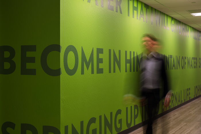
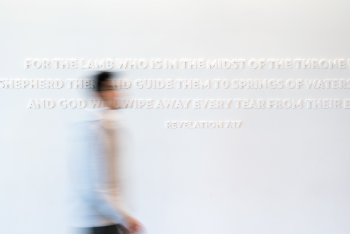
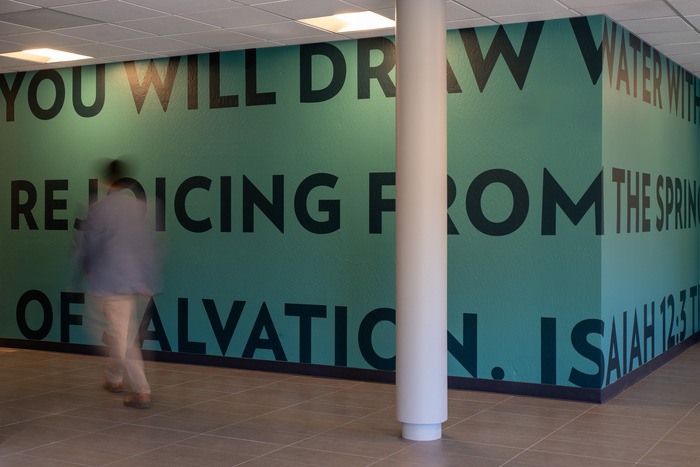
Springs are also significant in the Bible and are used as a metaphor to represent salvation, satisfaction, and refreshment. John 4:14 says, “But whoever drinks of the water that I will give him shall by no means thirst forever, but the water that I will give him will become in him a fountain of water springing up into eternal life.” With all of this before us, we knew this would be an integral part of the center’s visual identity.
In addition, we found that some of the city’s most important landmarks are trees cultivated by its early pioneers, including the olive trees that lived near the conference center. These trees provide a rich heritage and a vital link to the city’s past. They reference a point in time, especially for the younger generation, on “where we’ve been, where we are, and where we’re going.” Today, these trees play a significant role in providing and maintaining a future identity with the community, making it an appropriate and fitting direction for the logo.
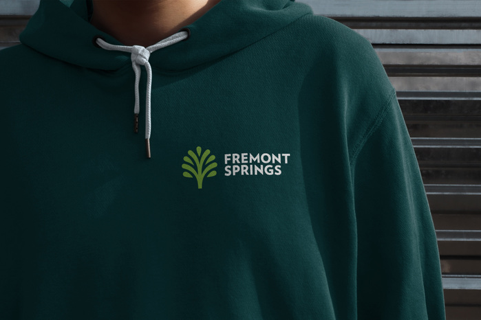
After hundreds of sketches, we landed on a simple yet iconic design concept that pointed to the name – a tree representing the city of Fremont and the depiction of water portraying a spring.
Two typefaces were selected for the brand – Verlag and Archer (not shown here). Verlag is a friendly and approachable sans serif that retains some of the same organic shapes found in the logomark, making it a suitable complement. Archer’s rolling ball terminals lend the typeface much warmth and character.
Source: eaxelson.com Eric Axelson Studio. License: All Rights Reserved.
Source: eaxelson.com Eric Axelson Studio. License: All Rights Reserved.
Source: eaxelson.com Eric Axelson Studio. License: All Rights Reserved.
Source: eaxelson.com Eric Axelson Studio. License: All Rights Reserved.
Source: eaxelson.com Eric Axelson Studio. License: All Rights Reserved.
This post was originally published at Fonts In Use