The Forever War by Joe Haldeman (Weidenfeld & Nicolson)
Published February 3, 2024
By FontsInUse
Contributed by Florian Hardwig
Source: talesfromweirdland.tumblr.com License: All Rights Reserved.


Source: www.abebooks.com Alcuin Books. License: All Rights Reserved.
This post was originally published at Fonts In Use
Source: talesfromweirdland.tumblr.com License: All Rights Reserved.
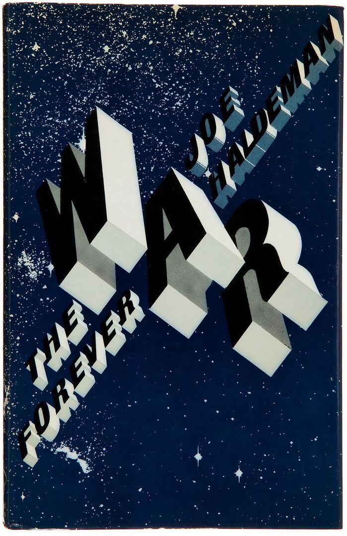
A spectacular jacket design for the first British edition of The Forever War, published in fall 1975 by Weidenfeld & Nicolson.
Designer Nick Sutton started with Tony Wenman’s Buster, a 1972 Letraset face with perspective caps. He inverted the shadow-only glyphs, gave them dimensional bodies, and rotated them by about 55 degrees to the left. Now they seem to float in space; an illusion that is intensified by the big overlapping “WAR” letters (backwards rotalics!) and the implied stars in the speckled background.
Source: www.abebooks.com Alcuin Books. License: All Rights Reserved.
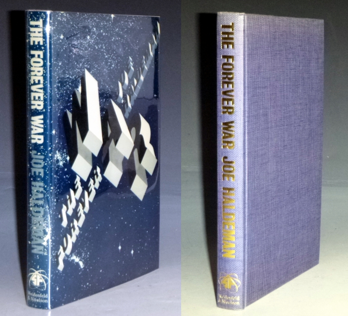
The spine lettering is in all-caps Grotesque No. 9.
This post was originally published at Fonts In Use
Read full story.
WRITTEN BY
FontsInUse
An independent archive of typography.
More from FontsInUse