First Lady boat tour

Source: span.studio Span. License: All Rights Reserved.

For nearly a century, Mercury Cruises and First Lady have offered Chicago’s most iconic waterway experiences. Most notably, they partnered with the Chicago Architecture Center to create the world-renowned Chicago Architecture Center River Cruise aboard First Lady. Now considered the No. 1 boat tour in the country.
Despite pedigree, both boat operators faced a shifting landscape as the Chicago River became increasingly crowded with competitors. They brought on Nick Adam’s team at Span to help chart a new course, refining their position and crafting a brand that honors their 90-year legacy. The goal: to set a new standard for Chicago’s cultural and tourism landscape.
Span began by simplifying the name. From Chicago’s First Lady Cruiseline and Mercury Skyline Cruises, to the more resonant, flexible First Lady. From there, we developed a visual identity that bridges heritage and modernity. Channeling both the utility of the working river and the refined character of the vessels themselves.
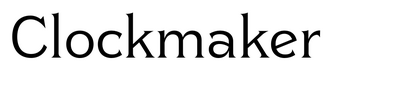
At the heart of the new identity is a custom logotype based on Clockmaker, a lavish typeface inspired by Elandkay and the architectural lettering traditions of Louis Sullivan and Frank Lloyd Wright. We refined its letterforms to merge Victorian curves, Art Nouveau grace, Prairie-style form, and Art Deco precision—creating a typographic expression of Chicago’s rich design lineage. A signature swash numeral 1 flows like waves and wind, integrating seamlessly into the logotype or standing alone as a monogram. Paired with Euchre, a Chicago-designed typeface full of charm and sparkle, the system balances Midwestern elegance and grandeur with a tone that feels sophisticated yet approachable.
The vessels’ signature green and gold livery became the foundation of the refreshed color palette—elevated, amplified, and extended system-wide. We designed a suite of decorative plaque borders, intricate rule lines, and custom guilloché patterns that evoke both water and currency—offering a sense of timeless craft and detail.

Source: span.studio Span. License: All Rights Reserved.

Source: span.studio Span. License: All Rights Reserved.

Source: span.studio Span. License: All Rights Reserved.

Source: span.studio Span. License: All Rights Reserved.

Source: span.studio Span. License: All Rights Reserved.

Source: span.studio Span. License: All Rights Reserved.

Source: span.studio Span. License: All Rights Reserved.

Source: span.studio Span. License: All Rights Reserved.

Source: span.studio Span. License: All Rights Reserved.

Source: span.studio Span. License: All Rights Reserved.

Source: span.studio Span. License: All Rights Reserved.

Source: span.studio Span. License: All Rights Reserved.

Source: span.studio Span. License: All Rights Reserved.

Source: span.studio Span. License: All Rights Reserved.

Source: span.studio Span. License: All Rights Reserved.

Source: span.studio Span. License: All Rights Reserved.

Source: span.studio Span. License: All Rights Reserved.
This post was originally published at Fonts In Use