FIMU Belfort Festival 2026
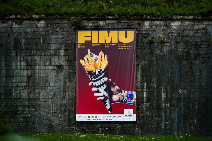
Photo: Benjamin Puddu. License: All Rights Reserved.


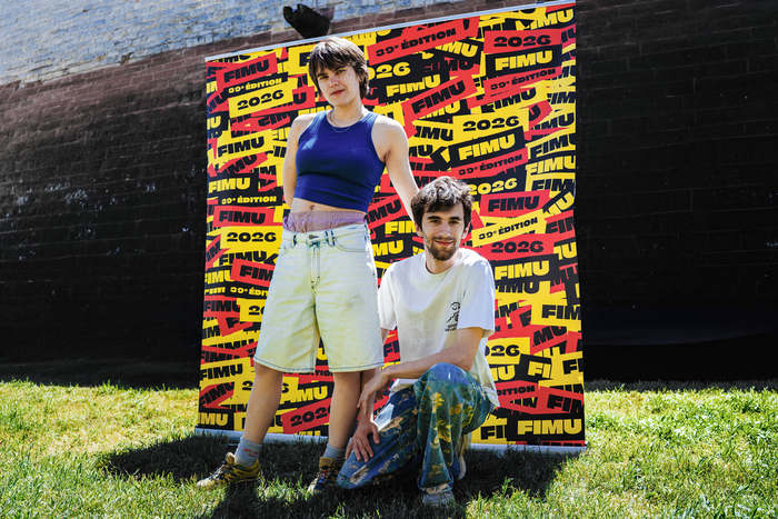
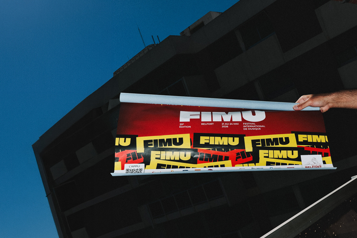
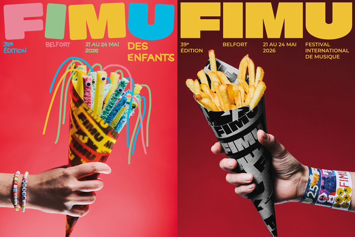
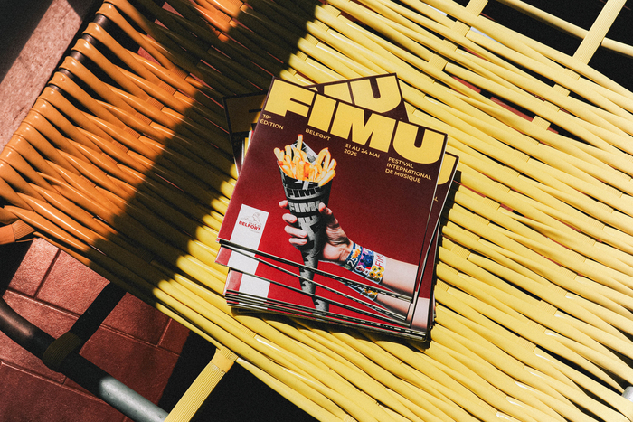
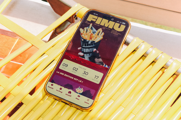
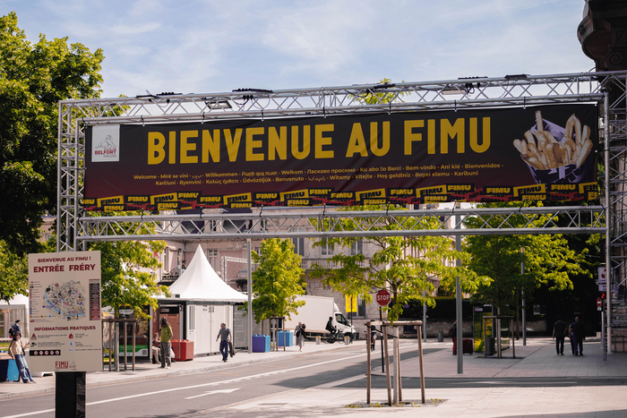
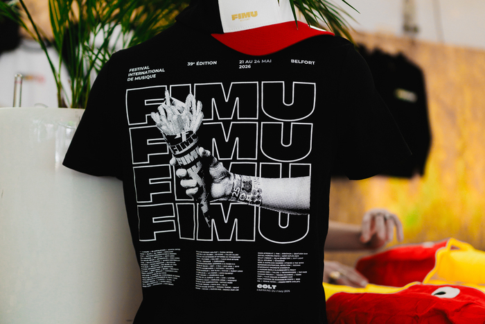
For its 39th edition, the Festival International de Musique de Belfort (FIMU) – which draws over 100,000 festival-goers and 1,000 international artists each year – honors Belgium with a quirky, advertising-inspired visual identity. Conceived by me, art director and graphic designer Benjamin Puddu, the concept revisits the traditional cone of French fries. Treated as an iconic object, this popular symbol captures the festival’s energy without falling into literal folklore. The colors of the Belgian flag structure the composition, while the inclusion of wristbands from past editions weaves a link to the event's history.
The poster is the result of a close collaboration between me and IGO Studio (Steven Mazzola and Coline Munier). Known for their sculptural and meticulous approach to still life, the duo focused on authentic materiality in the face of omnipresent AI. In contrast to algorithmic visuals, the image comes from a 100% real studio production using deliberate flash lighting. This technical choice heightens the visual impact of this free festival, while adopting a frontal aesthetic that underscores the absurdity of the staging. To bring this universe to life across all touchpoints, graphic designers Sarah Not and Barbee meticulously handled the entire graphic rollout and layout adaptations.
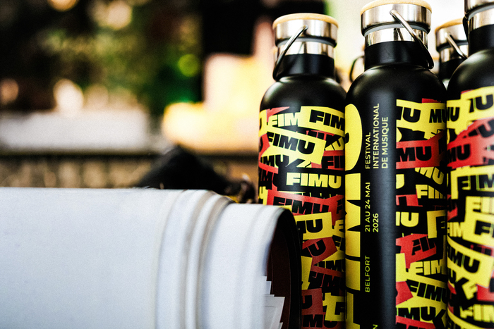
On the typography front, the choice of Julieta Ulanovsky’s Montserrat responds to a need for clarity and power. Inspired by the urban signage of Buenos Aires, this geometric sans-serif eliminates all artifice. Its rational structure resonates perfectly with the almost commercial treatment of the photograph. Universal and robust, its raw neutrality offers an ideal counterpoint to the image, anchoring FIMU within a sustainable and coherent art direction for all audiences.
The visual universe is also adapted into a children’s version with a more playful tone. The typographic block adjusts: Montserrat becomes rounded and the letters of the word FIMU shift to create a freer rhythm. Secondary information adopts a handwritten style evoking children's writing, while the color palette swaps vivid tones for four pastel shades, all while maintaining the aesthetic rigor of the main poster.
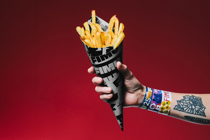
IGO STUDIO. License: All Rights Reserved.
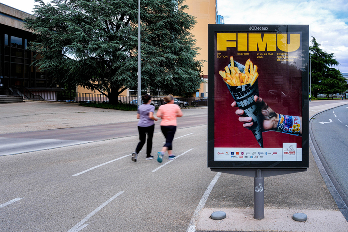
Benjamin Puddu. License: All Rights Reserved.
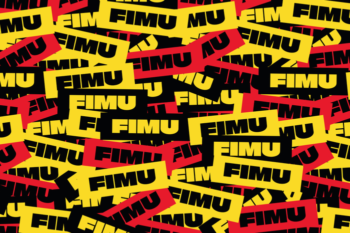
Benjamin Puddu. License: All Rights Reserved.
Nathan Fabry. License: All Rights Reserved.
IGO Studio. License: All Rights Reserved.
Nathan Fabry. License: All Rights Reserved.
Benjamin Puddu. License: All Rights Reserved.
IGO Studio. License: All Rights Reserved.
IGO Studio. License: All Rights Reserved.
Nathan Fabry. License: All Rights Reserved.
Nathan Fabry. License: All Rights Reserved.
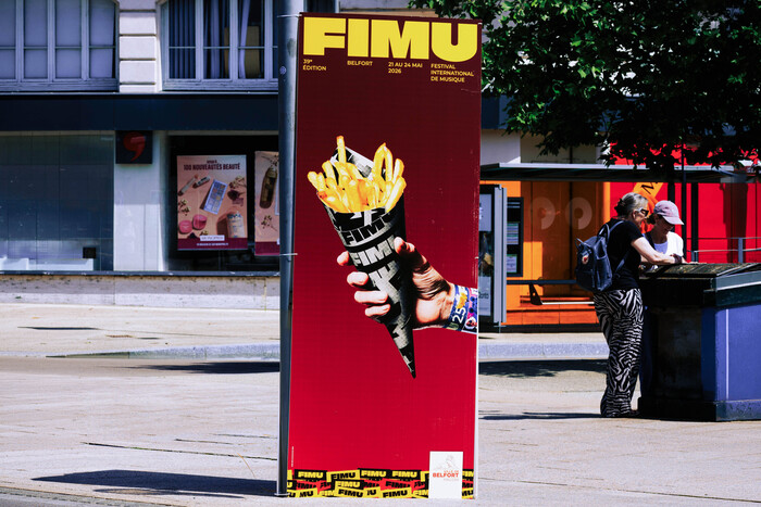
Nathan Fabry. License: All Rights Reserved.
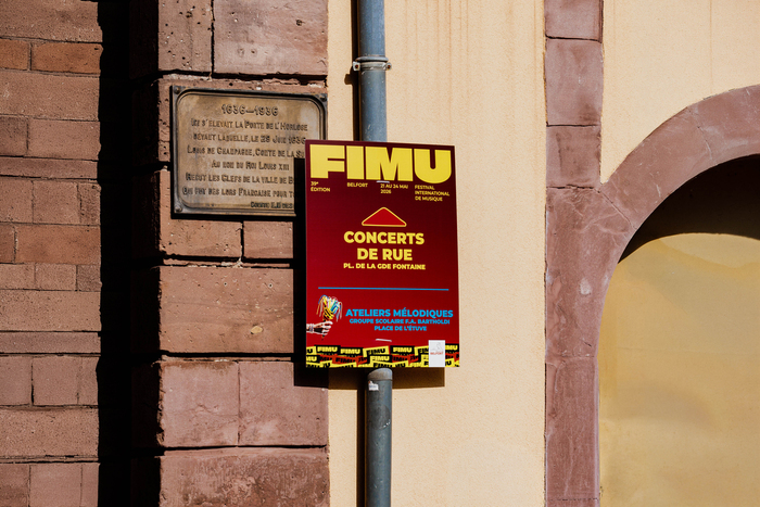
Nathan Fabry. License: All Rights Reserved.
This post was originally published at Fonts In Use