Falter website
Source: christophrauscher.de Christoph Rauscher. License: All Rights Reserved.



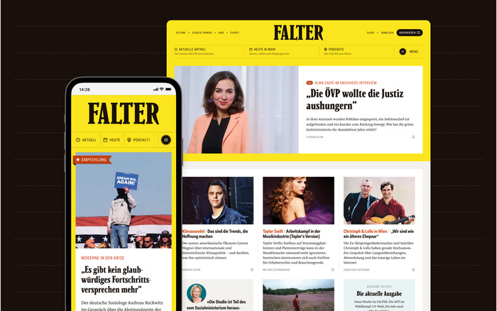
Falter is a liberal, left-leaning Viennese weekly newspaper that covers politics and culture. This long-standing publication has recently made a successful shift in focus from print to the web. A comprehensive relaunch of the website was implemented to guarantee an accessible online experience while preserving the newspaper's independent and alternative character. Christoph Rauscher was significantly involved in the ambitious redesign. He writes:
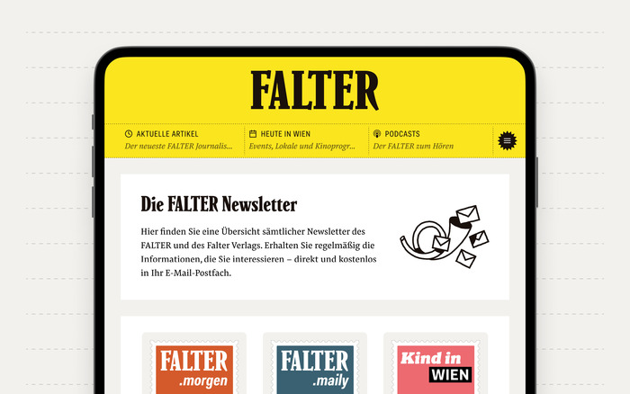
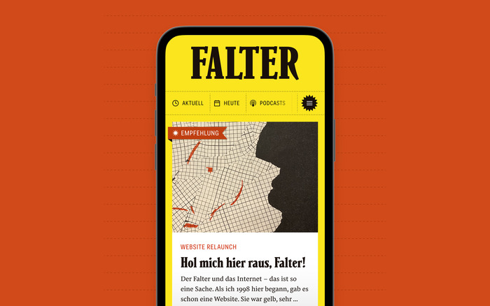
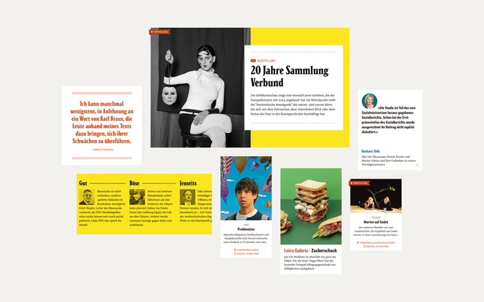
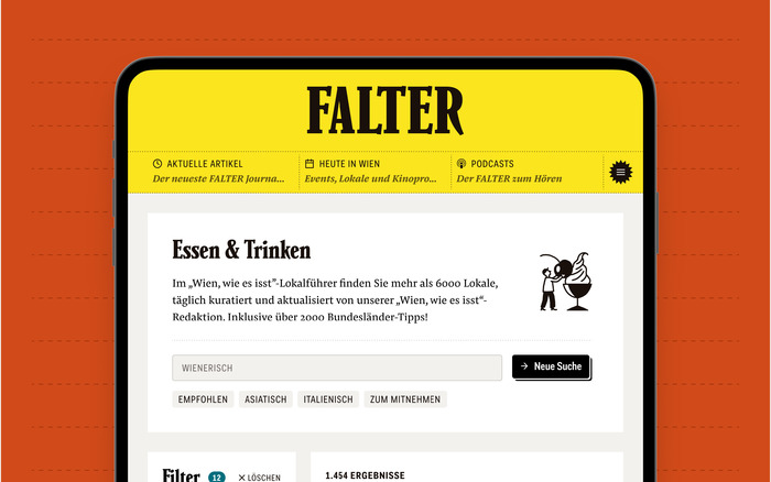
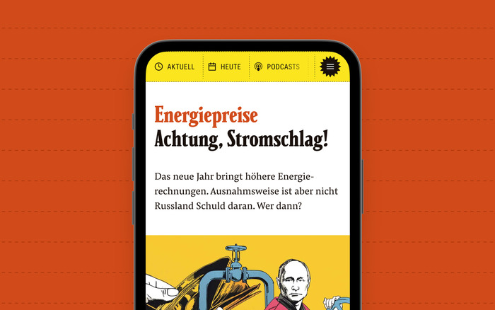
For the FALTER website relaunch, we wanted to focus on the newspaper’s underground history, but also bring the site closer to the print edition. The characteristic Parkinson headline font and the sans serif Fakt Pro display font were already set. The print edition uses Lirico from Type By as its text font—a very delicate serif font with partially open punches and many swings. For screens and smaller text, we needed something that was just as high-quality but not quite as delicate – Pensum Pro has similar serifs, but looks a little more sturdy, especially on mobile devices. Previously, a Google web font was used throughout the site (one for everything). The new, slightly wilder font mix is a better fit for the brand and the playful design of the site.
Source: christophrauscher.de Christoph Rauscher. License: All Rights Reserved.
Source: christophrauscher.de Christoph Rauscher. License: All Rights Reserved.
Source: christophrauscher.de Christoph Rauscher. License: All Rights Reserved.
Source: christophrauscher.de Christoph Rauscher. License: All Rights Reserved.
Source: christophrauscher.de Christoph Rauscher. License: All Rights Reserved.
This post was originally published at Fonts In Use