Fear and Loathing at Rolling Stone. The Essential Writing of Hunter S. Thompson

Source: bookshopapocalypse.com Bookshop Apocalypse. License: All Rights Reserved.


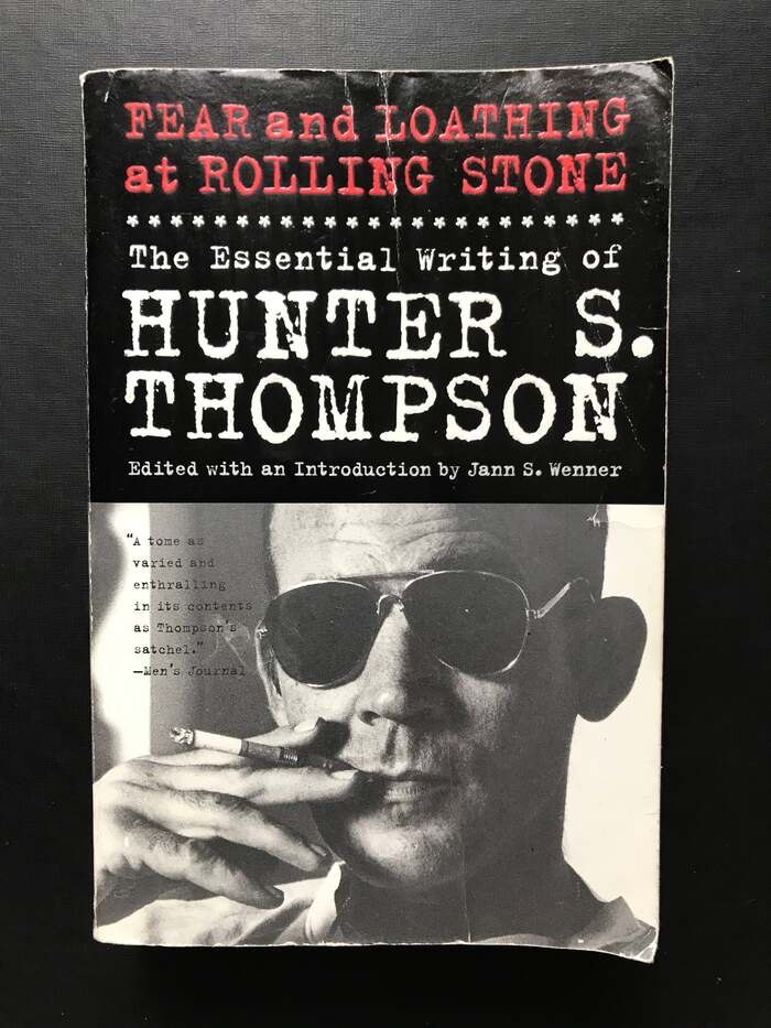
As a journalist and writer active in the twentieth century, Hunter S. Thompson (1937–2005) naturally was a typewriter guy. Robert Messenger has a collection of portraits of the author at his typewriters, spanning two decades. To say Thompson’s relation with his working equipment was carefree would be incorrect – there are at least two pictures of him pointing a gun at his typewriter – but it definitely was an intense one.
Hence, what better choice for a book with his essential writing than a typewriter font? If I were to nitpick, Thompson’s model of choice was a Selectric. He used other machines before, but at least since the 1970s, he wrote on a Selectric II, the second generation of IBM’s electric typewriter with an interchangeable “typeball”. Then again, the output of a Selectric looks rather clean, certainly when compared to that of earlier mechanical models. That’s where Trixie – recently renamed to LTR NCND – comes in: Erik van Blokland’s digital fontification of the typescript produced by a vintage Triumph Durabel Norma has the right amount of smudge and unruly alignment that we expect to see from the manic Gonzo persona.
.jpg)
The dust jacket for Fear and Loathing at Rolling Stone was designed by Joseph Hutchinson, who was Rolling Stone’s art director at the time (since 2018, his title is Creative Director). The book’s interior design is credited to Joy O’Meara, designer at Simon & Schuster.

Source: bookshopapocalypse.com Bookshop Apocalypse. License: All Rights Reserved.
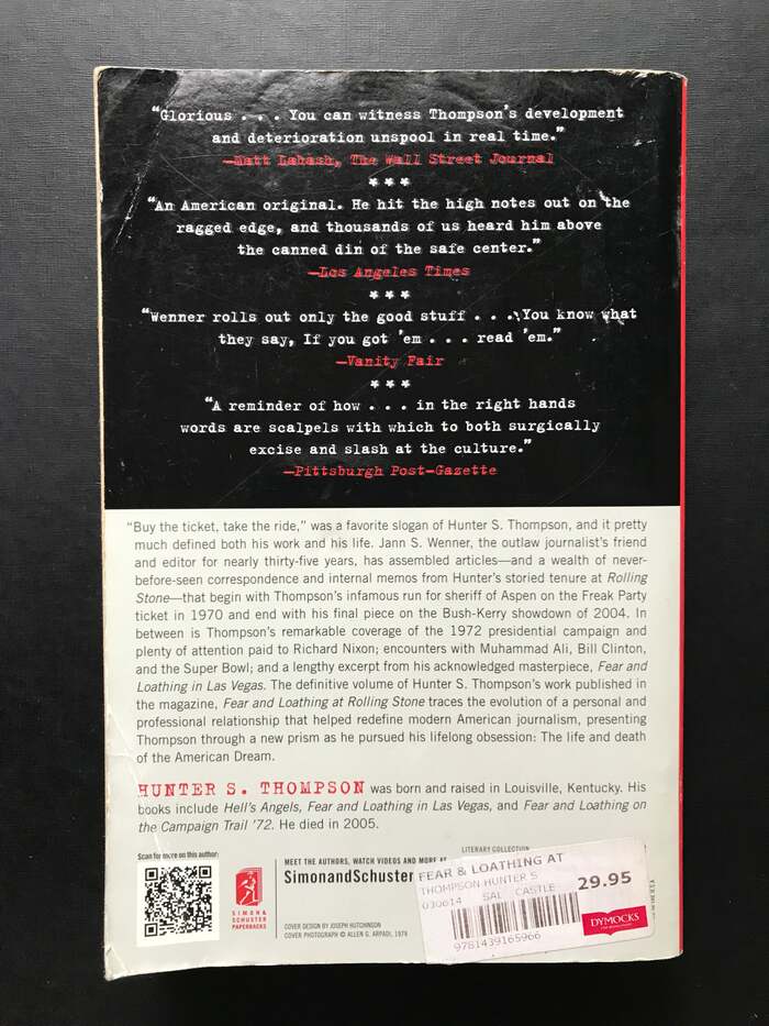
Back of dust jacket with praise

Source: bookshopapocalypse.com Bookshop Apocalypse. License: All Rights Reserved.
Cover and spine

Source: bookshopapocalypse.com Bookshop Apocalypse. License: All Rights Reserved.
Title page with credits in Rockwell
Source: www.brownandbunting.com.au Brown & Bunting Booksellers. License: All Rights Reserved.
The paperback edition has a different blurb, but otherwise the same design.
Source: www.brownandbunting.com.au Brown & Bunting Booksellers. License: All Rights Reserved.
Back cover of the paperback edition, with the synopsis set in Trade Gothic or similar
This post was originally published at Fonts In Use